Introduction
Enhanced Datylon Bar chart for wider use.
The first release of this year is mainly dedicated to the bar chart. If you think bar charts are vanilla and cannot be improved anymore, think again. We have added new features to the Datylon Bar chart which turns it into a multi-purpose and versatile chart type that can be used for even more complex visualizations and data stories.
More flexible templates in Datylon webapp
We see that more and more users are discovering the benefits of the Datylon web app and are creating charts online or reusing design templates made in Datylon for Illustrator just by uploading new data into it. To increase flexibility in use, we created the concept of snippets that allow you to add a template into another template.
Datylon for Illustrator & Datylon web app
Overlaying bars and marks
Do you want to compare values in a bar or column chart but want to keep it compact? Or want to add one or more data marks on top of your bars? You now can with the new overlay feature in the Datylon chart maker.
Choose an overlay mode in Styling > Multi-Series > Bars > Overlay, and enable Overlay in at least one series via Styling > Series > Bars > Overlay.
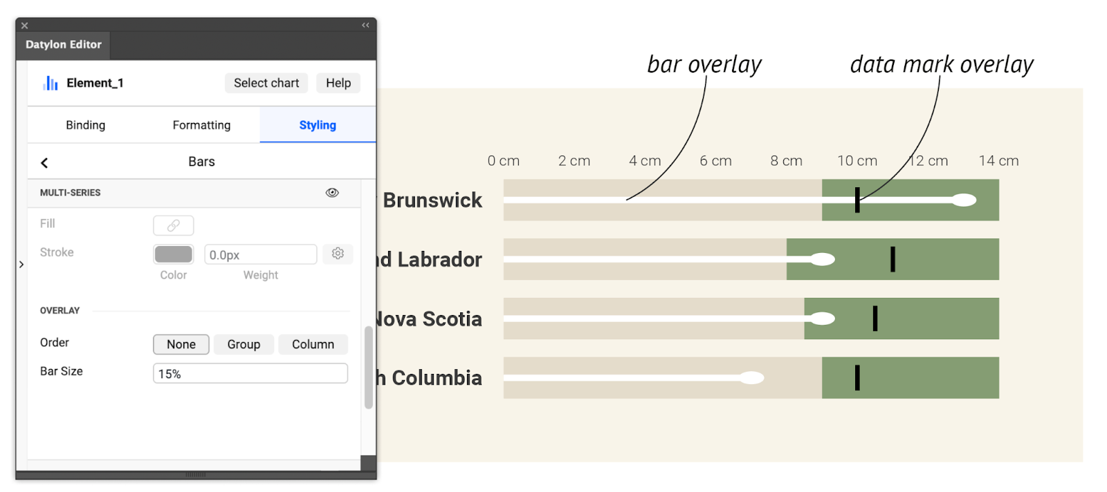
See this article for more details.
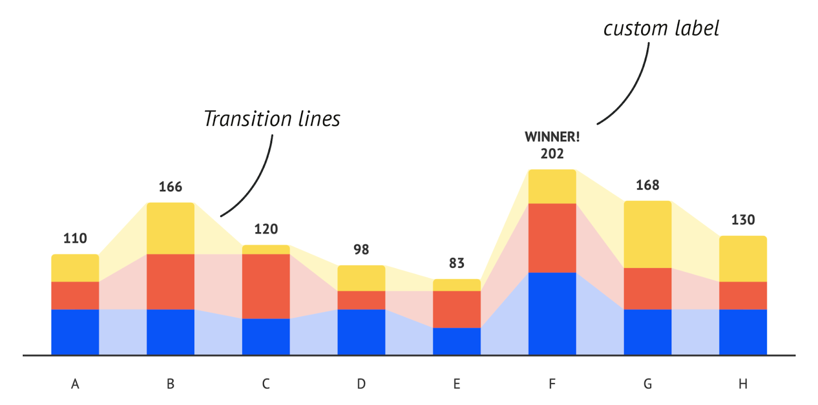
Add transition lines for clarity
In stacked bars, subtle value changes between categories are sometimes difficult to spot. Transition lines or areas between the bars help to perceive those oven minor differences.
In the Datylon editor, go to Styling > Bars > Multi-Series > Transition.
Click this link for more details.
Enrich your Bar chart with custom labels
We added the option to bind any column/row of data to a bar label. This is particularly useful for adding totals labels to a stacked bar or other data-driven custom labels.
In the Binding tab, bind a column/row to Data label and enable data labels for all or one series in Styling > Data > Data Labels or Styling > Series > Data Labels.
Extra label options for better readability
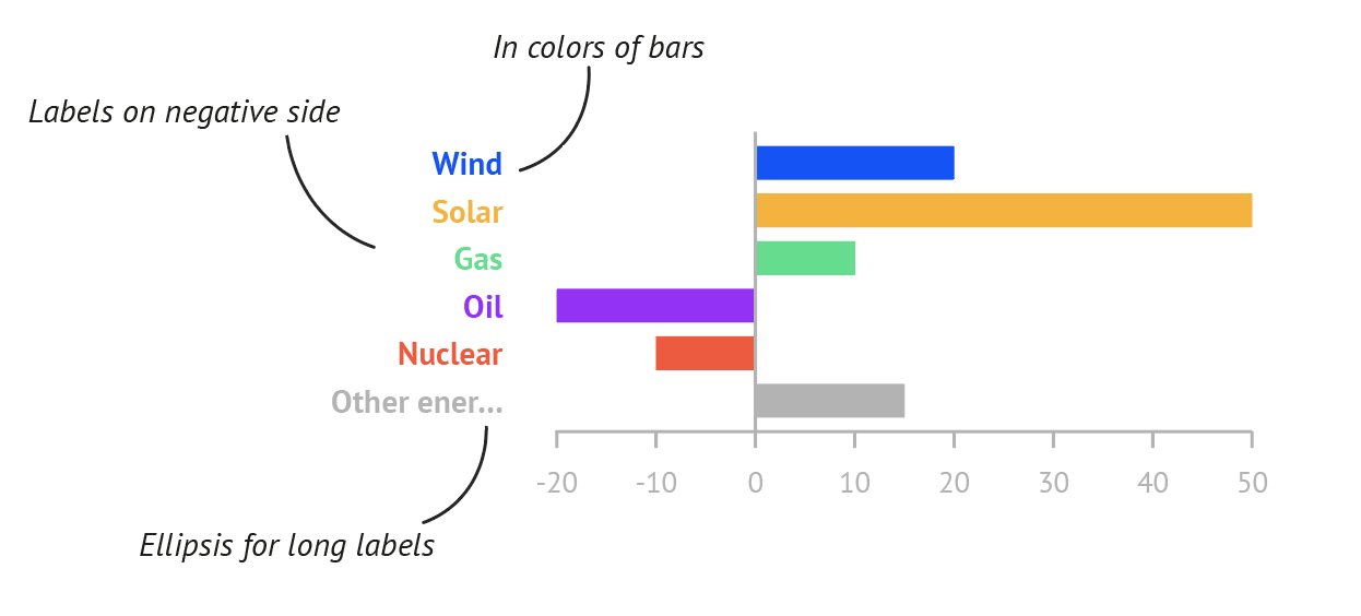
- Position axis labels on the negative side
For numerical axis labels of a Bar chart, we added the option to position the labels at the end of the negative side, so they will not be covered by the bars ensuring good readability of the labels. Find it at Styling > Y or X axis > Labels > Anchor Point > Negative Side.
More info here. - Bind colors to categorical labels
If the distance between the labels and the bars becomes too high or you just want to highlight the labels, the category axis label colors can now easily be linked to the bar colors. First color your bars using a palette and then activate the option in Styling > Y or X axis > Labels > Character > Color > Link.
More info here. - Ellipsis for long long la...
Labels that contain a long string of text that does not fit within the paragraph width, an ellipsis is shown at the end if enabled. This option is available for any label, in any chart. Look for the Max Number of Lines option in the paragraph section of the label properties.
More info here.
More control over bubbles.
If the data points in a bubble chart get too small so you don’t see them anymore, the point of showing them is lost. Therefore we added a feature where you can control the minimum and maximum size of your data marks.
This also allows you to create multiple bubble charts which can be compared to each other because they have the same size “scale”. In that case, make sure the min and max size is set to the same value.
See the different options under Styling > Data Marks in the Datylon chart maker, or check the properties article.
Note that if you disable Use Absolute Values, the bubble size scale can be distorted and does not represent the exact proportion between the values in the data.
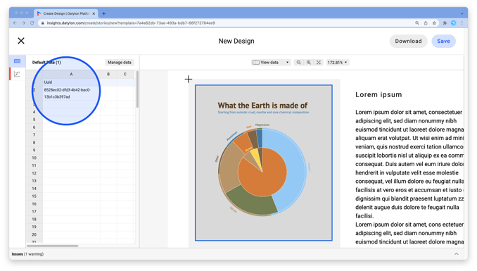
Snippets for use with Datylon web app
Datylon’s web app is designed to easily reuse and share data visualizations. Designers first create and upload on-brand and pixel-perfect templates with Datylon for Illustrator. Co-workers then re-use these templates online by linking new data.
We created a new chart type "Snippet", which is not really a chart but a placeholder for online users to combine different templates together by loading other templates in these snippets. This allows online users to create a wide variety of beautifully designed data visualizations.
To start using snippets, place one or more snippets with Datylon for Illustrator on an artboard, and export it as a template via the Illustrator menu Window > Extensions > Datylon Account. Then sign in and export your active artboard. In the web app, users can then load other templates in the snippet placeholder by adding the UUID (which is the last part of the URL) of the template into the snippet datasheet.
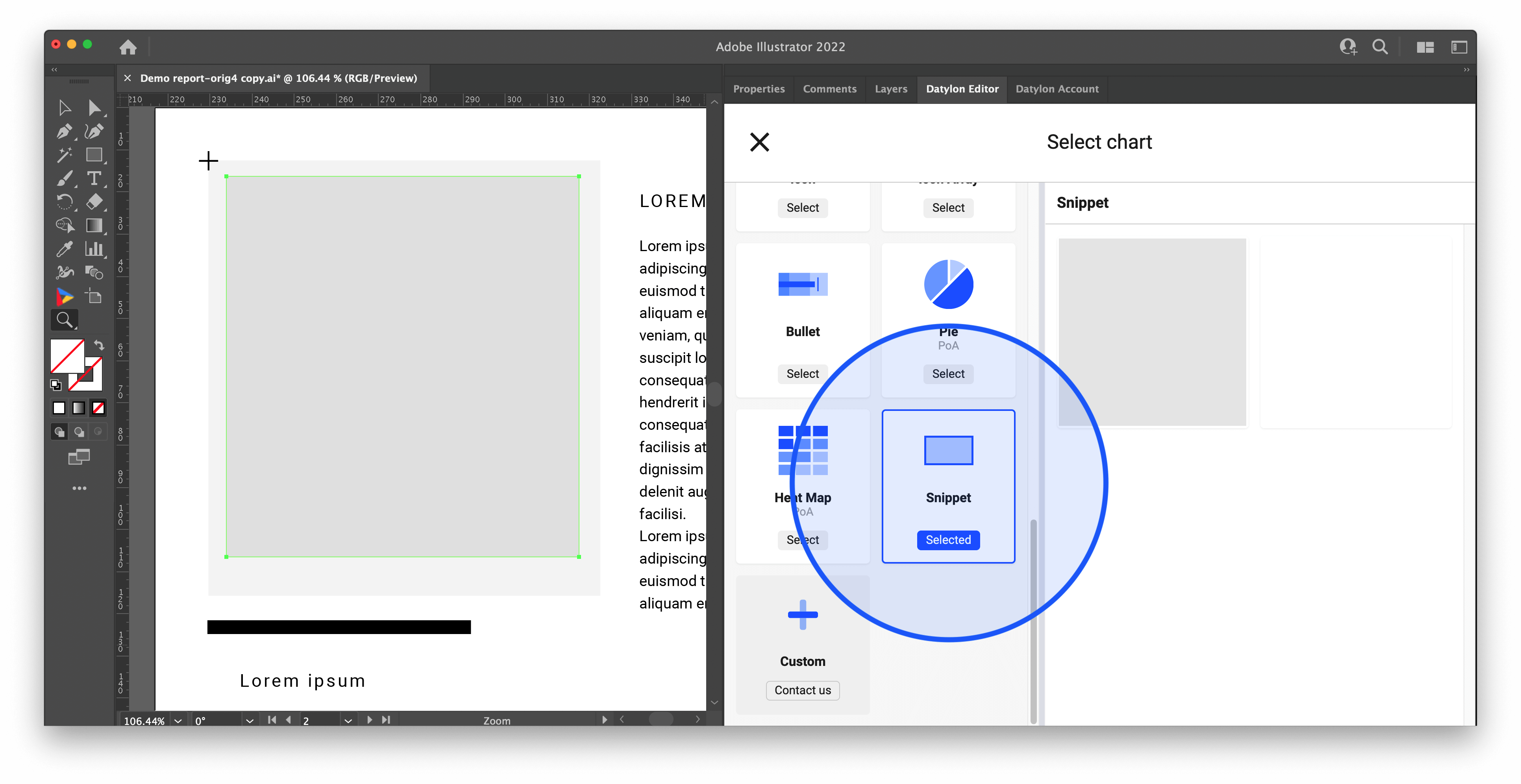
Check out this article with more details.