![Datylon_logo_blue_NEW2.svg]](https://help.datylon.com/hubfs/Datylon%20Brand%20Identity/Datylon_logo_blue_NEW2.svg)
Many properties in the DATA section can be set overall for the whole chart, but also separately on the data point level. See data point styling for more details.
Binding tab
1 Dataset
2 Series
Styling tab
General
1 Positions and Size
2 Appearance
3 Legend
Data
4 Bars
5 Data Marks
6 Data Labels
Axes and Grid
7 X Axis
8 Y Axis
Binding Tab
Dataset>
| First row/column are headings |
When enabled, the first row (column) of the dataset are headings. When disabled, the first row (column) of the dataset is included in the data range. |
 |
| Data is in | Sets the way data is structured: in rows or columns. |  |
Series>
| Name |
Text field to name the Series. By default, it is set to “New Series n”. This name will be used for Direct labels in Line charts. |
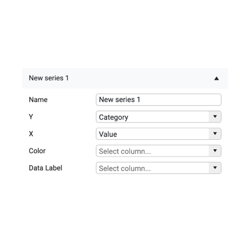 |
| Y |
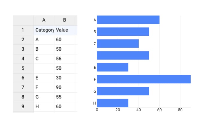
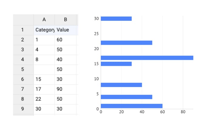
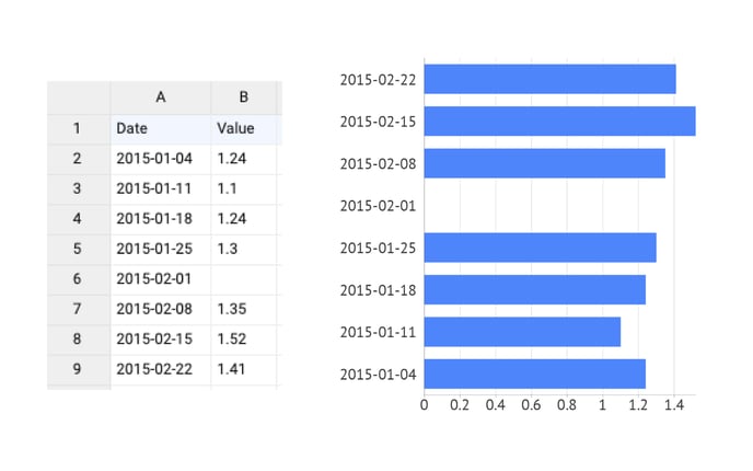
Y-axis is used for binding categories. Categories can be of 3 types:
|
 |
|
One or more empty cells in the data will give the following result::
|
1
2
3
|
|
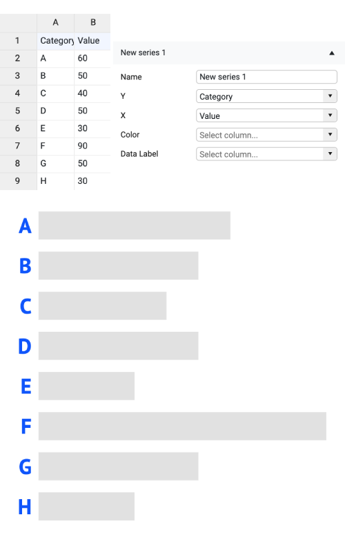
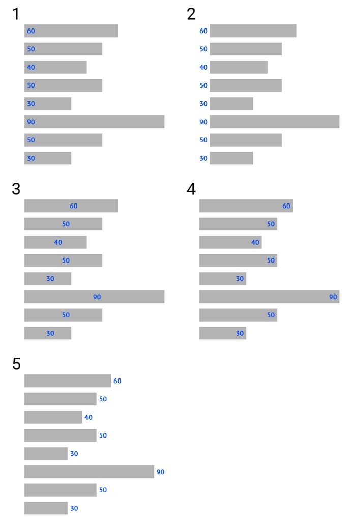
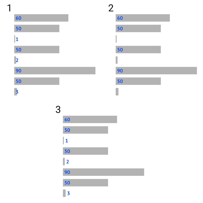
| X | The X-axis is used for binding numerical data which will be visualized by the length of the bar. | 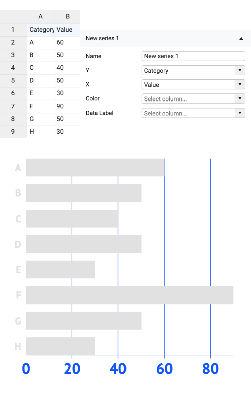 |
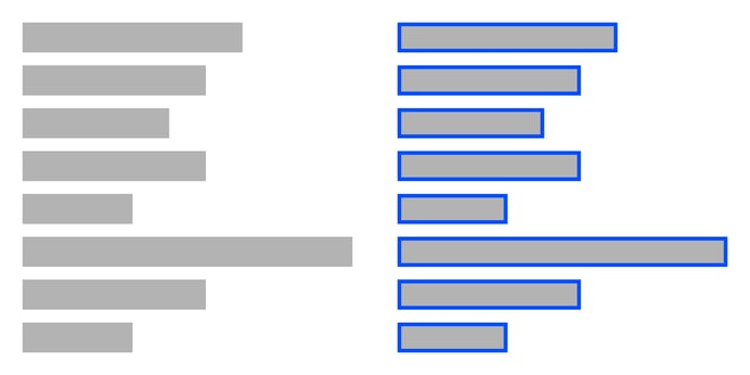
| If there are empty cells in the column (row) bound to the X-axis, the bar won’t be plotted, no data label is added (as opposed to a zero in the data), but the corresponding category will still appear. | 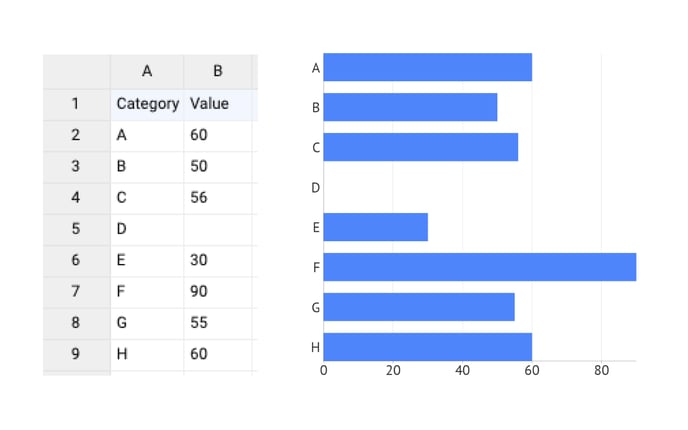 |
|
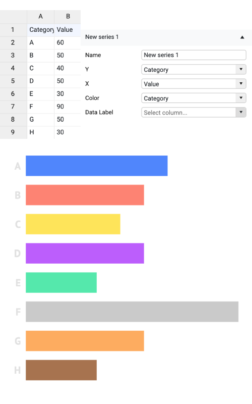
| Color | Allows binding color to column (row). For more details see How to optimally use colors in bar charts Colors can be presented directly as HTML colors, HEX, RGB, or CMYK values. To use direct coloring the color of bars should be set to “None” under Styling > Data > Bars > Color. |
 |
| Data Label | Adds the content of a bound column (row) instead of data labels | 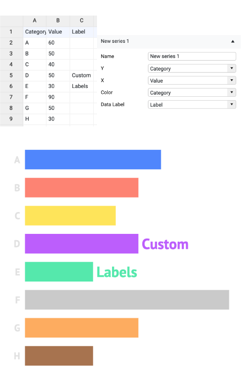 |
Styling Tab
DATA
Bars>
| Chart Orientation | Defines the X-axis as horizontal or vertical. | 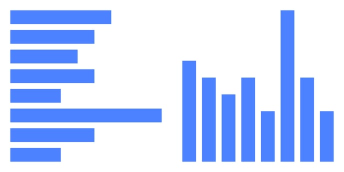 |
| Color | Sets the color of the bar. | 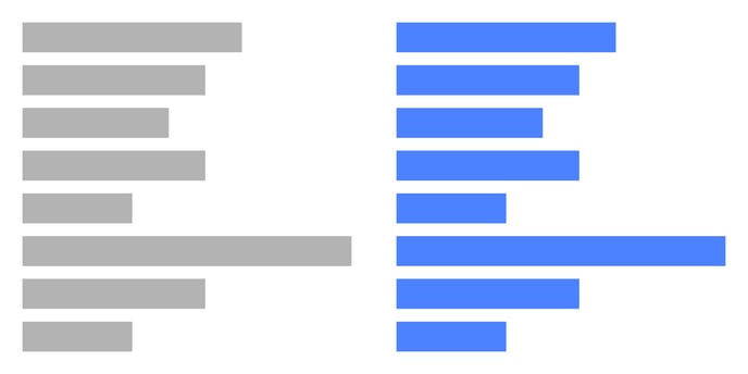 |
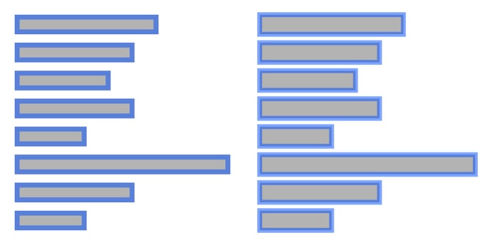
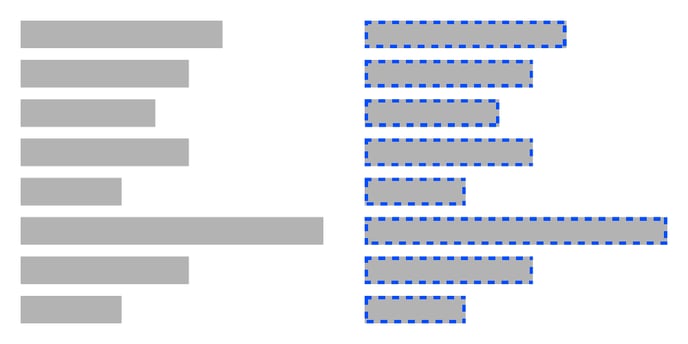
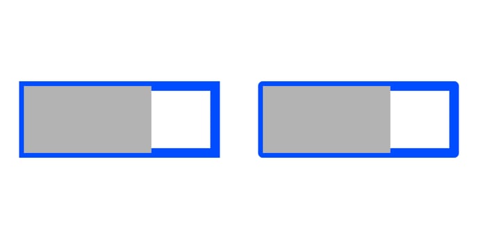
| Stroke |
Sets the color and weight of the stroke. You can apply a dashed stroke or change the type of stroke placement by clicking the cogwheel. |
 |
| Stroke > Cogwheel > Type |
Allows to use two types of stroke placement:
|
 |
| Stroke > Cogwheel > Corner |
Allows to change the corner type when Center stroke type is applied. Possible options are: Miter and Round |  |
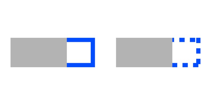
| Stroke > Cogwheel > Dashed Line |
Allows changing the length and gaps between the dashes. |
 |
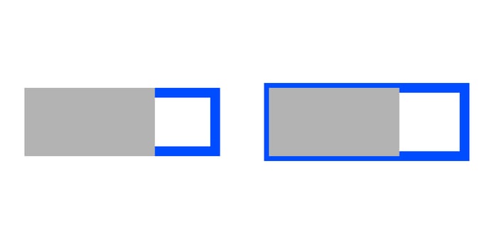
| Horizontal Rounding | Sets the horizontal rounding of the bar. Becomes visible if the vertical rounding value is above zero. |  |
| Vertical Rounding | Sets the vertical rounding of the bar. Becomes visible if the horizontal rounding value is above zero. |  |
| Round All Corners | Applies rounding to all corners of the bar. | 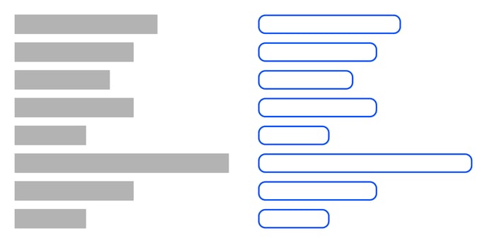 |
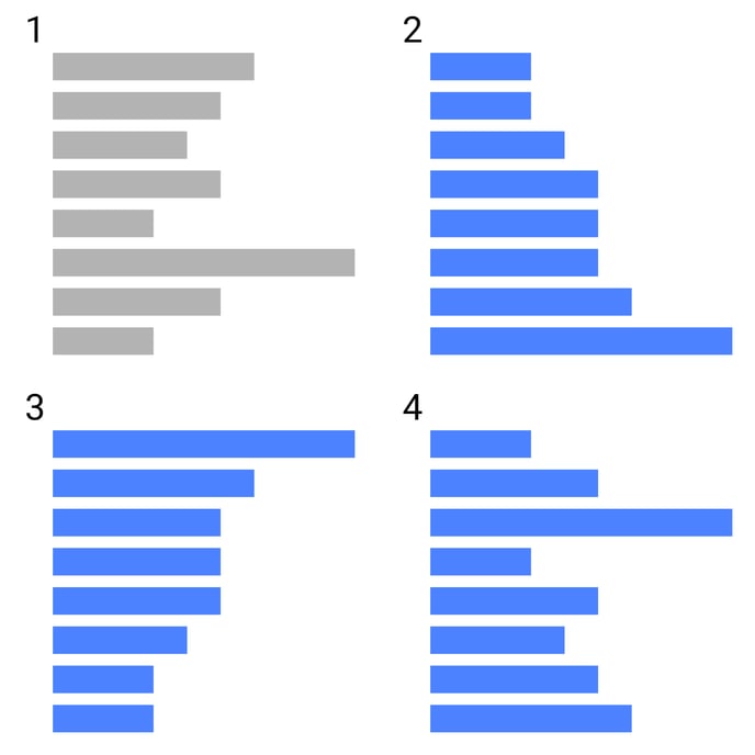
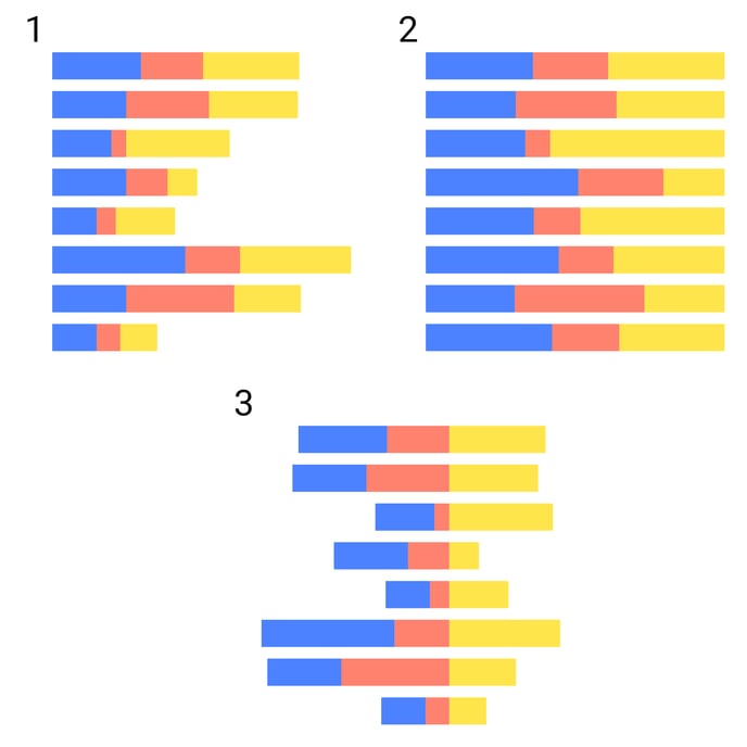
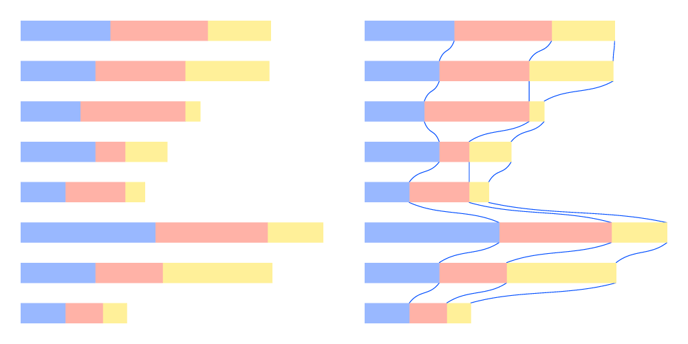
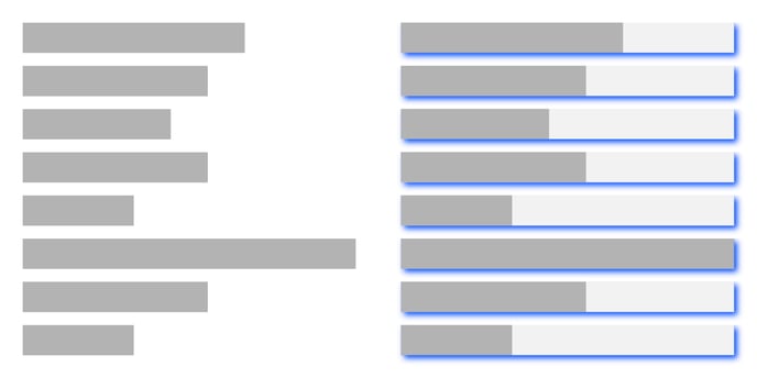
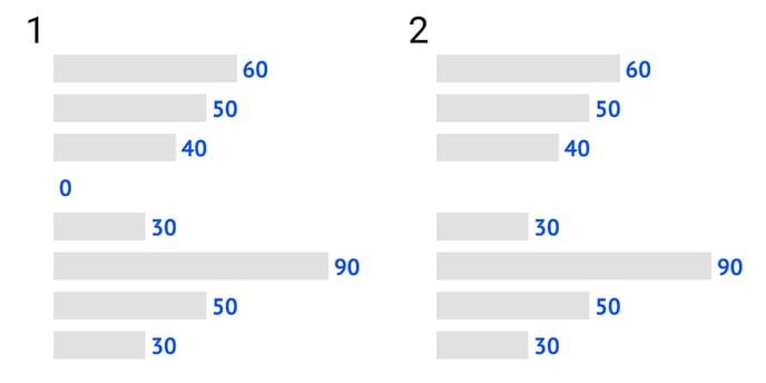
| Sorting |
Set the type of bar sorting. There are 4 options available:
|
 |
| Max Number of Bars | Set the number of bars that will be displayed. No changes in data are applied. |  |
MULTI-SERIES MODE: GROUPED
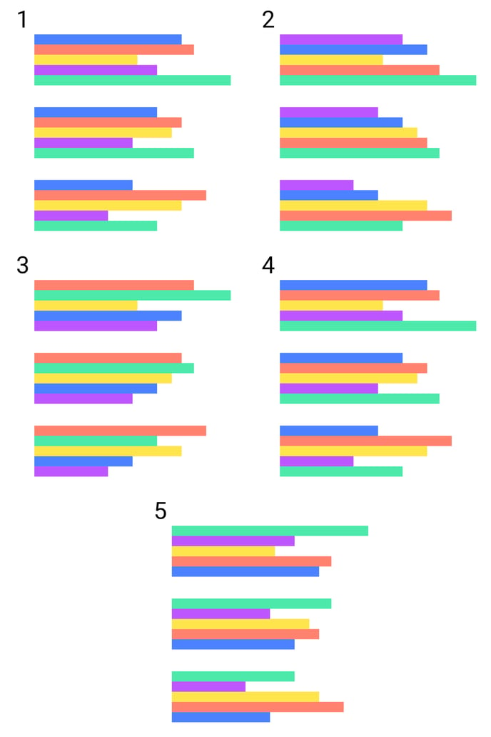
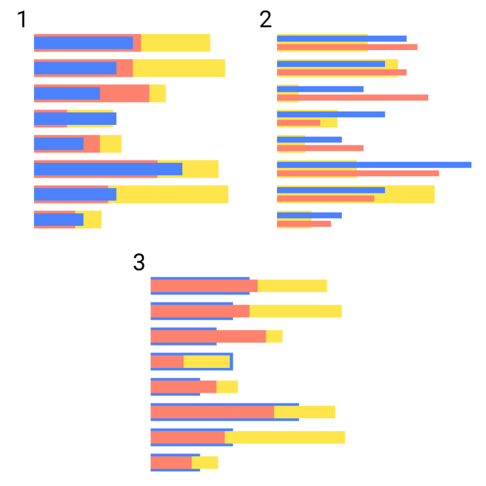
| Series Order |
Sets the order of bars inside a group. Ordering is based on a sum of all values from each series. There are 5 options available:
|
 |
| Spacing |
Sets the space between bars within the same group |
 |
MULTI-SERIES MODE: STACKED
| Stack Type |
Sets the stack type:
|
 |
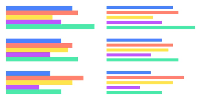
| Series Order |
Sets the order of bars inside of the stack. Ordering is based on a sum of all values from each series. There are 5 options available:
|
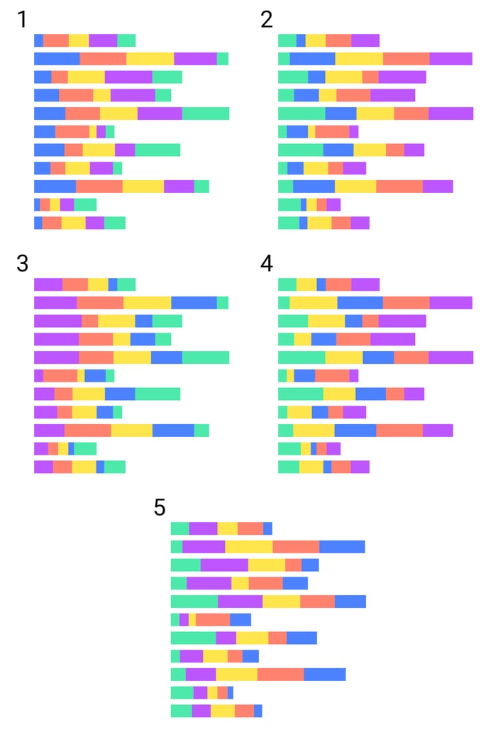 |
| Round All Corners of Stack | Round all corners of a stack as if it’s one bar | 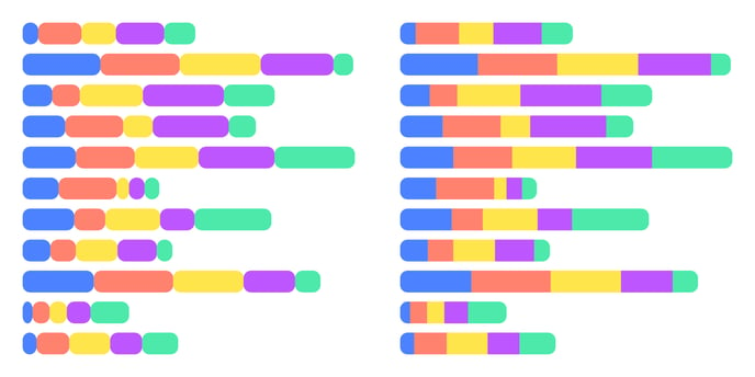 |
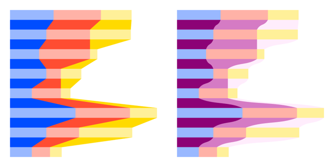
TRANSITION
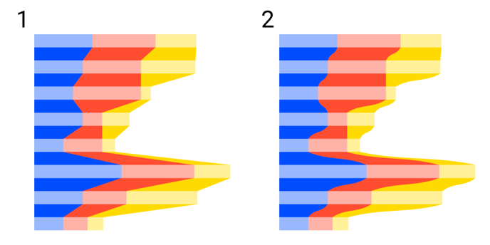
| Transition |
Adds a transition line or/and area between bars of the same series (stack) |
|
| Type |
Sets the transition type: 1. Linear 2. Curved |
 |
| Fill |
Sets the color of the transition. Possible options are: 2. Link 3. Solid 4. Palette 5. Gradient |
 |
| Stroke |
Sets the color, weight, and dashed line options of the stroke of the transition lines. |
 |
OVERLAY
| Overlay |
Option to overlay one or more series on top of others. This section defines the generic behavior of those overlay series. Only applicable in case Styling > Series > Overlay Series is enabled for one or more series. |
|
| Overlay Mode |
Sets the way the overlaid bar and/or marks will be placed: 2. Grouped 3. Stacked |
 |
| Bar Size | Sets the relative width of the overlaid bar relative to the main underlying bar. | 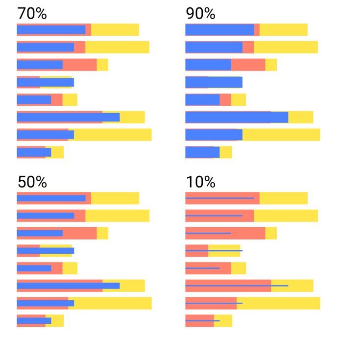 |
| Outer Padding | Available only when Grouped Overlay Mode is selected. Sets the padding between grouped overlaid bars and the main bars. | 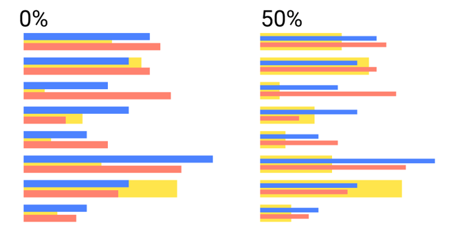 |
DISTRIBUTION
| Width | Sets the width of the bar in absolute or relative values | 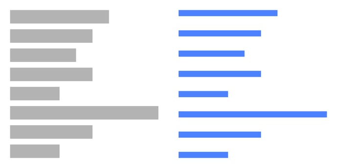 |
SHADOW
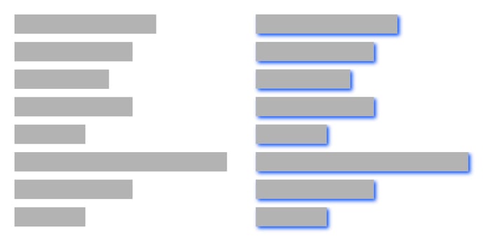
| Shadow |
Available in Datylon web app only. Adds shadow to a given element. Color, Xand Y offset and Blur are available for editing. |
 |
BACKGROUND
| Color | Sets the color of the background bar | 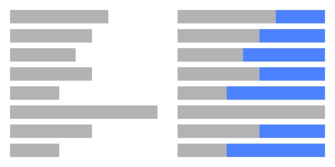 |
| Stroke |
Sets the color and weight of the stroke of the background bar You can apply a dashed stroke by clicking the cogwheel. |
 |
| Stroke > Cogwheel > Type |
Allows to use two types of stroke placement:
|
|
| Stroke > Cogwheel > Corner |
Allows to change the corner type when Center stroke type is applied. Possible options are: Miter and Round. |
 |
| Stroke > Cogwheel > Dash line |
Allows changing the length and gaps between the dashes. |
 |
| Horizontal Rounding | Sets the horizontal rounding of the end of the background bar. Becomes visible if the vertical rounding value is above zero. |  |
| Vertical Rounding | Sets the vertical rounding of the end of the background bar. Becomes visible if the horizontal rounding value is above zero. | 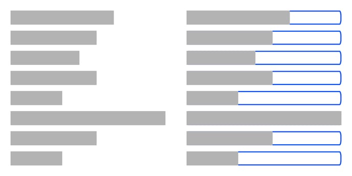 |
| Round All Corners | Applies rounding to all of the corners of the background bar. | 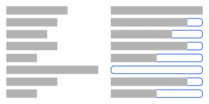 |
| Shadow |
Available in Datylon web app only. Adds shadow to a given element. Color, Xand Y offset and Blur are available for editing. |
 |
Data Marks>
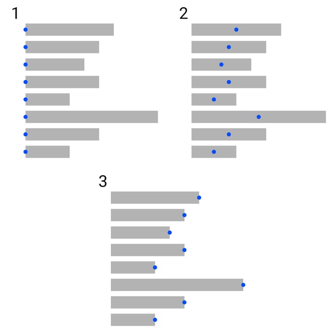
| Anchor Point |
Sets the placement of an anchor point of the data mark:
|
 |
Data Labels>
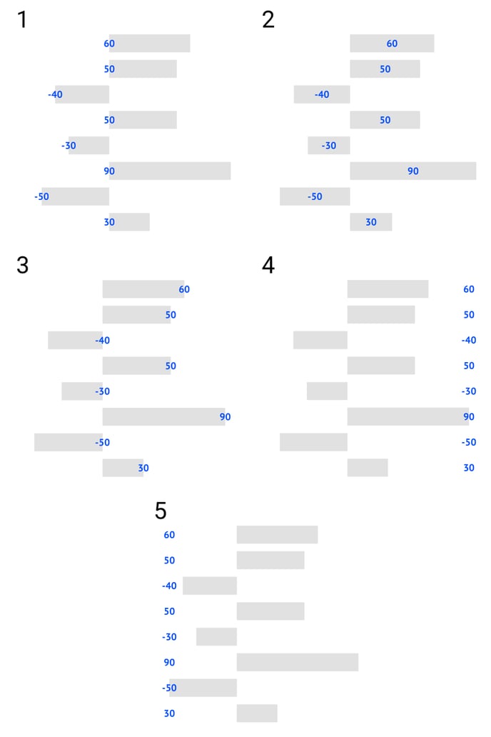
| Anchor Point |
(can be applied only if Smart labels are turned off) 1. Start 2. Center 3. End 4. Positive Side 5. Negative Side |
 |
| Horizontal Alignment | Aligns the label left, centered, or right relative to the data point or relative to the data mark anchor if data marks are shown. | 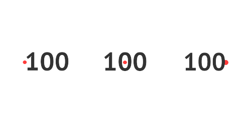 |
| Vertical Alignment | Aligns the label top, center, or bottom relative to the data point or relative to the data mark anchor if data marks are shown. | 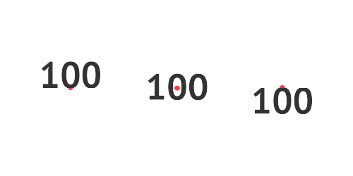 |
| Horizontal Offset | Sets the position of the label horizontally. Enter a positive value to move to the right. Enter a negative value to move to the left. |  |
| Vertical Offset | Sets the position of the label vertically. Enter a positive value to move up. Enter a negative value to move down. |  |
| Rotation |
Rotates the label around the anchor point. A positive value rotates counterclockwise. A negative value clockwise. |
 |
| Prefix |
Adds a prefix to all legend labels. Consecutive spaces are ignored. |
 |
| Suffix |
Adds a suffix to all legend labels. Consecutive spaces are ignored. |
 |
| Hide Zero |
Hides the label if the corresponding value is 0 |
 |
SMART LABELS
| Location |
(Smart labels override left and right position alignment and paragraph alignment) Places data labels to one of the following relative positions:
|
 |
| Overflow |
Sets one out of 3 options when an inside start or end label is larger than the bar:
|
 |
| Overflow Color | Sets the color of an overflow label when the “Outside” option is selected. | 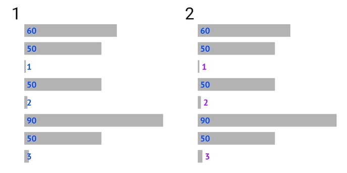 |