![Datylon_logo_blue_NEW2.svg]](https://help.datylon.com/hubfs/Datylon%20Brand%20Identity/Datylon_logo_blue_NEW2.svg)
Many properties in the DATA section can be set overall for the whole chart, but also separately on data point level. See data point styling for more details.
Binding Tab
1 Dataset
2 Series
Styling Tab
General
1 Position and Size
2 Appearance
Data
3 Cell
4 Data Labels
Axes and Grid
5 Axis > Type: Categorical
Binding Tab
Dataset>
| First row (column) are headings |
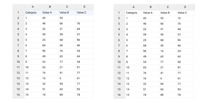
When enabled, the first row (column) of the dataset are headings. When disabled, the first row (column) of the dataset is included in the data range. |
 |
| Data is in | Sets the way data is structured: in rows or columns. | 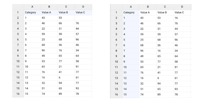 |
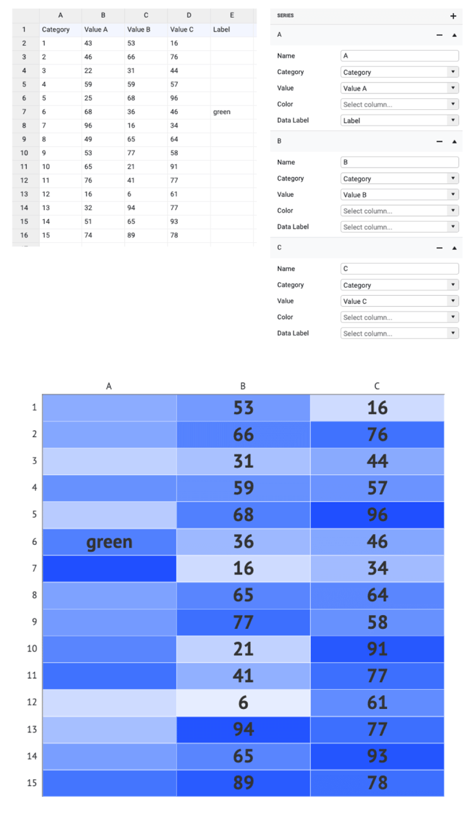
Series>
| Name | Text field to name the Series. By default, it is set to “New Series n”. The content of the name field behaves as an X-Axis label. | 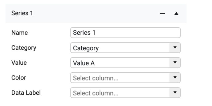 |
| Category | Used for binding categories visually presented as a Y-Axis. | 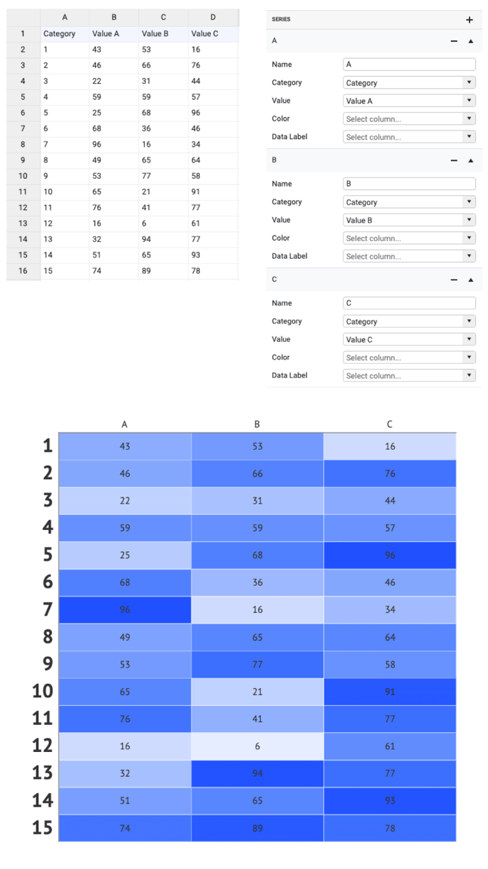 |
| If there are one or more empty cells, an empty category is added. Values of multiple empty categories will be merged into one category. | 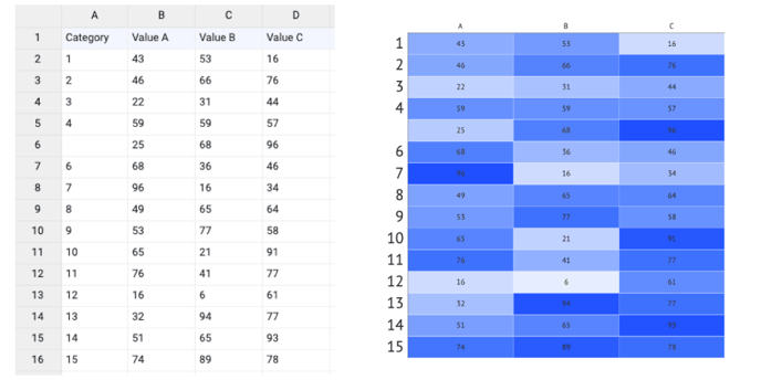 |
|
| Value | Used to bind values to the color of the cells. The bound column/row can represent only numerical values. | 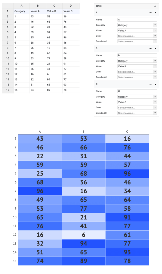 |
| If there are one or more empty cells, no heatmap cells are added. The order of categories remains unchanged. | 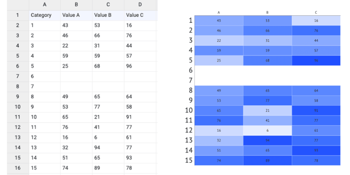 |
|
| Color | Used for direct binding of colors presented as HTML color, HEX, RGB, or CMYK values. More on that here. | 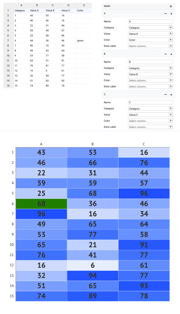 |
| Data Label | Used for direct binding of labels. Data labels binding overwrites the data labels represented by Values. |
 |
Styling Tab
DATA
Cell >
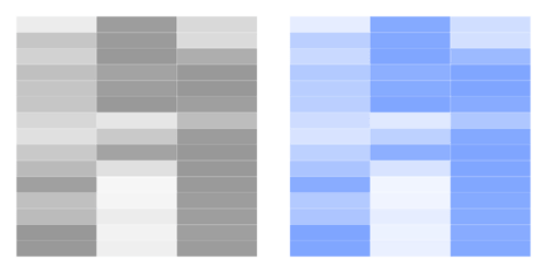
| Color |
Sets the color of the cells. For heatmap, the most useful color options are sequential and diverging palettes. See more on color here. |
 |
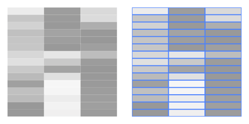
| Stroke |
Sets the stroke color and weight of the cell. |
 |
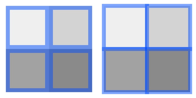
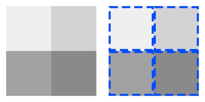
| Stroke > Cogwheel > Type |
Allows to set two types of stroke placement:
|
 |
|
Stroke > Cogwheel > |
Sets the type of the corner. There are two types available: Miter and Round. Available only if Center Type is applied. |
 |
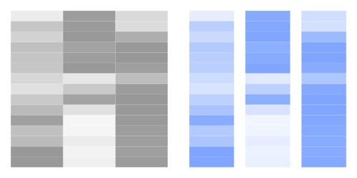
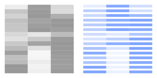
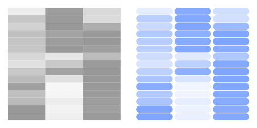
| Stroke > Cogwheel > Dash |
Sets the length and gap of the dashes. |
 |
GAPS BETWEEN CELLS
| Horizontal |
Sets width of the horizontal gap between cells. The relative gap is measured as a percentage of the cell width. The absolute gap is measured in absolute units set in Illustrator (px, mm, in, etc.). |
 |
| Vertical |
Sets the height of the vertical gap between cells. The relative gap is measured as a percentage of the cell height. The absolute gap is measured in absolute units set in Illustrator (px, mm, in, etc.) |
 |
CORNER RADIUS
| Corner Radius |
Applies rounded corners to the cells. Separate settings for each corner can be applied by clicking on the cogwheel. |
 |