How to use color palettes for data-driven coloring of charts
Use palettes to color your chart series or data marks
In the following article, all features explained refer to the RGB color mode. Datylon for Illustrator also supports CMYK color mode. Please read more about it in this article.
Introduction
There are 2 completely different ways to color Datylon chart components by using data. Either by palettes or by color reference codes in the data itself. For the latter see Binding colors & other properties.
Any component of a Datylon chart such as an axis, grid, label, text, background etc. can be direct colored. Many of them can even be linked to data driven colored items. See more about direct coloring in this article.
To find out more about the palettes themselves, read this article: Color palettes in Datylon.
Using the palettes feature, components can be colored based on the underlying data values of the data points. The following components can be colored using palettes:
-
-
Bars in a single serie bar chart
-
Pie slices
-
Scatter data marks
-
Heatmap cells
-
Series in Area chart, Line chart, and multi-series Bar chart.
-
And more to come…
-
In Datylon, there are 3 distinct ways of data-driven coloring using palettes:
-
-
Categorical: assigning colors to categories in the data set
-
Numerical: assigning colors to data marks based on values in the data set
-
Multi-series: assigning colors to different series
-
Assign a palette for single series Icon Array & Heatmaps, and multi-series Line, Area & Bar charts
For multi-series Bar charts, make sure no column/row is bound to the Color property in the Binding tab.
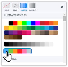
Go the Styling tab and continue to the item that needs to be colored e.g. Line of a Line chart, Bars of a multi-series Bar chart, etc. Click on the Color field and then the Palette button in the top row to open the data-driven palettes. Click on any palette to assign the colors to the chart.

The colors of the palette will be added by default from left to right to the subsequent series as they are ordered in Styling > Series. The order can be reversed by ticking the Reverse option. Or, the order of the series can manually be set by dragging them in the list under Styling > Series.
Assign a palette to Single series Bar charts, Pie chart and Scatter plot.
- Bind data to Color in the Binding tab
- Select the right data formatting in the Formatting tab
- Assign the color palette
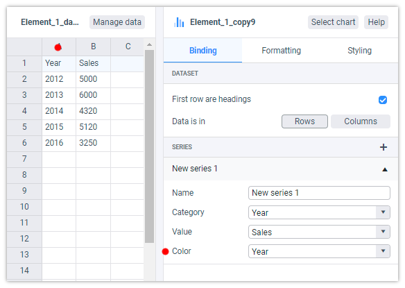
1. Bind data to Color in the Binding tab
Before a palette can be assigned to a single series chart, one has to select which column/row in the data has to be bound to Color. Both strings and numbers can be bound.

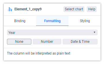
2. Select the right data formatting in the Formatting tab
- Categorical
For categorical coloring, the formatting of the relevant column should be on None, which is the default. If the formatting has been previously changed, go to Formatting > Select Column/Row… > None. Note also numbers e.g. years, can also be defined as categories. - Numerical
For numerical coloring, go to Formatting > Select Column/Row… > Number. Obviously, the data can only be numbers.
3. Assign the color palette
Go to the Styling tab and continue to Color of the item that needs to be colored e.g. bars of a single series Bar chart, Pie slices, etc. Click on the Color field and then the Palette button to open the data-driven palettes. Click on any palette to assign the colors to the chart.
For single series bar charts, palettes can only be assigned on the series level.
Go to Styling > Series > Bars > Color
- Categorical
When a palette is bound to a chart, the colors from the palette are assigned starting from left to right. If there are more items to color than there are swatches in the palette, the sequence starts all over from the left. The order can be reversed by ticking the Reverse option. - Numerical
When assigning a palette, the value of the data will determine which color is applied. The left color in the palette represents the lowest value, the right color the highest value. This can be reversed by enabling the Reverse option. The best result is obtained when the number of swatches is the same as the number of values. For larger sets of data, use the continuous palettes.


