This article is work in progress, but the information it contains might still be helpful to you.
At the bottom of the Datylon panel in the Issues pane, you may find warning or error messages marked with a yellow background referring to one or more charts in your document.
You can ignore the warning messages and continue working, but it is advised to apply the suggested property changes in order to improve the appearance of your chart(s).
Below you'll find most of the possible warning and some error messages, and an explanation about the suggested corrections.
Datylon Report Studio & Datylon for Illustrator
Chart specific warnings:
| Chart type | Warning message | What caused warning to appear | What to do to make warning disappear |
|
Bar chart |
'Round all corners of stack’ overwrites the rounding of corners of bar segments |
Appears when both Styling > Bars > Round all corners and Styling > Bars > Multi-Series > Round all corners of stack checkboxes are on. |
If you want to round all corners of each stack then leave only Styling > Bars > Round all corners checkbox on. If you want to round corners of the bar as a whole then leave only Styling > Bars > Multi-Series > Round all corners of stack checkbox on. |
| Bar chart | There are only <number of series> series available | Appears when Styling > Multi-Series > Stack Type is set to Diverging and Styling > Multi-Series > Series Alignment Position value is bigger than the number of series available. | Set the value of Styling > Multi-Series > Series Alignment Position to a number that is equal or less than the number of series. |
| Bar chart | Disabling multi-series will only render the first bound series | Appears when Styling > Bars > Multi-Series is turned off and the number of series is two or more. | Turn Styling > Bars > Multi-Series on or reduce the number of series to 1. |
| Bar chart | Sorting is ignored, because stack type is set to "percentages" | Appears when Styling > Bars > Multi-Series > Stack Type is set to Percentages and Styling > Bars > Sorting applied ( means if any type except "None" applied) | Set Percentages and Styling > Bars > Sorting to None. |
| Bar chart | "Stack Offset - Percentages (Diverging)" can not be applied to negative values | Appears when data has negative values and Styling > Bars > Multi-Series > Stack Type set to Percentages or Diverging | Either set Styling > Bars > Multi-Series > Stack Type to None or remove negative values from data used. |
| Bullet chart | The Bar (Target) Value should fall within the Measure Range | Appears when the number assigned to value (target) is bigger than max value of Measures or less than min value of Measures. | The number assigned to value (target) should be between min and max value of Measures. |
| Icon Array chart | Generating this amount of icons can influence the performance of Datylon | Appears when the number of icons is more than 1000. (Number of icons = number of icons in rows * number of icons in columns). | Go to Styling > Array > Columns, Styling > Array > Rows and change this values so the number of columns is equal or less than 1000. |
| Icon Array chart | The number of rows and/or columns is too small to generate the amount of icons | Appears when Styling > Array > Value of 1 Icon is set and the number of icons that should be generated based on data and Value of 1 Icon property exceeds the product of Columns and Rows value | Either remove Value of 1 Icon or make the values of Columns and Rows values big enough to exceed the value icons that should be generated based on data and Value of 1 Icon |
| Bar / Line / Area / Scatter chart | "X"("Y") values should be of type 'number' | Appears when values bound to "X"("Y") are not numerical or isn't formatted as a number. | If you want to use values bound to ("X")"Y" as numbers you should format your data (you can read more about this here), if you don't want to use values bound to ("X")"Y" as numbers switch to other available type: go to Styling > X(Y) Axis > Type |
| Bar / Line / Area / Scatter chart | "'X'("Y") values cannot be recognized as the type 'DateTime' | Appears when values bonded to "X"("Y") are not numerical or isn't formatted as a number. | If you want to use values bound to ("X")"Y" as date you should format your data (you can read more about this here), if you don't want to use values bound to ("X")"Y" as numbers switch to other available type: go to Styling > X(Y) Axis > Type |
| Icon chart | Max value should be greater then or equal to the maximum value from data | Appears when Styling > Icons > Distribution > Absolute > Max Value is less than the maximum value from data | Set Styling > Icons > Distribution > Absolute > Max Value to the value that is greater or equal to maximum value from the dataset |
| Icon chart | Min value should be less then or equal to the maximum value from data | Appears when Styling > Icons > Distribution > Absolute > Min Value is less than the minimum value from data | Set Styling > Icons > Distribution > Absolute > Min Value to the value that is greater or equal to minimum value from the dataset |
| All charts | the value in cell xx cannot be converted | This warning typically appears when there are non-numerical characters, such as commas, percentages, or currencies, in numerical data. | Go to Formatting > select the column/row which is marked red > Number > and either change the Decimal separator setting, Thousand separator setting or use Ignore characters. |
Property specific warnings:
| Property | Warning message | What caused warning to appear | What to do to make warning disappear |
| Styling > X(Y) Axis > Major Ticks and Grid > Custom Ticks Amount > Starting Tick in Numerical or Datetime type axis. | Starting tick should fall within the data range | Appears when starting tick is less than min value or bigger than the max value. | Enter Starting Tick value that is bigger than min value and smaller than max value. |
| Styling > X(Y) Axis > Major Ticks and Grid > Custom Ticks Amount > Ticks Interval | This ticks interval is too small to ensure a good performance | Appears when space between ticks is less than 1px. | Increase Ticks Interval |
| Styling > X(Y) Axis > Locate At Zero | The other axis is not numerical, this axis can not be placed at 0 | Appears when other axis is not of type numerical | Switch other axis to numerical type or turn off the the checkbox |
| Styling > Position and Size > Margins or Spacing | The chart area is too small to render the chart. Adjust the margins or increase the chart area size to render the chart | Appears when margins or spacing are bigger than width and/or height of the chart or the chart area is too small. | Increase the size of the chart and/or decrease margins or spacing |
| Styling > X(Y) Axis > Min Value in Numerical or Datetime type axis. | Min value should be smaller than <min value from data> | Appears when entered min value is bigger than min value from data. | Enter min value that is smaller than min value from the data |
| Styling > X(Y) Axis > Max Value in Numerical or Datetime type axis. | Max value should be bigger than <max value from data> | Appears when entered max value is smaller than max value from data. | Enter max value that is bigger than max value from the data |
| Color > Palette > Range > Min Value / Max Value / Center for palette that was applied to categorical data | Min/max/center values can not be set for categorically applied palettes | Appears when some values are typed into Color > Palette > Range > Min Value / Max Value / Center while palette is applied to categorical data | Remove values from Color > Palette > Range > Min Value / Max Value / Center filed |
| Binding > Series > Color |
Invalid color value detected |
When in the Binding tab the color property is bound to a column/row, but no palette is assigned to the data marks, or invalid color references are used in the data, this warning appears. |
Assign a palette to the data mark or add correct color references in the data. See more info here on the use of palettes or color binding. |
| Styling > Axes & Grid > X or Y axis > type Categorical > Ticks and Grid > Custom Ticks > Starting Tick |
Categorical axis Starting Tick data point not found
|
The value in Styling > Axes & Grid > X or Y axis > type Categorical > Ticks and Grid > Custom Ticks > Starting Tick, cannot be found in the data column/row bound to X or Y axis. |
Enter a correct string that corresponds with the categories in the data. |
| Manage Data, Add or Swap Workbook |
More than 1000 rows. Your data contains more than 1000 rows, the application could work unstable. Are you sure you want to proceed? |
This warning appears if the uploaded data contains more than 1000 rows. Note however that data sheets can contain empty rows. Although they still trigger the warning message, the empty rows will not have an effect on the performance of the application. |
Reduce the number of rows/columns if possible. The performance of the application strongly depends on the hardware spec's of your platform and other applications running alongside Adobe Illustrator. |
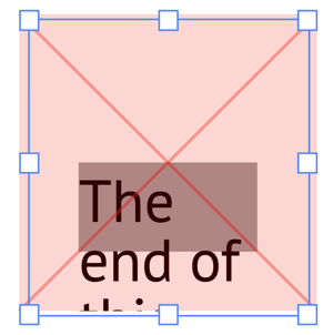
APPENDIX A: Specific behaviour of Text Object
No warning, nor error message
Even if the text exceeds the Plot area in the width, no warning nor error message is given. The text will be clipped though by the chart area boundary box.
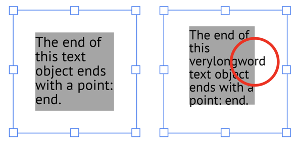
Warning message
The chart area is too small to render the chart. Adjust the margins or increase the chart area size to render the chart
The lines of the text exceed the plot area in the height. The text will be clipped by the chart area boundary box.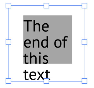
Error message
The chart area is too small to render the chart. Adjust the margins or increase the chart area size to render the chart.
The sum of the top & bottom margins is larger than chart area height (boundary box height).
And/or,
the sum of the left & right margins is larger than chart area width (boundary box width).
APPENDIX B: Warnings and errors related to Export template from Datylon for Illustrator
These errors and warning messages can occur when you export an Illustrator file to Datylon Report Studio.
Error message
Request Entity Too Large.
This error occurs when there the file size of the exported file is too high. This can be caused by too many Illustrator objects, often images or very large or complex linework objects, in the file.
To fix:
- Save a copy of your file and open it.
- Remove large objects (like images) from your design or reduce the file size, for instance by reducing the resolution of images.
Error message
Failed to update used fonts
This error can occur when there are corrupted and unknown glyphs or characters in one ore more of the Illustrator text objects in your document.
To fix:
If the text does not need to be edited anymore, outline all text using the Illustrator feature Type > Create Outlines.
Otherwise, try to identify the object that causes the problem. This can be done by deleting the object and try to export again. If that works, the removed text should be replaced.
APPENDIX C: Color modes
Error message
Exporting of a CMYK document is not supported in current plugin version.
Datylon Report Studio does not support CMYK color mode, only RGB. As a work around, create a new document in RGB color mode with the same size as your CMYK document. Then copy all objects including the Datylon charts, and paste them in the new RGB document. Save this RGB document. Now you can export it to the Datylon Report Studio.
Warning message
Datylon for Illustrator supports both CMYK and RGB color modes. But the color mode of your document can't be changed anymore once a Datylon element was added.
In Illustrator, you can change the color mode of our document in File > Document Color Mode. However, this does not work if your document contains Datylon charts.
If you want to convert an Illustrator document with Datylon charts from CMYK to RGB color mode, create a new document in RGB color mode with the same size as your CMYK document. Then copy all objects including the Datylon charts, and paste them in the new RGB document. Similarly for RGB to CMYK.