Datylon R47 - Release Notes | 2021 Oct 19
Datylon for Illustrator & Datylon web app
No more passwords with Google login
Use your Google account to sign up or sign in to the Datylon web app or to Datylon for Illustrator. If you already have a Datylon account with a password login, feel free to switch to Google anytime. However, make sure you select the correct Google account in case you have more than one.

Improved axis behavior
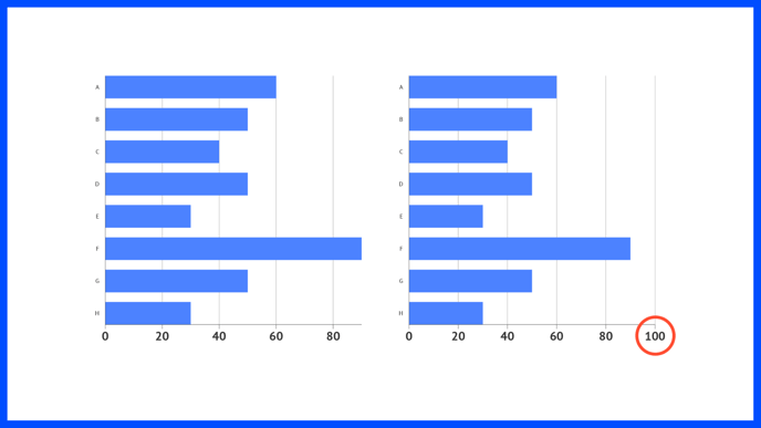
We have added an option to extend the axis up to an extra axis tick above the highest value in your dataset. Go to Styling > (Numerical) Axis > Major Ticks & Grid and enable Add Extra Tick.

Besides that, we also added an option to control the layering of the axes versus the data marks and other elements. See this article for more details.
Connect the dots
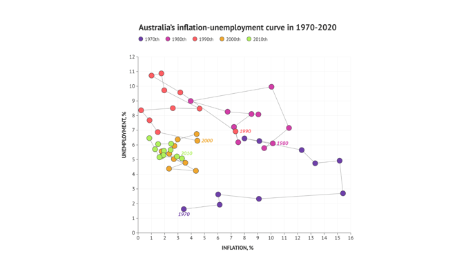
A connected scatter plot visualizes the evolution of a numerical value. It is used for different kinds of datasets e.g. paired time series. The dots in a standard Datylon Scatter Plot can now be connected using Styling > Data Marks > Connector.

To know more about scatter plots, check this article.
Advanced styling options for Range Chart and Dot Plot
The beauty is in the details. So we created the option to add gradients in the Range Chart (formerly known as Arrow Chart) and in the Dot Plot. Additionally, it is now possible to make the icon style in your dot plot design data-driven. These new features were implemented to support your flexibility in design. Read more here about binding properties.
Some more fixes:
- Line chart, Area chart
Sometimes the order of direct labels in Line or Area charts got mixed up when Smart Labels were enabled. Now they show up in the right order, according to their values. - Scatter chart
Fixed issue with Datetime axis type in Scatter Plot. - Don’t look for an arrow chart anymore in the chart type window. A Datylon Arrow Chart is now a subtype of a Range chart, but with arrowheads on the bars.