Data point styling is supported for Bar-, Line-, Area-, Pie-, Icon charts, Heat Map, Scatter and Dot Plot.
Why data point styling?
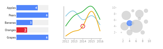
A data point is a single value in a datasheet cell that is plotted in a chart.
To improve the good readability of a chart, emphasize a specific value or highlight a distinct topic in a data story, it is essential to be able to style one or more particular data points or dim out others.
Some data point styling is already supported by means of reference codes in the data. See Define colors and other properties by data.
However, data point styling allows you to be more creative and change specific data points in a more intuitive and elaborate manner.
How to apply data point styling
All relevant properties in the data section of the Styling tab which are applied on the global level (for all data points simultaneously), or per series, can also be applied on each single data point.
A data point can be styled on different levels and different places in the user interface. So leaving color binding by means of color reference codes in the data aside, the following priority should be kept in mind. Highest priority level on top:
- Data point styling
- Data-driven coloring using palettes. See Data-driven coloring
- Series styling. See Working with series
- Global styling
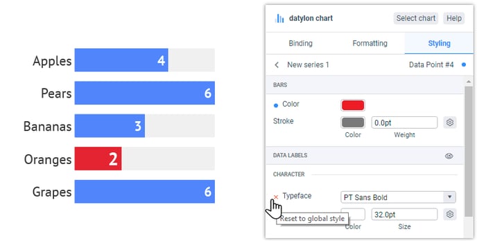
For example, if a data point’s style is changed in the data point styling section (priority level 1), it will overrule the settings of all the levels below (priority level 2 to 4). In case a property is “overruling” another lower priority level, it will be marked with a blue dot. Clicking on the blue dot will reset the property to the series or global level.
To style one or more specific data point using data point styling for one of the supported chart types, follow the below procedure:
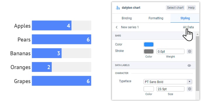
- Go to Styling > Series and select the proper series which includes the data point(s) you want to style.
- Click on All Data.
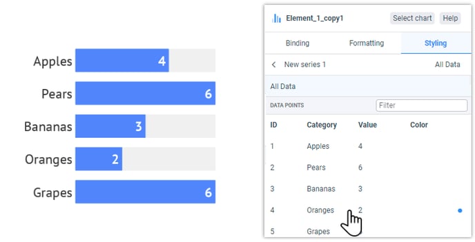
- A list appears with all the data points from this series. Select the wanted data point and style it.
- You will now see a blue dot next to the property, and on a higher level next to the series to indicate a data point has been styled overruling the global settings.
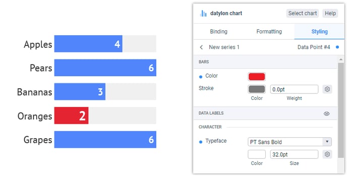
- Done! This can be repeated for as many data points as you like.