![Datylon_logo_blue_NEW2.svg]](https://help.datylon.com/hubfs/Datylon%20Brand%20Identity/Datylon_logo_blue_NEW2.svg)
Common properties are properties that appear in most chart types. They are bundled in one single article for your reference and convenience.
Styling Tab
General
1 Position and Size
2 Appearance
3 Legend
4 Symbol
5 Labels
6 Axes and Grid
Position and Size >
POSITION CHART AREA
|
Position |
Datylon for Illustrator only. |
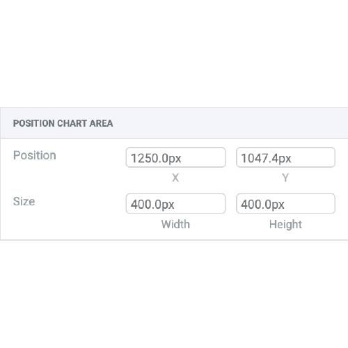 |
| Size | Displays the size of the chart area. Disabled. Changing the size of the chart should be done by dragging the chart box controls or via the illustrator controls. |
POSITION PLOT AREA
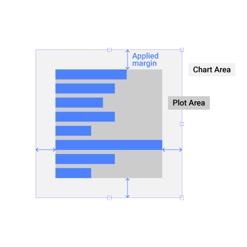
| Fixed Position > Margins |
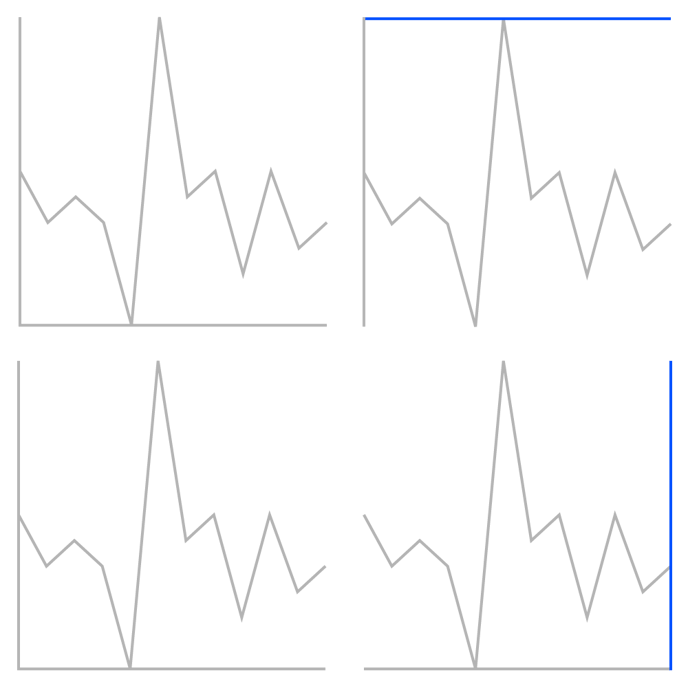
Chart area = Plot Area + Margins Margins set the position of the Plot Area within the Chart Area. You can change all sides in on go, or set each side separately by clicking the cogwheel first. |
 |
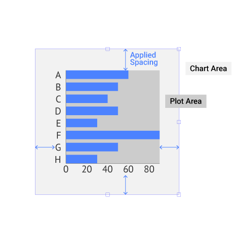
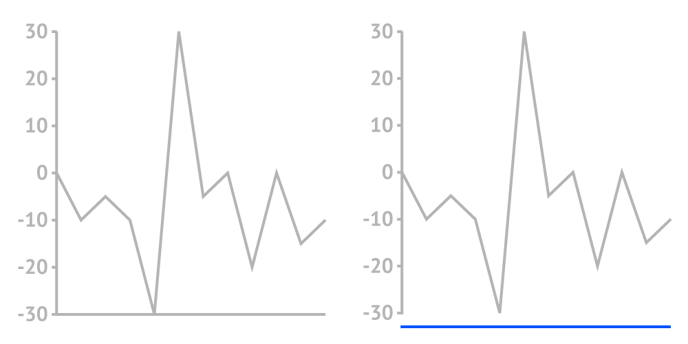
| Auto-Fit > Spacing |
Chart area = Plot Area + Labels + Spacing Auto-fit takes into account labels, ticks, or other chart elements that fall out of the plot area. Click on the cogwheel to set each side separately. |
 |
Appearance >
CHART BACKGROUND
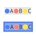
| Color | Sets the color of the Chart Area background. All color properties like Opacity or Gradient can be applied. |  |
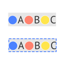
| Stroke |
Sets the stroke color and weight around the Chart Area. You can apply a dashed stroke by clicking the cogwheel. |
 |
| Corner Radius |
Applies rounded corners to the Chart Background. Separate settings for each corner can be applied by clicking the cogwheel. |
 |
PLOT BACKGROUND
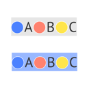
| Color |
Sets the color of the Plot Area background. All color properties like Opacity or Gradient can be applied. |
 |
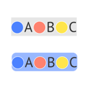
| Stroke |
Sets the stroke color and weight around the Plot Area. You can apply a dashed stroke by clicking the cogwheel. |
 |
|
Corner Radius |
Applies rounded corners to the Plot Background. Separate settings for each corner can be applied by clicking the cogwheel. |
 |
Legend >
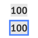
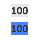
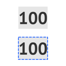
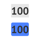
| Allow Overlap With Chart | When Allow Overlap is enabled, the legend can be placed on top of the chart; When the checkbox is "off" and the "Autofit" option is selected under Position and Size > Plot Area, the chart will be scaled to avoid overlap with the chart. | |
 |
||
| Position | Sets the X and Y position of the left upper corner of the legend relative to the left upper corner of the Chart Area. | 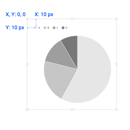 |
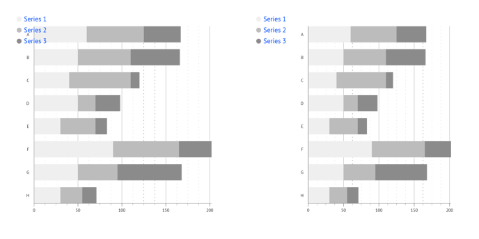
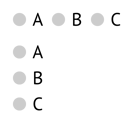
| Distribution |
Sets the direction of the legend elements (one element = the symbol + the label), distributed into rows or columns. Columns, Rows |
 |
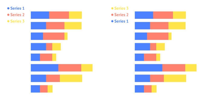
| Reverse order |
Reverses the order of the series in the legend list. |
|
|
|
||
| Columns/ Rows | Sets the number of rows or columns | 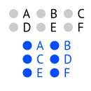 |
|
Horizontal Spacing |
Applies horizontal spacing between the legend elements. | 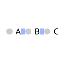 |
| Vertical Spacing | Applies vertical spacing between the legend elements. | 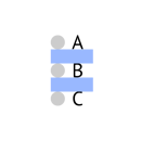 |
LINE (available only for line and area chart)
| Length | Sets the length of the line legend. |  |
| Stroke | Sets the stroke weight and color of the line legend. |  |
| Cap | Sets the type of the line cap. There are two types available: Butt and Round. |  |
| Dashed Line | Allows changing the length and gaps between the dashes. Applies a dashed stroke line when a number placed into Dash field. If no value added to Gap field the value from a Dash field applies as a Gap value. |
 |
| Copy Stroke From Series | Uses the stroke styling from the corresponding series. |  |
BACKGROUND
| Padding |
The default legend background is set by the outer boundaries of the elements. Padding applies extra space around the legend background. Padding for each side separately can be applied by clicking the cogwheel. |
 |
| Color |
Sets the color of the legend background. All color properties like Opacity or Gradient can be applied. |
 |
| Stroke |
Sets a stroke color and weight around the legend background. You can apply a dashed stroke by clicking the cogwheel. |
 |
| Corner Radius |
Applies rounded corners to the legend background. Separate settings for each corner can be applied by clicking the cogwheel. |
 |
Symbols >
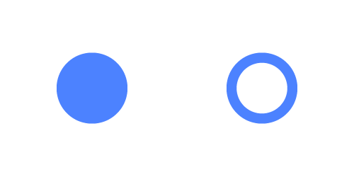
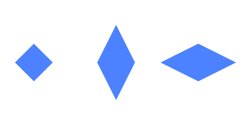
| Icon |
Sets the icon type. Available options: Circle Solid, Circle Outline, Hexagon Solid, Hexagon Outline, Star Solid, Star Outline, Man, Woman, Square Solid, Square Outline, Triangle Solid, Triangle Outline, Wye Solid, Wye Outline, Cross Solid, Cross Outline, Diamond Solid, Diamond Outline. Values in brackets after the icon type indicate the original ratio of each icon. |
 |
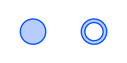
| Color |
Sets the color of the icon. |
 |
| Stroke |
Sets the stroke color and weight of the icon. |
 |
|
Stroke > Cogwheel > |
Sets the type of the corner. There are two types available: Miter and Round |
 |
| Stroke > Cogwheel > Dashed Line |
Allows changing the length and gaps between the dashes. |
|
| Size |
Sets the Width and Height of the icon. The width and height ratio is maintained when a link is enabled. |
 |
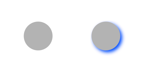
| Shadow |
Available in Datylon web app only. |
 |
Labels >
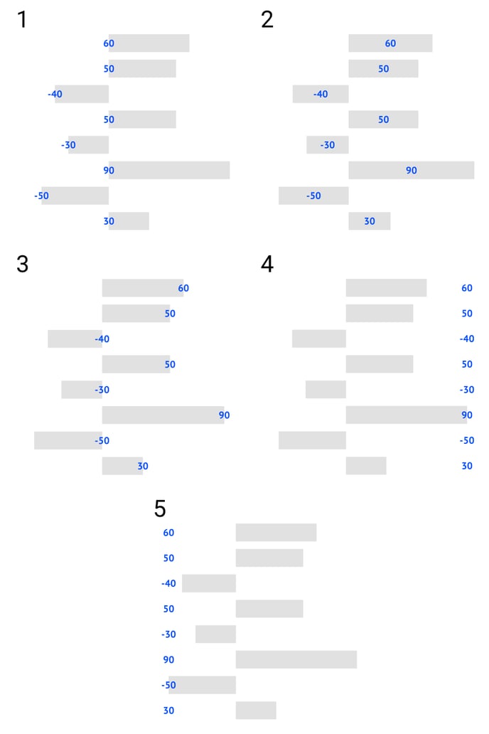
| Anchor Point (available in bar, line, area, scatter, heatmap, range, dot charts) |
Sets the reference point for label alignment and offset properties. There are 4 options available: 1. Axis 2. Zero 3. Lowest value 4. Highest value |
 |
| Anchor Point (available in bar chart for categorical axis) |
Can only be applied only if Smart labels are turned off. 1. Start 2. Center 3. End 4. Positive Side 5. Negative Side |
 |
| Data Mark Anchor (available in certain charts) | Sets the reference point for all label alignment and offset properties | 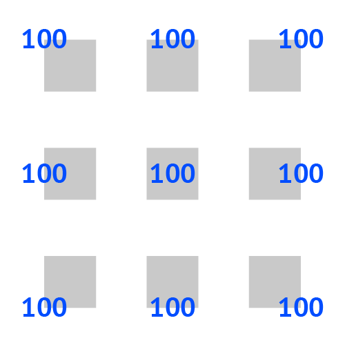 |
| Layering (available in certain charts) | Places labels either on the top of all data marks or groups them with the data mark it is related to. | 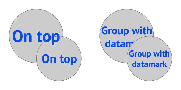 |
| Horizontal Alignment | Aligns the label left, centered, or right relative to the data point or relative to the data mark anchor if data marks are shown. | 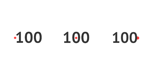 |
| Vertical Alignment | Aligns the label top, center, or bottom relative to the data point or relative to the data mark anchor if data marks are shown. | 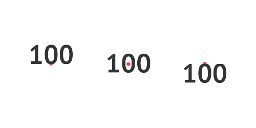 |
| Horizontal Offset | Sets the position of the label horizontally. Enter a positive value to move to the right. Enter a negative value to move to the left. |  |
| Vertical Offset | Sets the position of the label vertically. Enter a positive value to move up. Enter a negative value to move down. |  |
| Rotation |
Rotates the label around the anchor point. A positive value rotates counterclockwise. A negative value clockwise. |
 |
| Prefix |
Adds a prefix to labels. Consecutive spaces are ignored. |
 |
| Suffix |
Adds a suffix to labels. Consecutive spaces are ignored. |
 |
NUMBER FORMAT
| Decimal Separator | Sets the sign that will be used as a decimal separator. By default, it is set to “.” | 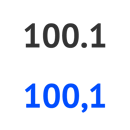 |
| Thousand Separator | Sets the sign that will be used as a thousand separator. |  |
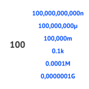
| Short Notation |
Converts the label using metric suffixes: Nano, Micro, Milli, Kilo, Mega, Giga |
 |
| Precision |
Sets the number of digits or decimals that will be shown after the decimal separator. If omitted the number of digits will be shown as it is represented in the data. |
 |
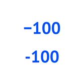
| Minus sign |
Sets a character for a minus sign: |
 |
| Add Plus | Adds a plus or minus sign in front of positive values. |  |
| Absolute Values | Converts any value to a positive value. | 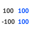 |
CHARACTER
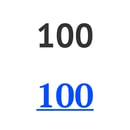
| Typeface |
Sets the font typeface. When clicking the cogwheel one has two text decoration options: crossed text and underlined text. See more on fonts here. |
 |
| Color |
Sets the color of the font. There are several available options. They can vary depending on the label function and chart used: 1. None: the font disappears if selected 2. Link: the color of the font is linked to the color of the relevant axis line. 3. Solid: the color is selected directly from the color picker. |
|
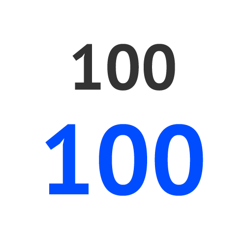
| Size |
Sets the size of the font. |
 |
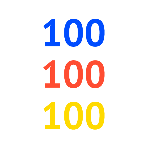
| Tracking |
Sets the amount of tracking in the labels. Tracking is the spacing between characters in the label text. The value can either be positive or negative. "0" is the default tracking value. |
 |
| Baseline Shift |
Changes the baseline position of the labels. |
 |
PARAGRAPH
| Width | Sets the maximum paragraph width. |  |
| Horizontal Align | Aligns the paragraph on the left, centered, or on the right. | 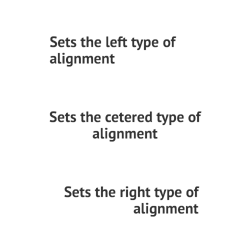 |
| Justify | Aligns all the text with both edges excluding the last line. |  |
| Leading |
Sets the spacing between adjacent lines of text. "0" will make the lines fall on top of each other. "1" is the default leading. |
 |
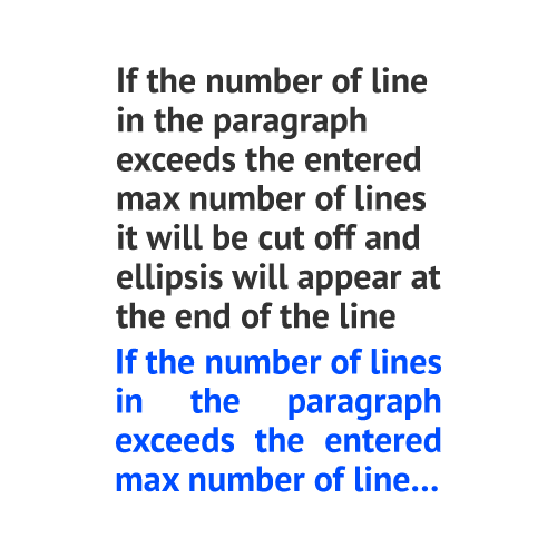
| Max Number of Lines |
The maximum number of lines allowed in a paragraph. If the text is cut off, it ends with an ellipsis. |
 |
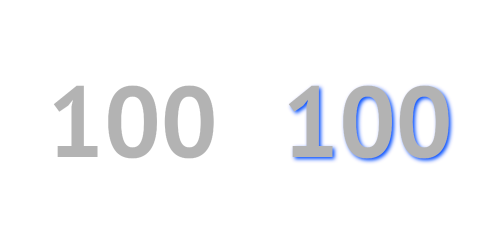
SHADOW
| Shadow |
Available in Datylon web app only. Adds shadow to a given element. Color, X and Y offset and Blur are available for editing. |
 |
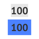
BACKGROUND
| Size |
Sets the size of the label background. If omitted, the size of the boundaries of the label text is taken by default. |
 |
| Padding |
Adds padding to the label background. Padding for each side separately can be applied by clicking the cogwheel. |
 |
| Color |
Sets the color of the background rectangle. All color properties like Opacity or Gradient can be applied. |
 |
| Stroke |
Sets the stroke color and weight around the label background. You can apply a dashed stroke by clicking the cogwheel. |
 |
| Stroke > Cogwheel > Corner |
Sets the type of the corner. There are two types available: Miter and Round |
|
| Stroke > Cogwheel > Dashed Line |
Applies a dashed stroke line when a number placed into Dash field. |
|
| Corner Radius |
Applies rounded corners to the label background. Separate settings for each corner can be applied by clicking the cogwheel. |
 |
Axes and Grid >
LINE
| Stroke | Sets the color and weight of line stroke. | |
 |
||
| Stroke > Cogwheel > Cap | Sets the type of the line cap. There are two types available: Butt and Round. | |
| Stroke > Cogwheel > Dashed Line |
Sets the length and gap of the dashes. If Gap is left empty, the value from the Dash field applies as Gap.
When Dash is set on 0, and Cap on Round, the dots will be perfect circles. |
|
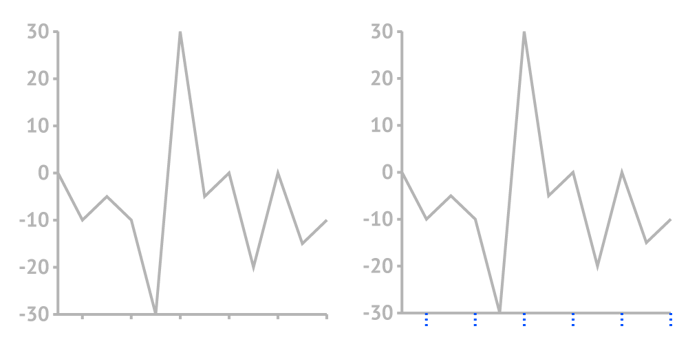
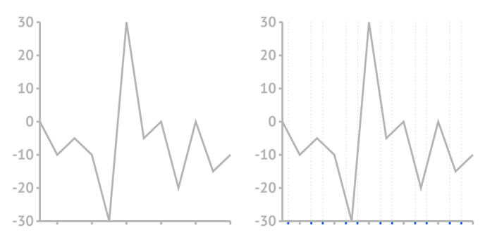
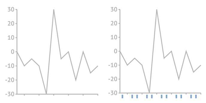
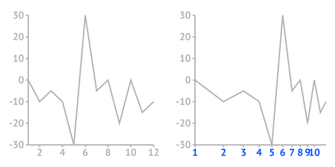
TICKS AND GRID (Categorical axis type)
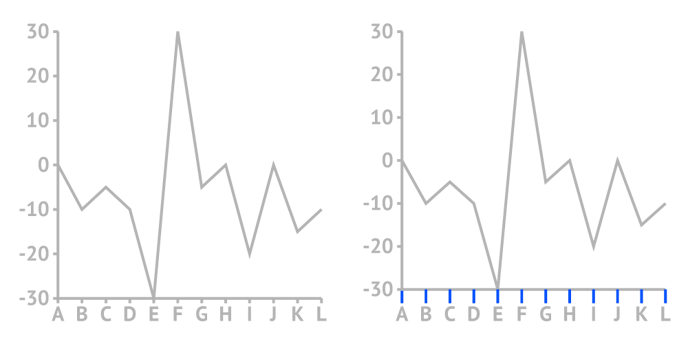
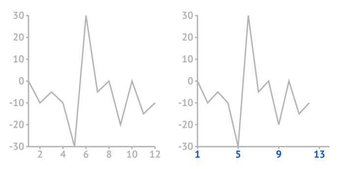
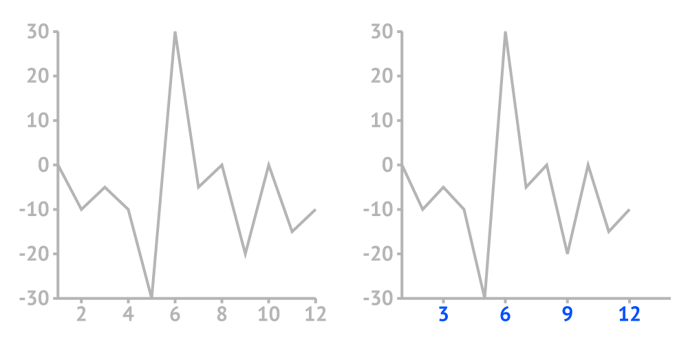
| Custom Ticks > Starting Tick | Sets the starting tick and corresponding grid. An actual category name should be typed into the field | |
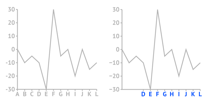 |
||
| Custom Ticks > Ticks Interval | Sets the interval between neighbor ticks and grids. | |
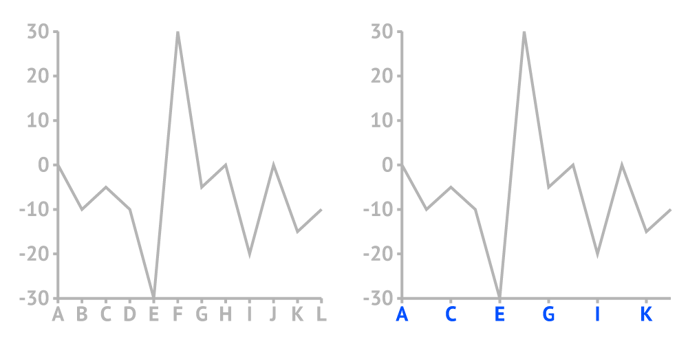 |
||
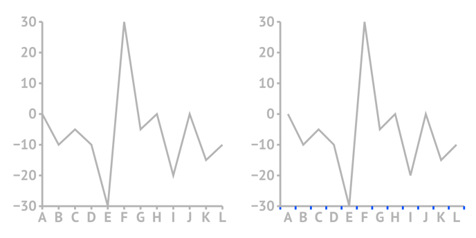
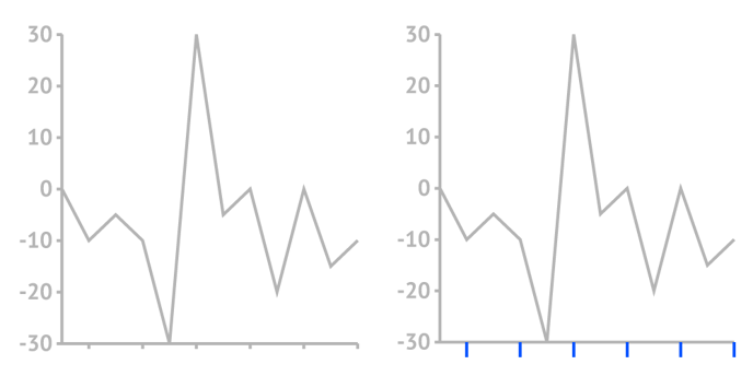
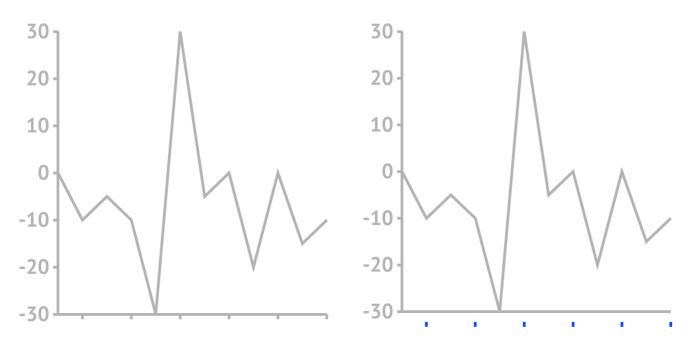
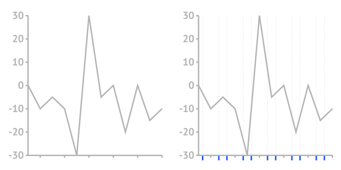
| Ticks > Between | Places the ticks around the labels corresponding to data points. | |
 |
||
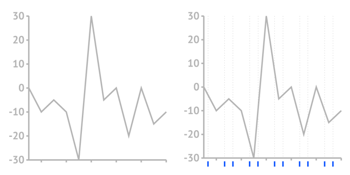
| Ticks > Length | Sets the length of ticks. | |
 |
||
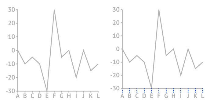
| Ticks > Offset | Sets the space between the line and the start of the tick. | |
 |
||
| Ticks > Stroke | Sets the color and weight of the tick stroke. | |
 |
||
| Ticks > Stroke > Cogwheel > Cap |
Sets the type of the corner. There are two types available: Miter and Round. | |
| Ticks > Stroke > Cogwheel > Dashed Line |
Sets the length and gap of the dashes. If Gap is left empty, the value from the Dash field applies as Gap.
When Dash is set on 0, and Cap on Round, the dots will be perfect circles. |
|
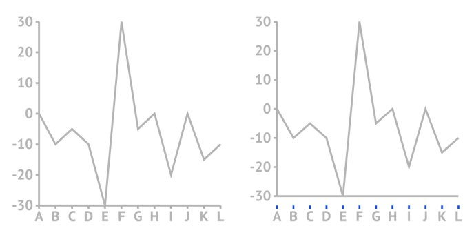
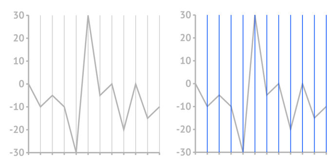
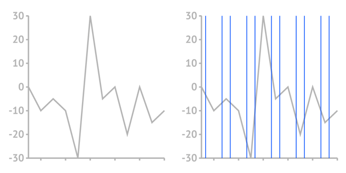
| Gridlines > Above | Places the gridline above the chart. | |
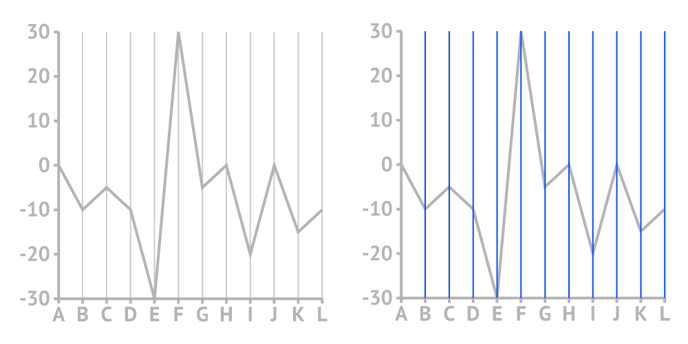 |
||
| Gridlines > Between | Places the gridline in the middle between data points. | |
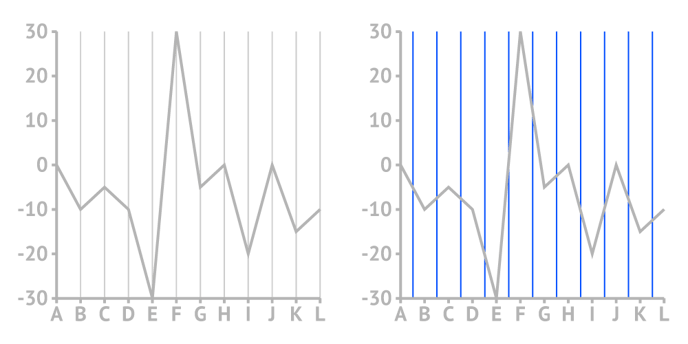 |
||
| Gridlines > Stroke | Sets the color and weight of the gridline stroke. | |
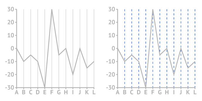 |
||
| Gridlines > Stroke > Cogwheel > Cap |
Sets the type of the line cap. There are two types available: Butt and Round. | |
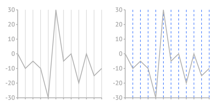
| Gridlines > Stroke > Cogwheel > Dashed Line |
Sets the length and gap of the dashes. If Gap is left empty, the value from the Dash field applies as Gap. When Dash is set on 0, and Cap on Round, the dots will be perfect circles. |
|
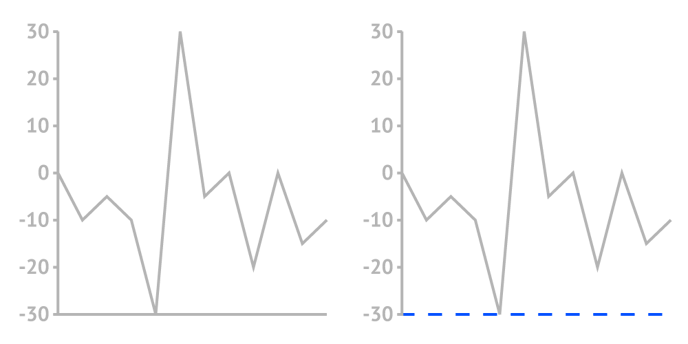
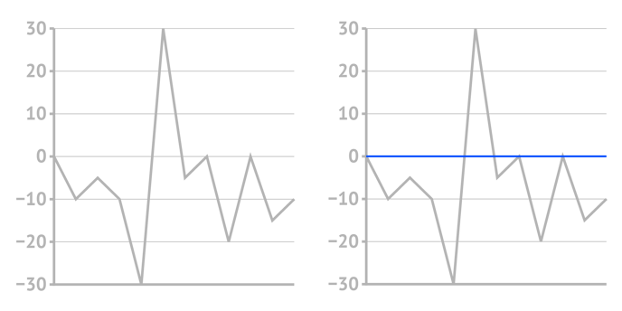
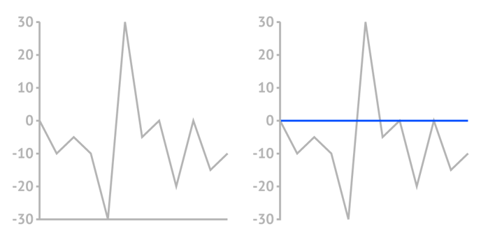
| Zero Gridline > Stroke |
Allows to set the color and weight of the zero gridline stroke separately. By default linked to the gridlines properties. |
|
|
||
| Zero Gridline Stroke > Cogwheel > Cap |
Sets the type of the line cap. There are two types available: Butt and Round. |
|
| Zero Gridlines > Stroke > Cogwheel > Dashed Line |
Sets the length and gap of the dashes. If Gap is left empty, the value from the Dash field applies as Gap. When Dash is set on 0, and Cap on Round, the dots will be perfect circles. |
|
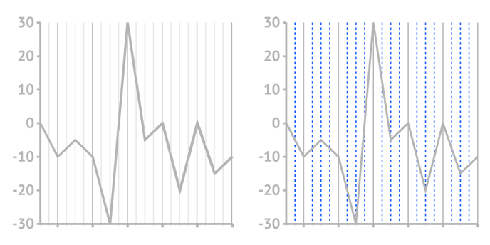
MAJOR TICKS AND GRID (Numerical and Datetime axis type)
| Add Extra Tick | Extends the axis up to an extra axis tick above the highest and below the lowest value in your data | |
 |
||
| Custom Ticks Amount > Ticks Interval | Sets the interval between neighbour ticks and grids. | |
 |
||
| Custom Ticks Amount > Starting Tick | Sets the starting tick and corresponding grid. | |
 |
||
| Ticks > Length | Sets the length of ticks | |
 |
||
| Ticks > Offset | Sets the space between the line and the start of the tick. | |
 |
||
| Ticks > Stroke | Sets the color and weight of the tick stroke. | |
 |
||
| Ticks > Stroke > Cogwheel > Cap |
Sets the type of the line cap. There are two types available: Butt and Round. | |
| Ticks > Stroke > Cogwheel > Dashed Line |
Sets the length and gap of the dashes. If Gap is left empty, the value from the Dash field applies as Gap.
When Dash is set on 0, and Cap on Round, the dots will be perfect circles. |
|
| Gridlines > Above | Places the gridline above the chart. | |
 |
||
| Gridlines > Stroke | Sets the color and weight of the gridline stroke. | |
 |
||
| Gridlines > Stroke > Cogwheel > Cap |
Sets the type of the line cap. There are two types available: Butt and Round. | |
| Gridlines > Stroke > Cogwheel > Dashed Line |
Sets the length and gaps of the dashes. If Gap is left empty, the value from the Dash field applies as Gap.
When Dash is set on 0, and Cap on Round, the dots will be perfect circles. |
|
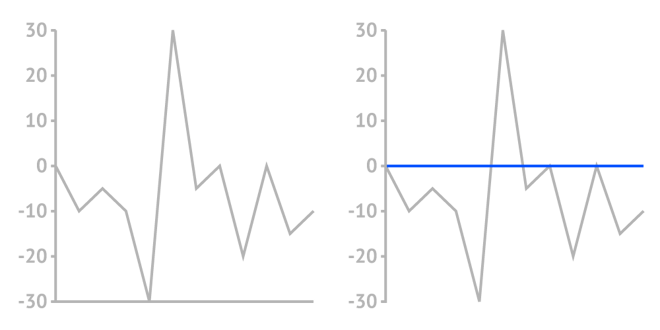
| Zero Gridline > Above |
Places the zero gridline above the chart |
|
 |
||
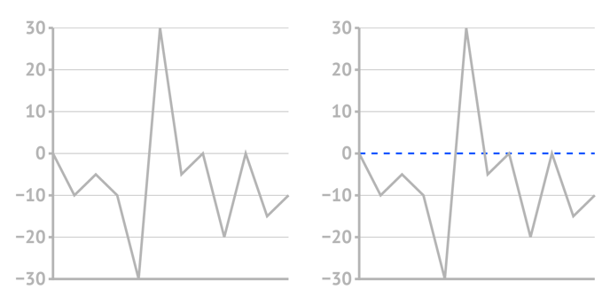
| Zero Gridline > Stroke |
Sets the color and weight of the zero gridline stroke. Allows to add another axis line and style it differently |
|
 |
||
| Zero Gridline Stroke > Cogwheel > Cap |
Sets the type of the line cap. There are two types available: Butt and Round. |
|
| Zero Gridlines > Stroke > Cogwheel > Dashed Line |
Sets the length and gap of the dashes. If Gap is left empty, the value from the Dash field applies as Gap. When Dash is set on 0, and Cap on Round, the dots will be perfect circles. |
|
MINOR TICKS AND GRID (Numerical and Datetime axis type)
| Amount | Sets the number of minor ticks that will be placed between major ticks. | |
 |
||
| Ticks > Length | Sets the length of ticks. | |
 |
||
| Ticks > Offset | Sets the space between the line and the start of the tick. | |
 |
||
| Ticks > Stroke | Sets the color and weight of the tick stroke. | |
 |
||
| Ticks > Stroke > Cap |
Sets the type of the line cap. There are two types available: Butt and Round. | |
| Ticks > Stroke > Dashed Line |
Sets the length and gaps of the dashes. If Gap is left empty, the value from the Dash field applies as Gap.
When Dash is set on 0, and Cap on Round, the dots will be perfect circles. |
|
| Gridlines > Above | Places the gridline above the chart. | |
 |
||
| Gridlines > Stroke | Sets the color and weight of the gridline stroke. | |
 |
||
| Gridlines > Stroke > Cap |
Sets the type of the line cap. There are two types available: Butt and Round. | |
| Gridlines > Stroke > Dashed Line |
Sets the length and gaps of the dashes. If Gap is left empty, the value from the Dash field applies as Gap.
When Dash is set on 0, and Cap on Round, the dots will be perfect circles. |
|
CATEGORICAL AXIS
| Locate at Zero | Places the axis on the zero position of the other axis. | |
 |
||
| Flip Location | Moves the axis to the other side of the chart area. From bottom to top or from right to left. | |
 |
||
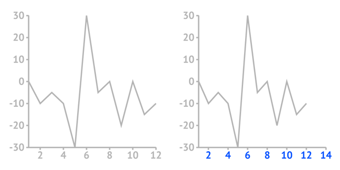
| Offset | Moves the axis away from the plot area. | |
 |
||
| Outer Padding | Adds outer padding on both sides of the chart. The chart is squashed inside. | |
 |
||
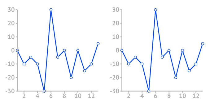
| Axis Above | Places axis above or below chart elements (bars, lines, marks, etc.) | |
 |
||
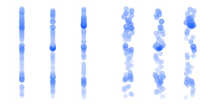
| Jitter (available in Scatter Plot) | Diffuses data marks randomly at a distance between 0 and the selected value | |
 |
||
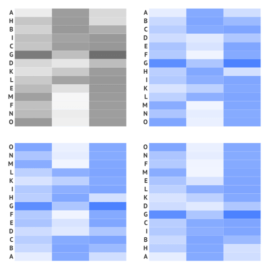
| Sorting (available in certain charts) | Sorts axis in a certain order: None, Ascending, Descending, Reverse |
|
 |
||
NUMERICAL AXIS
|
Locate at Zero (available in certain charts) |
Places the axis on the zero position of the other axis. | |
|
|
||
| Flip Location | Moves the axis to the other side of the chart area. From bottom to top, from right to left. | |
|
||
| Offset | Moves the axis away from the plot area. | |
|
||
|
Scale (available in certain charts) |
Sets the scale of the axis: Linear or Logarithmic. |
|
|
|
||
|
Constant (available in certain charts) |
For logarithmic scaled axes only. A true logarithmic scale goes infinite near zero. To avoid this we use a function called symlog which allows to set a range, or constant, around zero where the axis will be linear instead of logarithmic. The larger the constant, the closer the axis is to a linear scale. When omitted, the constant is equal to the lowest value on the axis. |
|
|
|
||
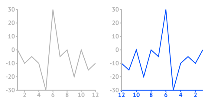
| Reverse | Sorts axis values either ascending if the checkbox is off or descending if the checkbox is on. | |
 |
||
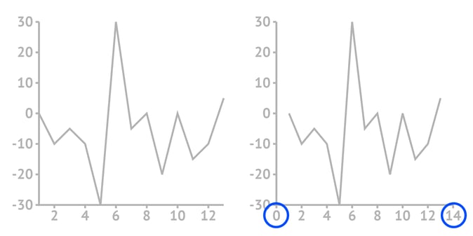
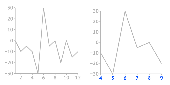
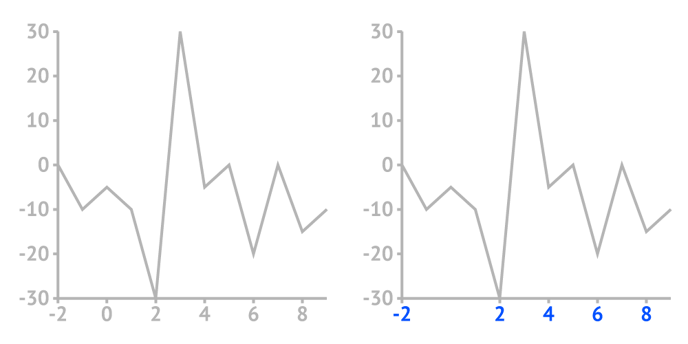
| Min Value | Sets the minimum shown value on the axis. Should be smaller than the minimum value from the data. | |
 |
||
| Max Value | Sets the maximum shown value on the axis. Should be bigger than the maximum value from the data. | |
 |
||
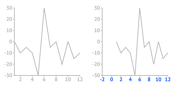
| Allow data cropping |
Allows to crop the data range with using Min Value and Max Value. Note that applying this property may cause distortion of the data representation. Caution! Only works if Styling > Position and Size > Plot Area is on Fixed Position. |
|
 |
||
| Hide Zero | Hide Ticks, Gridlines, and Labels that are connected with 0 on the axis. | |
 |
||
| Axis Above | Places axis above or below chart elements (bars, lines, marks, etc.) | |
 |
||
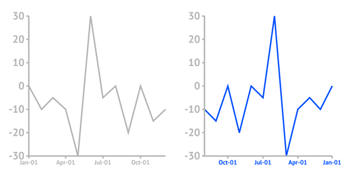
DATETIME AXIS
| Locate at zero | Places the axis on the level of 0 of the other axis. | |
 |
||
| Flip Location | Moves the axis to the other side of the chart area. From bottom to top, from right to left, and vice versa. | |
|
||
| Offset | Moves the axis away from the plot area. | |
|
||
| Reverse | Sorts axis values either ascending if the checkbox is off or descending if the checkbox is on. | |
 |
||
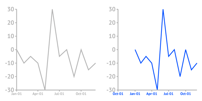
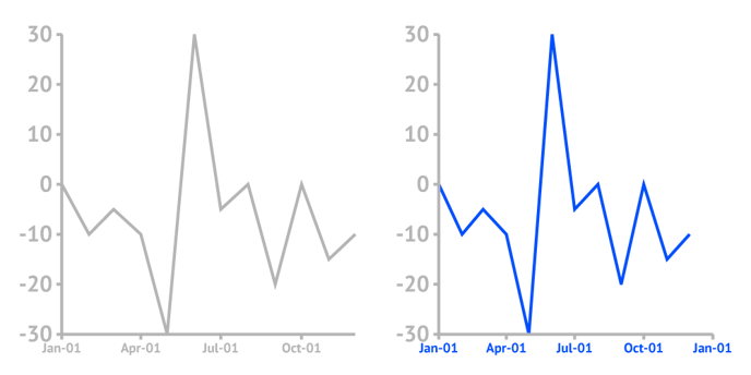
| Min DateTime | Sets the minimum shown value on the axis. Should be smaller than the minimum value from the data. | |
 |
||
| Max DateTime | Sets the maximum shown value on the axis. Should be bigger than the maximum value from the data. | |
 |
||
| Allow Data Cropping |
Allows to crop the data range with using Min Date Time and Max Date Time. Note that applying this property may cause distortion of the data representation. Caution! Only works if Styling > Position and Size > Plot Area is on Fixed Position. |
|
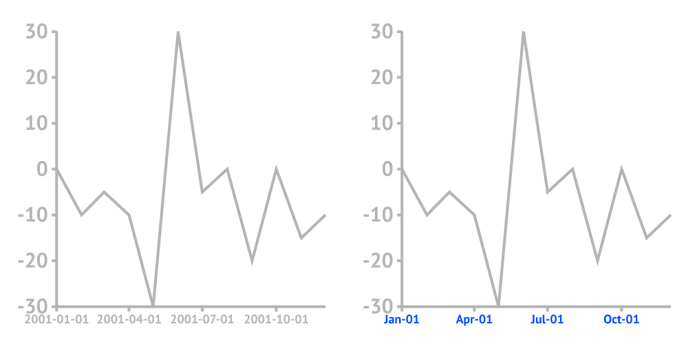
| DateTime Format | Set the format of date representation. For all the details about time format options see https://help.datylon.com/date | |
 |
||
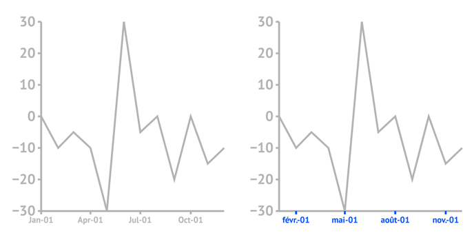
| Locale | Allows selecting locale settings in 31 different languages for Datetime label formatting e.g. (abbreviated) weekday names, (abbreviated) month names, etc. | |
 |
||
| Axis Above | Places axis above or below chart elements (bars, lines, marks, etc.) | |
|
||