![Datylon_logo_blue_NEW2.svg]](https://help.datylon.com/hubfs/Datylon%20Brand%20Identity/Datylon_logo_blue_NEW2.svg)
Many properties in the DATA section can be set overall for the whole chart, but also separately on data point level. See data point styling for more details.
Binding Tab
1 Dataset
2 Series
Styling Tab
GENERAL
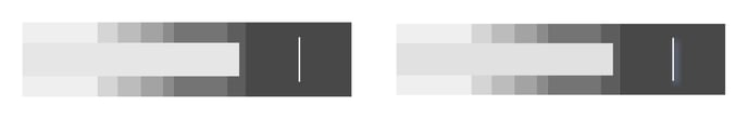
1 Position and Size
2 Appearance
DATA
3 Bar
4 Ranges
5 Target
AXES & GRID
6 Numerical Axis
Binding Tab
Dataset>
| First row/ column are headings |
When enabled, the first row (column) of the dataset are headings. When disabled, the first row (column) of the dataset is included in the data range. |
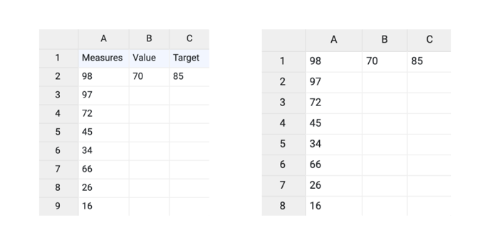 |
| Data is in | Sets the way data is structured: in rows or columns. | 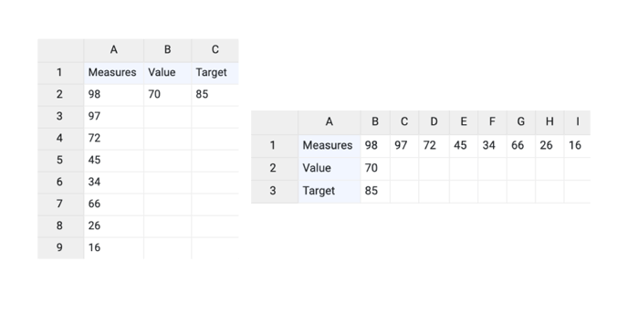 |
Series>
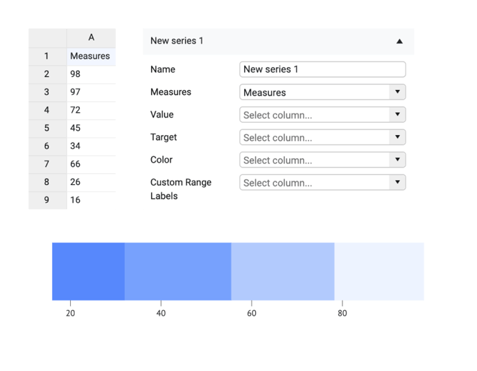
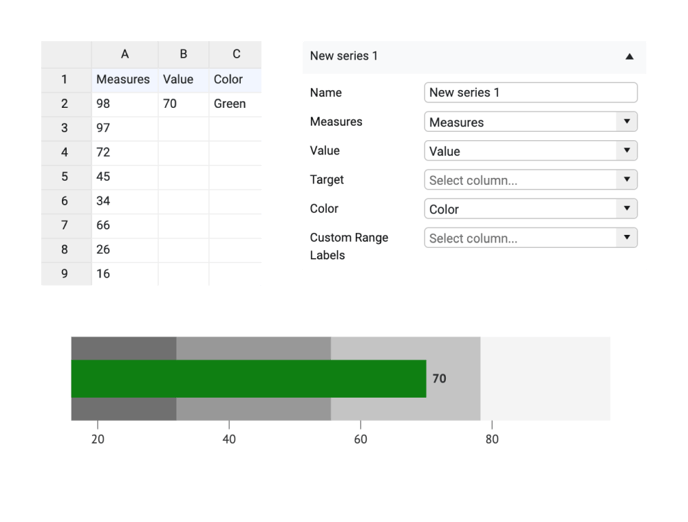
| Name | Text field to name the Series. By default, it is set to “New Series n”. In the Bullet Chart, only one series is available. | 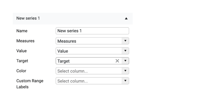 |
| Measures | Sets the range of values that will define the look of the Range bar. This bar can be divided in multiple ways based on Styling > Ranges > Ranges property. This field is obligatory. |
 |
| If one or more values missing in the Measures row they are ignored and not taken into account when calculating the Range bar. | 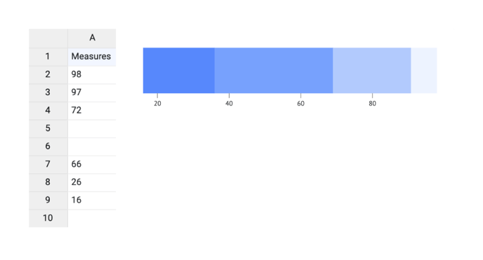 |
|
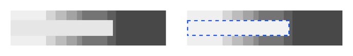
| Value | Sets the size of the Value bar. The column/row should contain only one value. | 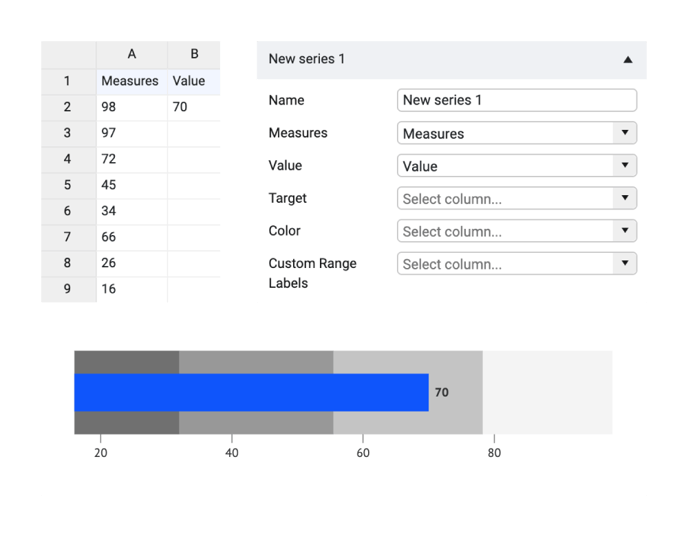 |
| If the value is missing the bar is not plotted. | 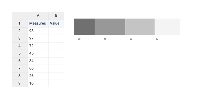 |
|
| Target | Sets the placement of the target icon. The column/row should contain only one value. | 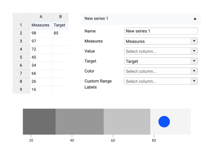 |
| If the value is missing the target icon is not plotted. | 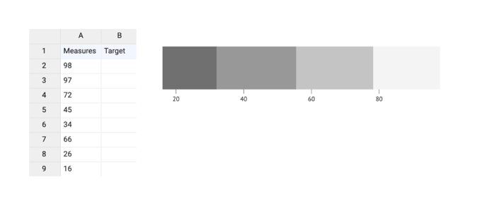 |
|
| Color | Sets the color of the Value bar. Color should be defined using data binding Colors can be presented directly as HTML names, HEX, RGB, or CMYK values. More on that here. . |
 |
| Custom Range Labels | Sets the custom labels for every Measure value. Can be applied only if Styling > Ranges > Ranges is set to “Values from data”. | 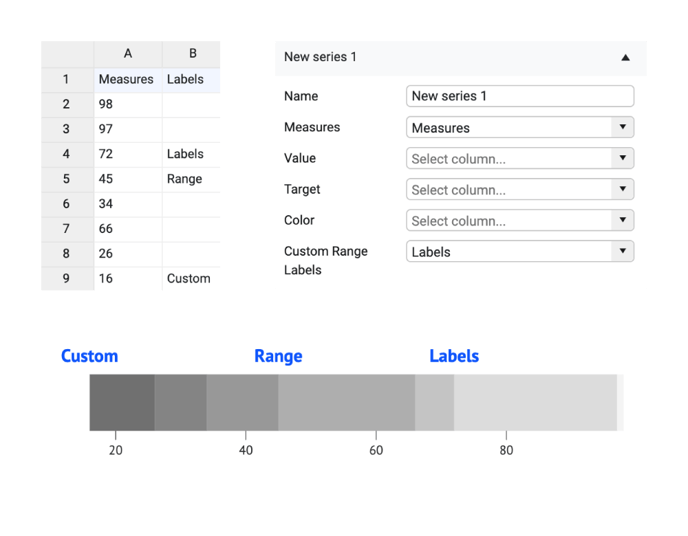 |
Styling Tab
DATA
Bar>
| Chart Orientation | Set the chart as horizontal or vertical | 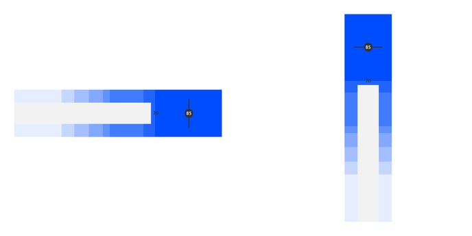 |
| Color | Sets the color of the bullet chart bar. Could be set to solid or gradient. | 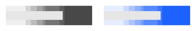 |
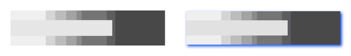
| Stroke |
Sets the stroke color and weight around the bar. You can apply a dashed stroke by clicking the cogwheel. |
 |
| Horizontal Rounding | Sets the horizontal rounding of the end of the bar. Becomes visible if the vertical rounding value is above zero | 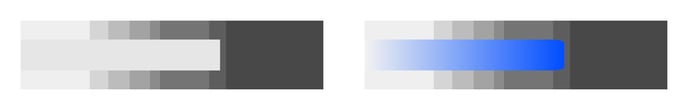 |
| Vertical Rounding | Sets the vertical rounding of the end of the bar. Becomes visible if the horizontal rounding value is above zero. | 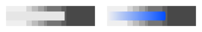 |
| Round All Corners | Apply rounding for all of the bar corners. | 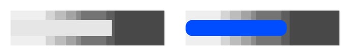 |
SIZE
| Width | Set relative (to ranges area) or absolute width of a bar. | 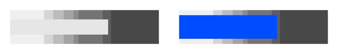 |
SHADOW
| Shadow | Adds shadow for the given element. Color, X and Y offset and Blur are available for editing. | 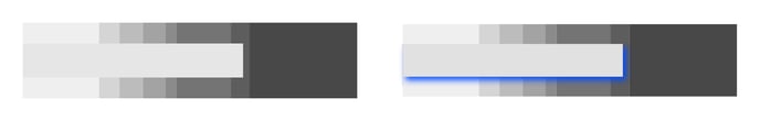 |
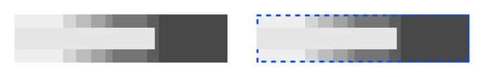
Ranges>
| Ranges |
Ranges are defined in the column/row bound to Measures in the binding tab. The ranges can be calculated in the following ways:
|
 |
| Color | Sets the color of the ranges bar. | |
| Stroke |
Sets a stroke color and weight around the ranges bar You can apply a dashed stroke by clicking the cogwheel. |
 |
| Horizontal Rounding | Sets the horizontal rounding of the end of the ranges bar. Becomes visible if vertical rounding is different from zero. | 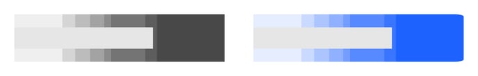 |
|
Vertical Rounding |
Sets the vertical rounding of the end of the ranges bar. Becomes visible if horizontal rounding is different from zero. | 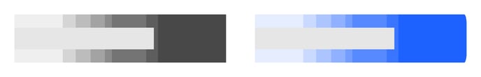 |
| Round All Corners | Apply rounding for all corners of the ranges bar. | 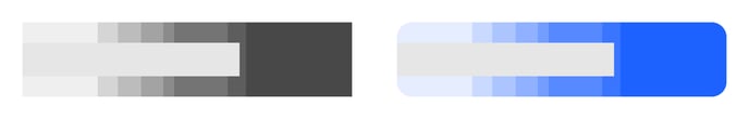 |
SIZE
| Width | Set relative (to chart area) or absolute width of a range bar. | 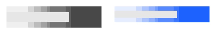 |
SHADOW
| Shadow |
Available in Datylon web app only. Adds shadow for the given element. Color, X and Y offset and Blur are available for editing. |
 |
Target>
SYMBOLS
Icon set to Line:
| Stroke | Sets the stroke color and weight of the line. You can apply a dashed stroke by clicking the cogwheel. | 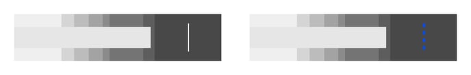 |
| Line Size - Length | Sets the line’s length in relative (to ranges) or absolute values | 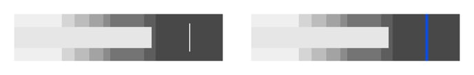 |
| Shadow |
Available in Datylon web app only. Adds shadow for the given element. Color, X and Y offset and Blur are available for editing. |
 |
Icon set to other than Line: Symbols