Video walkthrough
Prefer to watch instead of read? Here’s a walkthrough showing all steps described below.
Text-based instructions
Color can be used in bar chart on two levels:
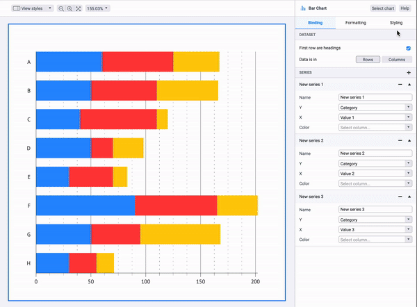
- 1. Coloring of bars grouped by series.
This option is relevant for simple bar charts or stacked bar charts. To apply color to all bars in series go to Styling > Bars > Color. You can learn more about using palettes here.
- 2. Coloring of separate bars within series.
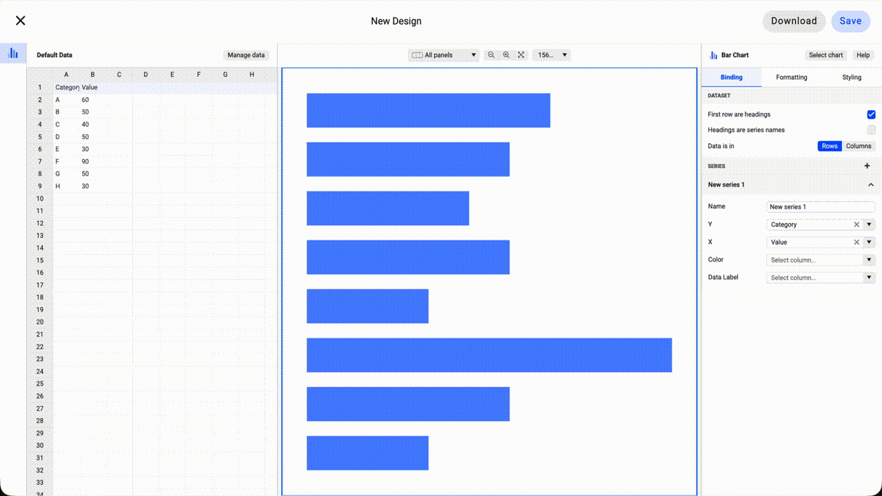
- A. Coloring by category.
Every bar will be colored depending on category it is representing. To apply this type of coloring, bind column/row that contain categories to Color field in the Binding tab. Then choose a categorical color palette in Styling > Series, Select the Series you want to color and then go to Bars > Color.
- A. Coloring by category.
-
- B. Coloring using data point style.
Every bar of every series can be colored manually using data point styling functionality. To do that you need to go to Styling > Series > (Series you want to select) > All Data > (Select the data point you want to change the color) > Color > Solid and select the color of your choice.
- B. Coloring using data point style.
-
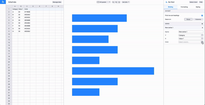
- D. Coloring by color codes that are presented in a separate row/column.
To apply this type of coloring bind column/row that contain color codes to Color field in the Binding tab. Learn more about defining colors by data here.
- D. Coloring by color codes that are presented in a separate row/column.
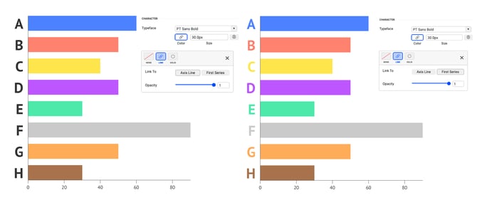
One more specific feature of bar chart is the ability to link Y axis label colors with the color of the bars of the first series. To use this feature go to Styling > Y Axis > Labels > Character > Typeface > Color > Link > First Series.
To learn more about colors in Datylon check out the related articles:
Using color in Datylon charts
Direct coloring of Datylon charts