How to create a bullet chart in Illustrator or online
Learn here how to make a bullet chart with Datylon, either using Datylon Report Studio or the plug-in for Illustrator
Introduction
A bullet chart is a variation of a bar chart developed by Stephen Few. Bullet charts were designed to overcome the fundamental issues of gauges and meters which typically display too little information for the space and are often cluttered with useless decoration.
The bullet chart features a single, quantitative primary measure (for example, current year-to-date revenue) and compares that to another measure or target. The primary measure is than related to defined qualitative ranges such as poor, satisfactory and good, or percentiles. The qualitative ranges are displayed as varying intensities of usually a single hue. The bullet chart’s linear no-frills design not only gives it a small footprint, but also supports more efficient reading than radial meters. Bullet charts may be horizontal or vertical, and may be stacked to allow comparisons of several measures at once.
Bullet charts have proven to be very useful for many different purposes ranging from financial reports, industrial dashboards to business performance benchmarks. You can download Illustrator files with some examples here.

In earlier versions of Datylon for Illustrator, a custom version of the Bullet chart was available, named the Datylon Benchmark chart. This is now replaced by a more generally applicable Datylon Bullet chart.
More information about the bullet chart can be found on the website of its inventor Steven Few. http://www.perceptualedge.com/articles/misc/Bullet_Graph_Design_Spec.pdf
How to create and style a Datylon Bullet chart
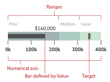
The Datylon Bullet chart consists of four primary components
- Bar
The primary measure displayed as a bar, defined by one cell in the data which we call “Value. - Numerical axis
A numerical scale along a single linear axis - Target
The comparative measure or target displayed as an icon - Ranges
Ranges visualized by color tints, illustrating a qualitative state like bad, medium and good or percentiles*

Many of the components and their styling properties are very similar to other charts, so in this article we’ll focus on the Bullet chart’s specific features.
Step by step
- Select the Bullet chart from the Datylon default chart list. Problems getting started? See first Get started with Datylon for Illustrator or Get started with the Datylon Report Studio.
- Choose between a horizontal or vertical Bullet chart. The orientation, is set in Styling > Bar > Chart Orientation.
- Load your data in Manage Data > +Add > Import file or copy the data in the datasheet.
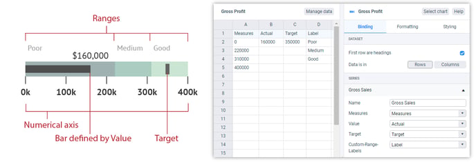
- Bind the data in Binding > Series.

The data has to be formatted in a specific way. You need at least 3 columns or rows, and optionally a fourth for the bar color and a fifth one for the custom range labels.- Measures column/row:
Contains the data which define the ranges behind the bar. Numbers only. It is recommend to limit the number of ranges to less than 5, but any number is possible. Unlike with a regular Bar chart, when the first range needs to start from 0, the data should also contain this 0 value. Numbers can also be negative. - Value column/row
Contains one single value of the primary measure and needs to be bound to “Value” in the bindings tab. This is represents the length of the bar. Number only. Can both be positive or negative. - Target column/row
Contains one single value to define the position of the Target icon on the Bullet chart and needs to be bound to “Target” in the bindings tab. Number only. Can both be positive or negative. - Color column/row
The color of the bar can be driven by data. Just add a hex code or a hex name to the data, bind it to the bar color and off you go! Read more info on color binding in this article.
- Measures column/row:
-
- Custom-Range-Labels
Contains the content of the range labels. Can be strings or numbers. The labels are only shown when Styling > Ranges > Ranges is set on Values From Data.
- Custom-Range-Labels
Then Style your chart using features and properties as other charts.
* Percentiles
To define the ranges, you have the choice to define them by the data as described above. However, in Datylon you can divide the measure data into percentiles as well. From Median (2 percentiles) to Deciles (10 percentiles), but usually not higher than Quartiles (4 percentiles) as more ranges create often too much clutter.