Introduction
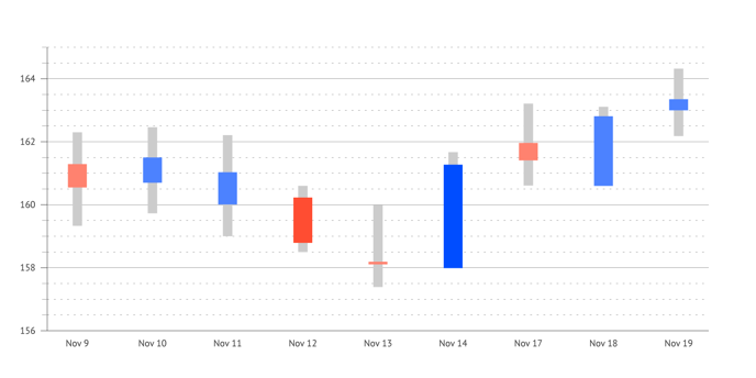
A candlestick chart is a financial instrument used to visualize price movements for stocks, securities, derivatives, or currencies, etc. Each candlestick typically shows one day and depicts four important elements of information for that day: open and close in the thick body; high and low in the candlewick.
The chart is also known as a Japanese candlestick chart and is thought to be developed as early as the 18th century in Japan. The sources vary on that point, but everyone agrees Candlestick charts are great for visualizing market trends over time and are useful for interpreting the day-to-day sentiment of the market.
In Datylon for Illustrator, a candlestick chart can easily be created with 2 Range charts driven by one single data sheet. One range chart represents the candle (open and close values), while the other range chart visualizes the candle wick (high and low). The color of the candle adds extra information to the chart: red means close is lower than open so the values have decreased during the day, blue or green means the values have risen.
And as for all other charts, Datylon allows you to style your Candlestick chart to the finest graphic detail, making your designs appealing and on-brand.
How to create and style a candlestick chart
Step-by-step
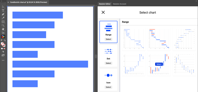
If you are unfamiliar with Datylon for Illustrator, please read this article or check one of our video tutorials in the Help Center.- After drawing the Datylon chart box on the Illustrator artboard, select a vertical Range chart (formerly known as Arrow chart) from the charts library in the Datylon panel.
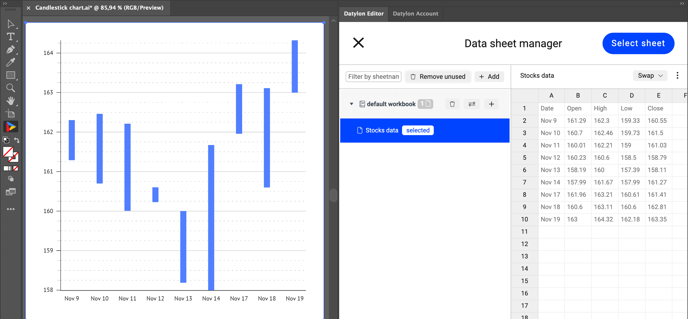
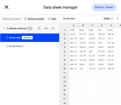
- Add data for any chart by pasting in or loading a datasheet in the Data manager. In this tutorial, we use stocks data. If you need help with importing data to Datylon, read this user guide.
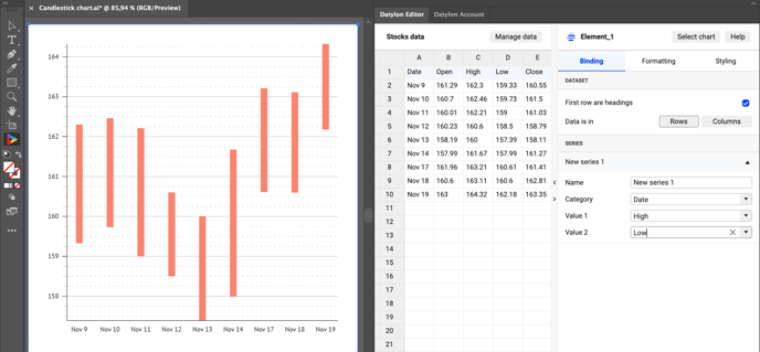
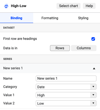
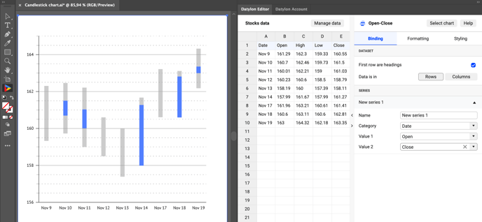
- Under the Binding tab, bind the high and low columns to Value 1 and Value 2 accordingly.
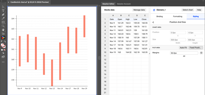
- To make sure that two charts are placed exactly on top of each other go to Styling > Position and Size > Plot Area > Fixed Position
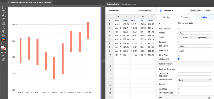
- Set min and max values for numerical axis in Styling > Numerical Axis > Min & Max Value.
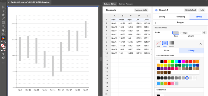
- Style the range to make a candle wick ( Styling > Ranges > Negative Range > Stroke ).
- As we are going to use two charts, avoid confusion and rename this first one to "High-Low" by editing the chart name in the Datylon panel.
- Now select the chart on the artboard in Illustrator. Copy (Edit > Copy) and paste it in place (Edit > Paste in Place ). Rename the new chart to "Open-Close".
- In the Data sheet manager select the original data sheet (Manage data > Select the correct data sheet > click the Select sheet button) Now the two charts are linked to one and the same datasheet.
- Bind open and close columns to Value 1 and Value 2 accordingly.
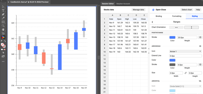
- Style ranges, or candles, to your convenience using Styling > Ranges> Stroke. We used red for low close, and blue for high close.
- Remove axes, gridlines, and axis labels for the "Open-Close" chart in Styling > Numerical Axis > Line, Major Ticks and Grid, Minor Ticks and Grid, Labels. And we're done! Now you can use your chart in any layout or export it to any format.
Save yourself some time for the next candlestick chart. Keep one version as a template and make a copy to re-use it with new data. Make sure to bind both new Range charts to the same datasheet after copying.