![Datylon_logo_blue_NEW2.svg]](https://help.datylon.com/hubfs/Datylon%20Brand%20Identity/Datylon_logo_blue_NEW2.svg)
Binding tab
1 Dataset
2 Series
Styling tab
General
1 Position and Size
2 Appearance
3 Legend
Data
4 Pie
5 Slices
6 Category Labels
7 Value Labels
Binding Tab
Dataset>
| First row (column) are headings |
When enabled, the first row (column) of the dataset are headings. When disabled, the first row (column) of the dataset is included in the data range. |
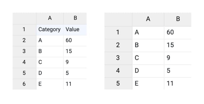 |
| Data is in | Sets the way data is structured: in rows or columns. | 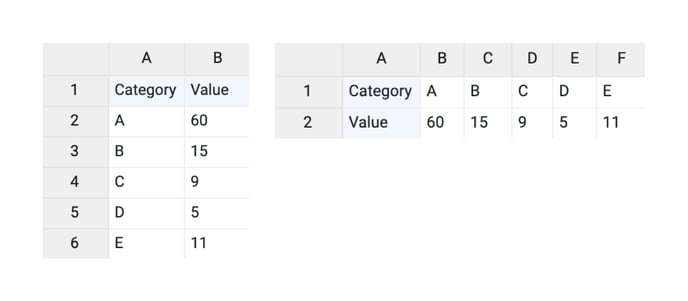 |
Series>
| Name |
Text field to name the Series. By default, it is set to “New Series n”. The name is used for Direct Labels |
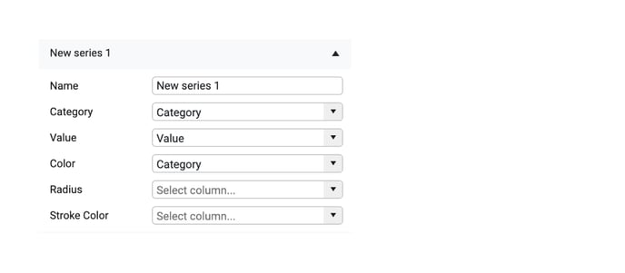 |
| Category | Used for binding categories. Visible if Category Labels are enabled. | 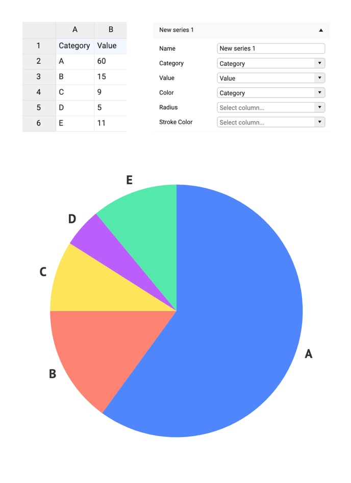 |
| One or more empty cells in the category data will cause the creation of an empty category. The corresponding slice will still be displayed. |
|
|
| Value | Used for binding numerical values to the degree of the pie slice. |  |
| The slice and its category will not be displayed if there are one or more empty cells in the numerical data. | 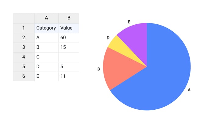 |
|
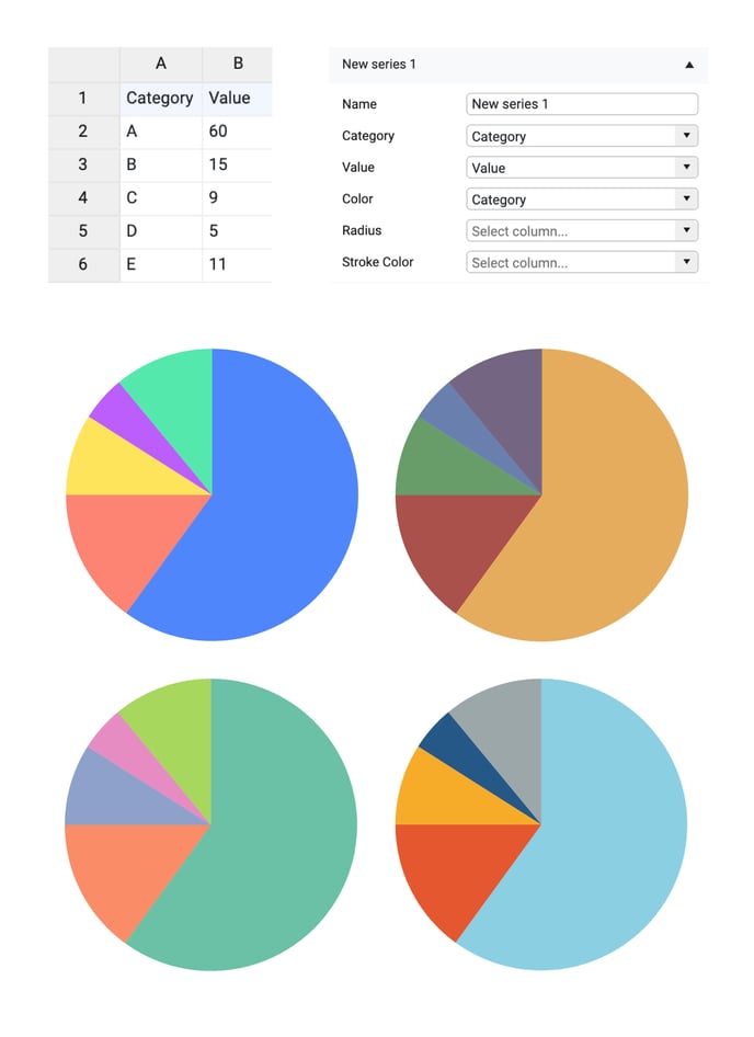
| Color |
Used for binding the colors of the pie slices. By default, it’s formatted as a categorical value. The type of data can be adjusted in the Formatting tab. Colors can be also presented directly as HTML values, HEX, RGB, or CMYK values. More on that here. To use direct coloring the color of slices should be set to “None” under Styling > Data > Slices > Fill. |
 |
| Radius | Used for binding values to the radius length of the corresponding slices. The range of the possible values is from 0 to 100. | 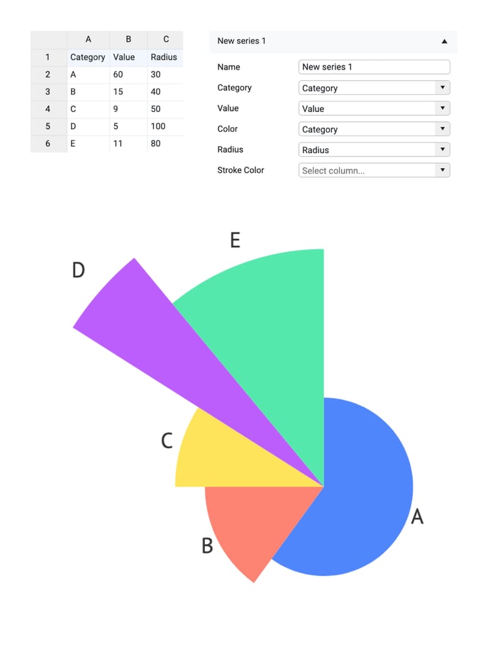 |
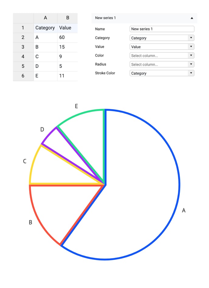
| Stroke Color |
Used to bind the data to the stroke color of the slice. The bound column/row can represent categorical, numerical, or datetime values. By default, it’s formatted as a categorical value. The type of data can be adjusted in the Formatting tab. Colors can be also presented directly as HEX, RGB, or CMYK values. More on that here. |
 |
Styling Tab
DATA
Many properties in the DATA section can be set globally, but also separately on series and data point levels. See data point styling for more details.
Pie >
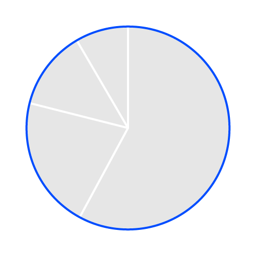
| Stroke Circumference |
Sets the stroke color and weight around the Pie's circumference. You can apply a dashed stroke by clicking the cogwheel. |
 |
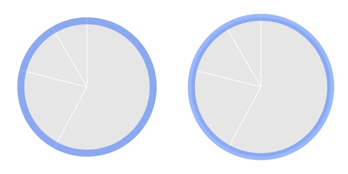
| Stroke Circumference> Type |
Allows to use two types of stroke placement:
|
 |
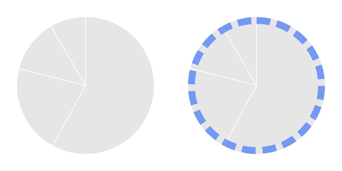
| Stroke Circumference> Dash |
Allows changing the length and gaps between the dashes. |
 |
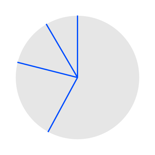
| Stroke Radial |
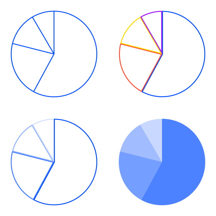
Sets the stroke color and weight on all slice radiuses. You can apply a dashed stroke by clicking the cogwheel. *Note the difference with Slices > Stroke. |
 |
| Gap Size |
Inserts a gap on either side of the main central axis of the pie. In degrees (0 to 360). |
 |
| Rotation |
Rotates the pie chart. In degrees (-360 to 360), positive is clockwise. |
 |
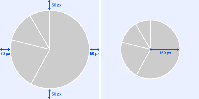
| Radius |
Sets the radius length of the pie in absolute units (pixel, mm,..). If omitted, the pie will be rendered to its maximum full size (chart area minus margins or spacing). If Radius is bound to data in the Binding tab, this property is overruled. |
 |
INNER RADIUS
| Inner Radius |
Relative and Absolute Gives the pie chart an inner radius, turning it into a Donut chart. Can be set in % of the radius (relative) or in absolute units. |
 |
Slices >
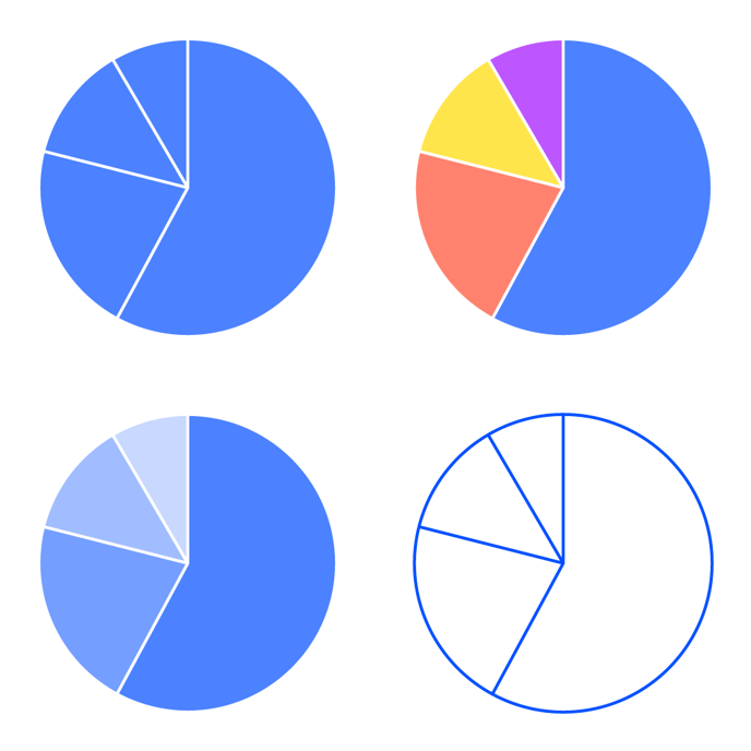
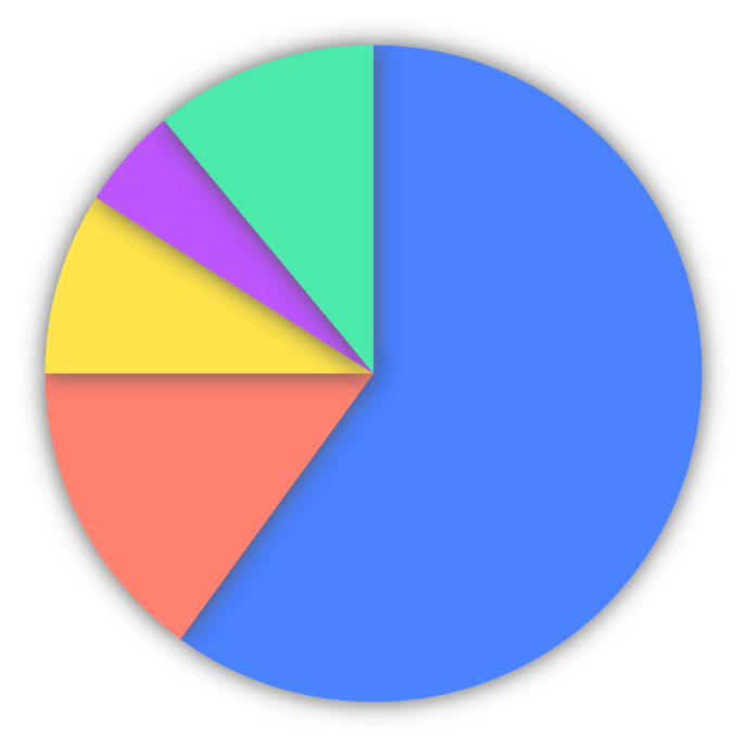
| Fill |
Sets the fill color of the slices. You can apply a solid fill, a palette fill (categorically and numerically), and no fill. If Color is bound to data in the Binding tab, this property is overruled.
|
 |
| Stroke |
Sets the stroke around a slice. You can apply a solid fill, a palette fill, and no fill. You can set the stroke weight and apply a dashed stroke via the cogwheel. If Stroke Color is bound to data in the Binding tab, this property is overruled.
|
 |
| Corner Radius | Sets rounded corners to the slices. |  |
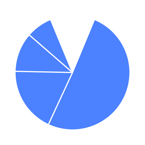
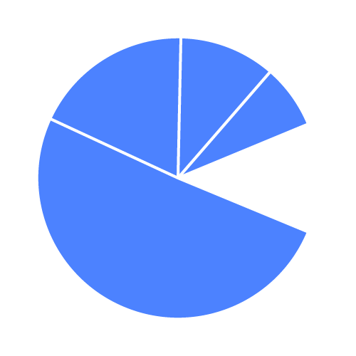
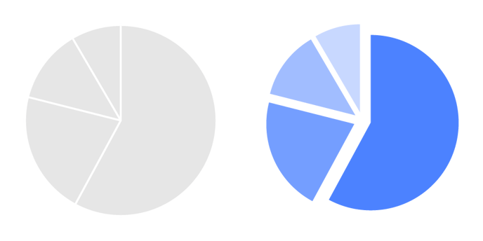
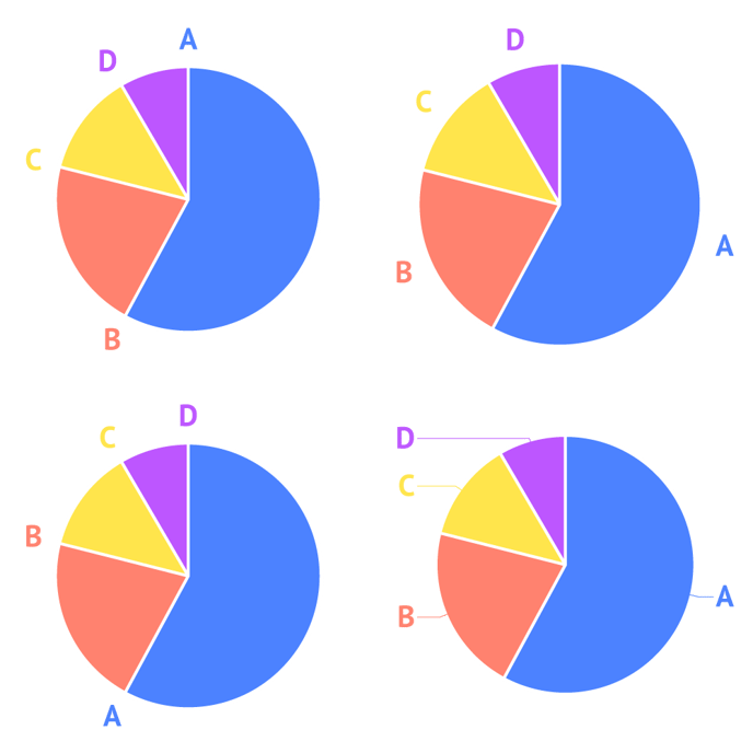
| Pull |
Adds padding between the slices, by pulling the slices away from the center, while keeping the radius.
|
 |
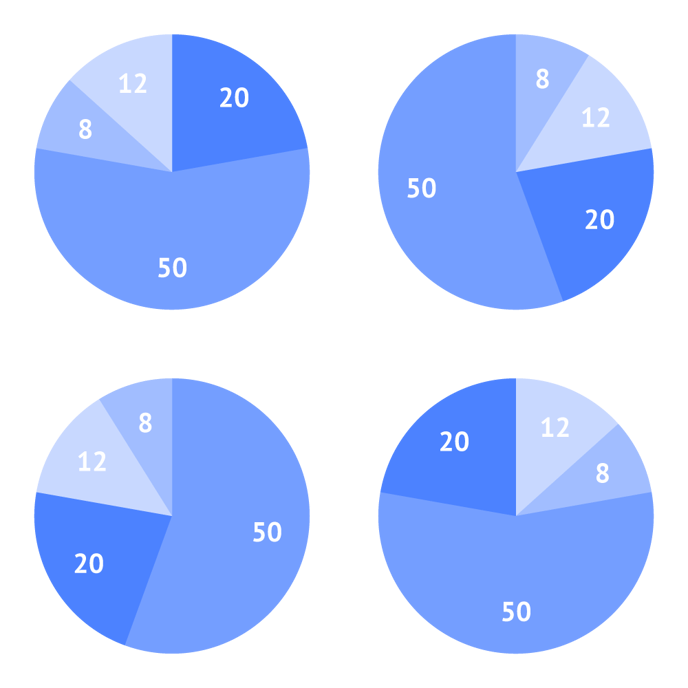
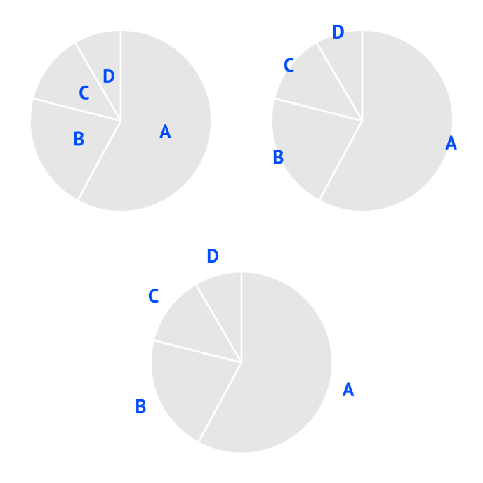
| Sorting |
Sorts the slices based on their value. None, Ascending, Descending, Reverse |
 |
| Amount | Sets the maximum number of slices and joins the remaining slices in one remaining ‘Other’ slice. | 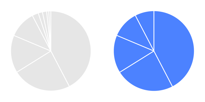 |
| Other Label | Specifies the text of the label of the remaining ‘Other’ slice. | 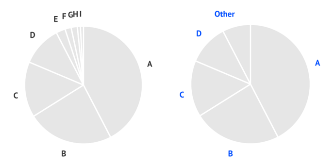 |
SHADOW
| Shadow |
Available in Datylon web app only.
|
 |
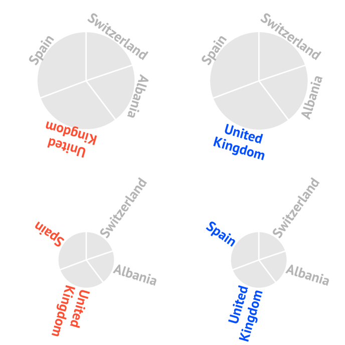
Category Labels >
| Anchor Position |
Positions the anchor point of the label on different anchor points of the pie chart. Start, Middle, End, Side |
 |
| Anchor Radius |
Defines the position of the labels on the radius of the slice. In percentages. 0% is in the center, 100% on the circumference of the pie. 50%, 100%, 120%
|
 |
| Direction |
Defines the direction of the label. Tangential, Radial, Horizontal
|
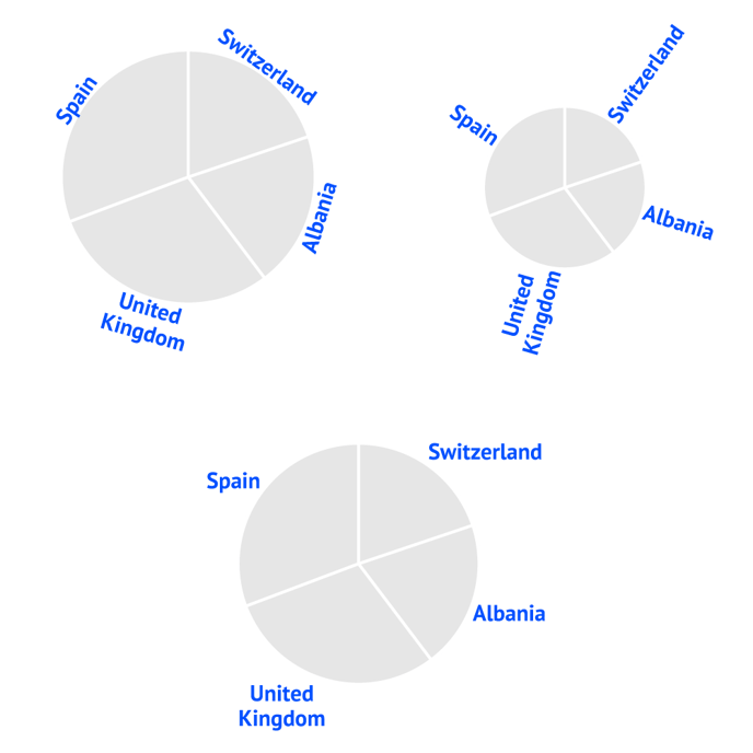 |
| Smart Direction |
Automatically adjusts the direction of the labels for optimal readability. |
|
| Alignment |
Specifies the alignment of the label relative to the anchor point. Useful when having labels with a different amount of lines and applying tangential direction. Inwards, Center, Outwards |
 |
| Prefix |
Adds a prefix to all category labels.
|
 |
| Suffix |
Adds a suffix to all category labels.
|
 |
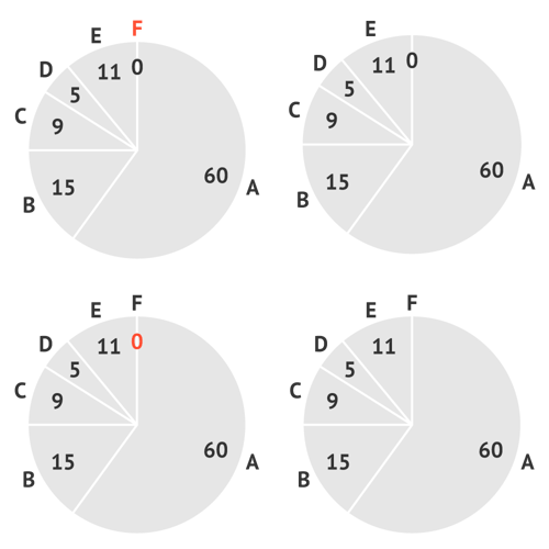
| Hide when Zero |
If a slice has a value of 0, checking this box will hide the accompanying category label. See also Values labels > Hide Zero. |
 |
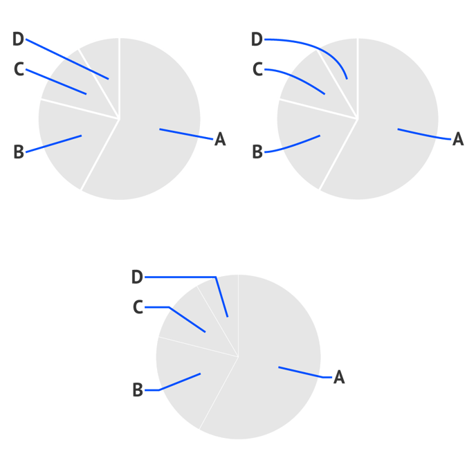
CONNECTOR (Only appears when Anchor Position = Side)
| Start |
Sets the starting point of the connector. Center, Edge |
 |
| Type |
Sets the type of the connector. Only applicable when Start is set to Center Line, Curve, Elbow |
 |
| Stroke |
Sets a stroke color and weight of the connector. You can apply a dashed stroke by clicking the cogwheel. |
 |
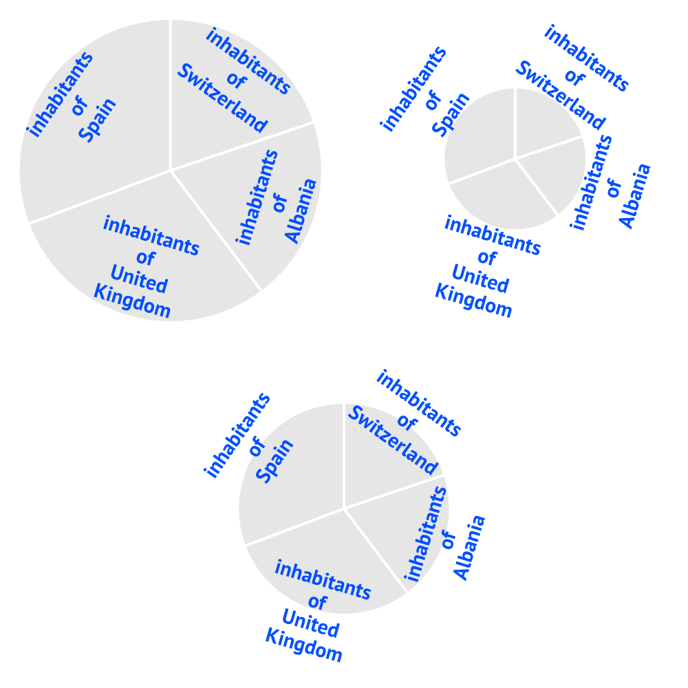
Value Labels >
| Anchor Position |
Positions the anchor point of the label on different anchor points of the pie chart. Start, Middle, End, Side
|
|
| Anchor Radius |
Defines the position of the labels on the radius of the slice. In percentages. 0% is in the center, 100% on the circumference of the pie. 50%, 100%, 120%
|
|
| Direction |
Defines the direction of the label Tangential, Radial, Horizontal
|
|
| Smart Direction |
Automatically adjusts the direction of the labels for optimal readability. |
 |
| Alignment |
Specifies the alignment of the label relative to the anchor point. Useful when having labels with a different amount of lines and applying tangential direction. Inwards, Center, Outwards
|
|
| Prefix |
Adds a prefix to all value labels.
|
|
| Suffix |
Adds a suffix to all value labels.
|
|
| Hide Zero |
If a slice has a value of 0, checking this box will hide the 0 labels. See also Category labels > Hide when Zero. |
|
CONNECTOR (Only appears when Anchor Position = Side)
| Start |
Sets the starting point of the connector. Center, Edge |
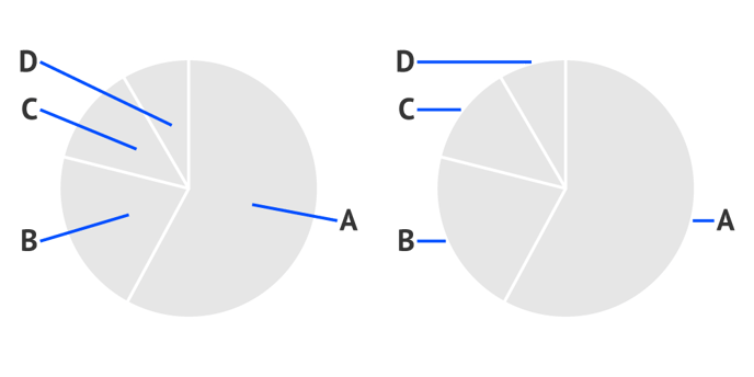 |
| Type |
Sets the type of the connector. Only applicable when Start is set to Center Line, Curve, Elbow |
 |
| Stroke |
Sets a stroke color and weight of the connector. You can apply a dashed stroke by clicking the cogwheel. |
 |