![Datylon_logo_blue_NEW2.svg]](https://help.datylon.com/hubfs/Datylon%20Brand%20Identity/Datylon_logo_blue_NEW2.svg)
Many properties in the DATA section can be set overall for the whole chart, but also separately on the data point level. See data point styling for more details.
Binding Tab
1 Dataset
2 Series
Styling Tab
GENERAL
1 Position and Size
2 Appearance
DATA
3 Icons
4 Category Labels
5 Data Labels
Binding Tab
Dataset>
| First row (column) are headings |
When enabled, the first row (column) of the dataset are headings. When disabled, the first row (column) of the dataset is included in the data range. |
 |
| Data is in | Sets the way data is structured: in rows or columns. |  |
Series>
| Name | Text field to name the Series. By default, it is set to “New Series n”. In the Icon chart, only one series is available. |  |
| Category | Used to bind categories. Every category is represented by one icon. | 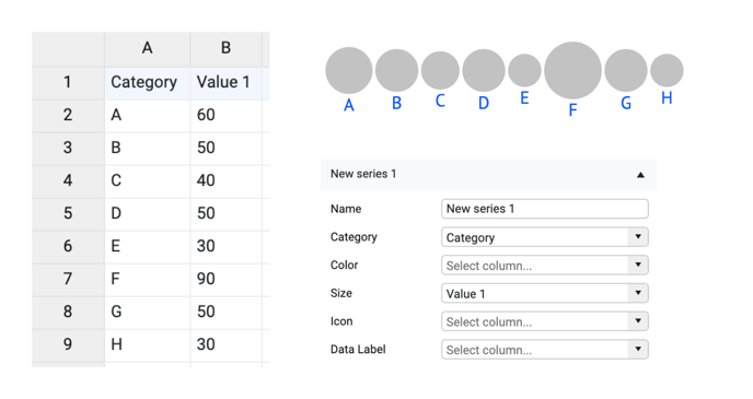 |
| If there are empty cells in the category column, no category labels will be plotted. The icons will still appear. The only exception is when only Category is bound. In this case, the corresponding icon will disappear. |  |
|
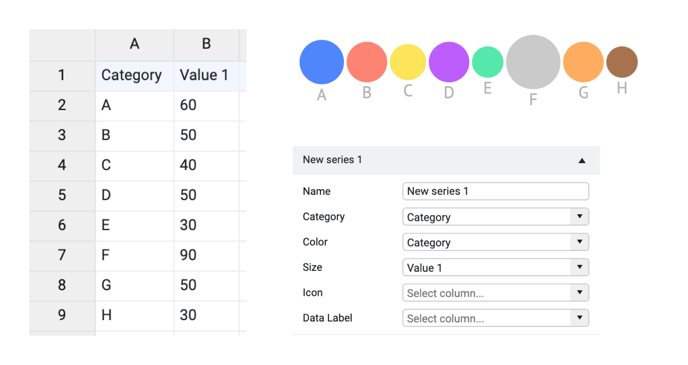
| Color |
Used to bind the data to the color of the icon. The bound column/row can represent categorical, numerical, or datetime values. By default, it’s formatted as a categorical value. The type of data can be adjusted in the Formatting tab. Colors can be presented directly as HTML names, HEX, RGB, or CMYK values. More on that here. |
 |
| Size | Used to bind the data to the size of the icon. The bound column/row should contain only numerical values. |  |
| If some of the values in the Size column are missing then the corresponding icons are not shown. | 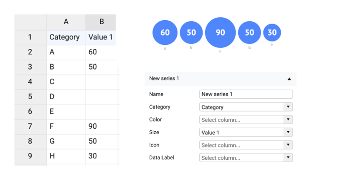 |
|
| Icon | Used for direct binding. Data should contain the naming of an icon type. Possible values are listed here. | 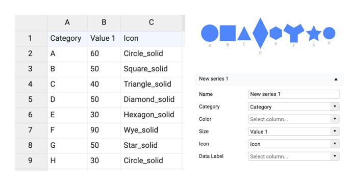 |
| Data Label | Used for direct binding of the data label. Data cells in the corresponding row/column could contain any type of data but it will be treated as text. | 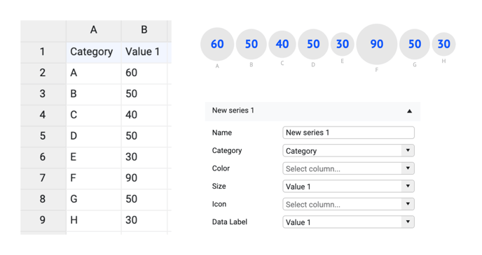 |
Styling Tab
Icons>
| Chart Orientation | Sets the orientation as horizontal or vertical. | 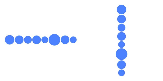 |
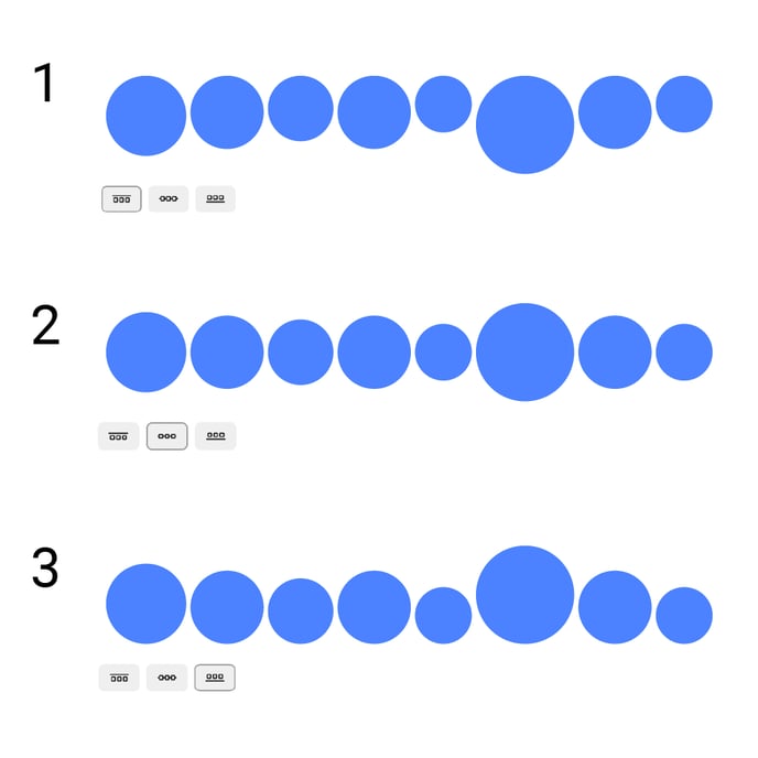
| Alignment |
Aligns icons: 1. To the top 2. To the center 3. To the bottom |
 |
SORTING
| Color | Sort icons based on the value that is bound to Color |  |
| Size | Sort icons based on the value that is bound to Value | 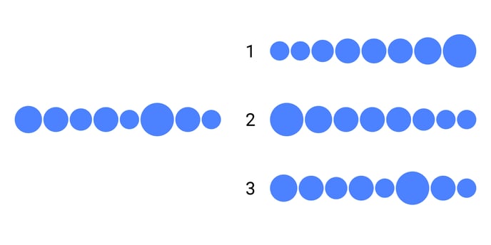 |
DISTRIBUTION
Relative
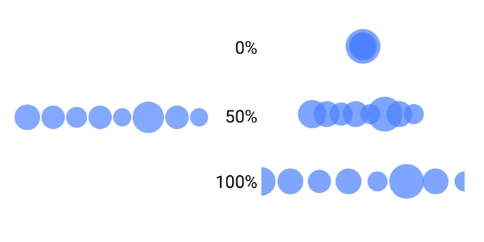
| Evenly Distributed (value field is visible when "Evenly Distributed" is turned on) |
Distribution icon centers within the plot area. When the value is 100%, centers of the first and last icons are placed on the edge of the chart area when Styling > Plot Area > Fixed Position > Margin is set to 0. |
 |
| Padding (visible when "Evenly Distributed" turned off) |
Distributes icons based on space between icon edges. When the value is 100% the size of the icons reduces to zero, so they become invisible. |
 |
Absolute
| Evenly Distributed (value field is visible when "Evenly Distributed" is turned on) | Distributes icon centers in absolute value. |  |
| Max Size | Sets the size of the icon with the largest value or Max Value | 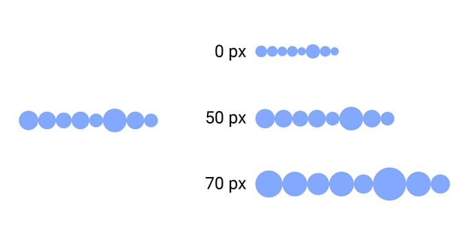 |
| Min Value, Max Value | Set the value for the smallest and biggest icons. | 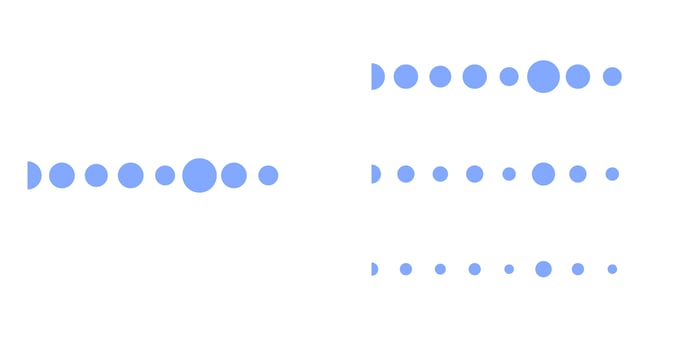 |
| Spacing (visible when "Evenly Distributed" turned off) | Distributes icons based on space between icon edges in absolute values. | 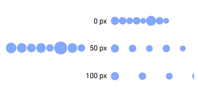 |