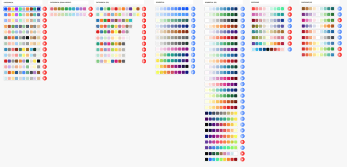
The image above displays all of the Datylon color palettes. The palettes marked with a blue check mark are recommended for use with color-blind audiences, while those marked with a red cross mark are not recommended for the same purpose.
In general, color palettes that contain both red and green colors are not suitable for most color-blind readers with protan and deutan colorblindness.
For colorblind users, the best option is to use sequential palettes that consist of a single hue (color) with varying saturation and lightness values.
To learn more about creating charts for color-blind viewers, you can refer to this resource.