There are three primary methods for creating a combo grouped bar chart, each with its own set of advantages and drawbacks:
1st method allows the use of both group names and data labels, however there’s no option to style the group names.
2nd method is similar to the first one with the difference of omitting the group names from the final result.
3rd method allows to style group names separately but limits the possibility of using data labels.
Now let’s see how to practically apply all three methods.
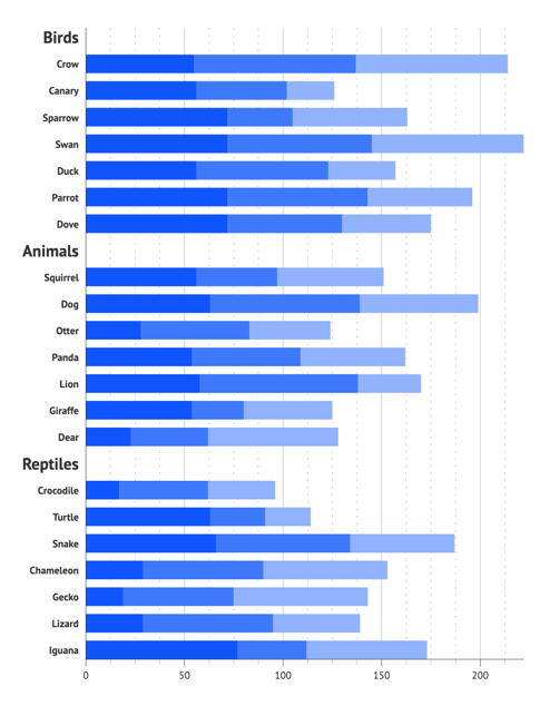
1st method. To begin creating a combo grouped and stacked bar chart, the best starting point is to select the appropriate default chart. In this case, the 5th default bar chart is the most suitable. Initially, we start with a stacked bar chart, and the grouping aspect will be addressed later by adjusting the data structure.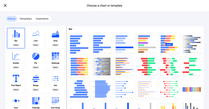
To obtain a combo chart, the data must be organized in a specific manner, as shown in the example below:
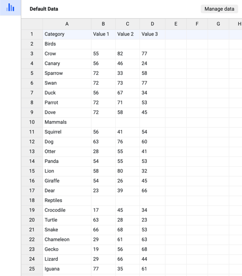
The data organization closely resembles a standard stacked bar chart, with the distinction being the categories placed above the group items. Please note that the cells next to the group names remain empty to create space between the bar groups.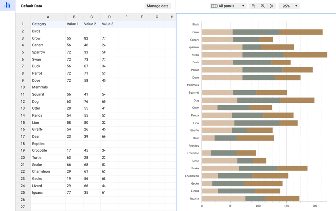
This approach allows for the utilization of both data labels and axis labels. However, there is a limitation – you cannot style individual axis labels separately; they are shared for all axis labels. This method makes the most of chart labeling possibilities.
There are also few alternative options.
2nd method. To implement this method, you will use the same layout as before but without including the group names. To achieve this, you need to make a few adjustments. First, match the color of the axis labels to the color of the first series.
Styling > Y Axis > Labels > Character > Color > Link > First Series
Afterwards, change the color of the first series to None for rows that only contain category names and no data. For instance, in the given example, this would apply to the "Mammals" and "Reptiles" rows (you can simply remove the "Birds" row).
Styling > New series 1 > All Data > Mammals/Reptiles > Bars > Color > None
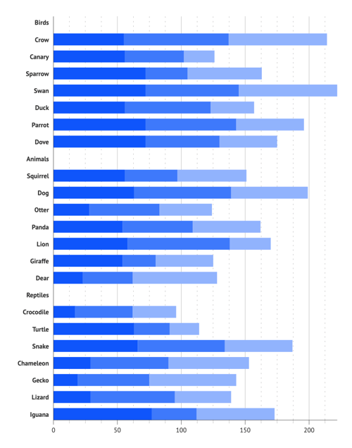
The outcome is illustrated in the screenshot, showcasing three sets of stacked bars that are evenly spaced apart.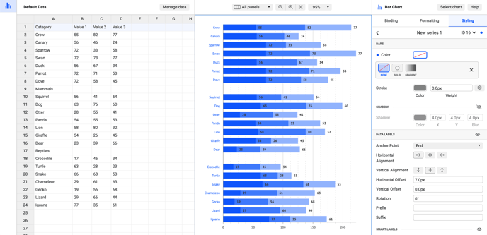
The 3rd method provides the option to customize the appearance of data labels. To accomplish this, you can follow these simple steps:
1.Bind Data Labels to the Categories column of the first series.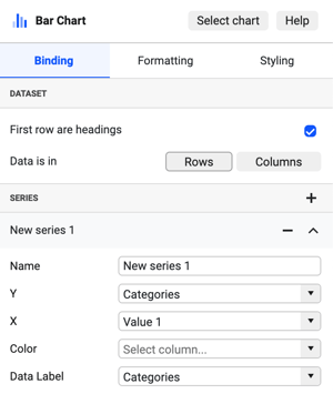
2. Add a zero value to first series column to a row corresponding to group category: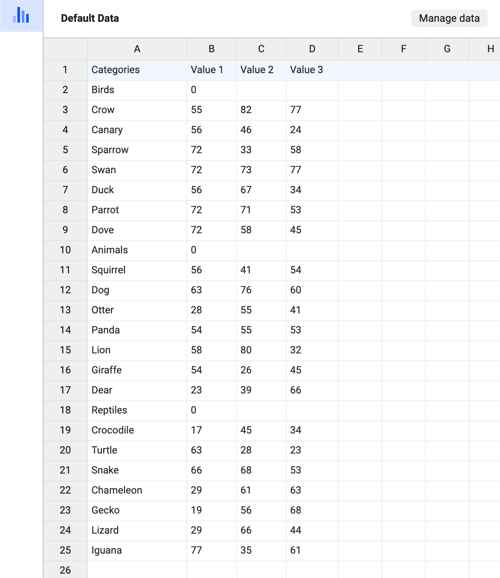
Styling > Series > New Series 1 > Data Labels > On
Also place labels to the start of the bar using smart labels:
Styling > Series > New Series 1 > Data Labels > Smart Labels > Location > Outside End
4. Style group labels differently using data point styling:
Styling > Series > New Series 1 > All Data > Birds/Animals/Reptiles > Data Labels > Character > Size > 16
As a result, the group category labels are displayed in a different font size compared to the regular category labels.
These steps yield three distinct approaches to creating a combo grouped and stacked bar chart in Datylon.
If you have any further questions, please don't hesitate to contact us via chat or at getsupport@datylon.com.