In previous versions of Datylon (before R56), disabling an axis, axis label, or series could impact the margins and position of a chart. This behavior is typically desired.
However, there are specific situations where it may be preferable to hide these objects instead of disabling them. In this case, the axis or axis labels will still be present but made transparent.
This feature is particularly valuable when you want to divide a chart into different layers for animation in other tools.
Please continue reading below for more details on the hide/unhide feature.
To hide axes and series without affecting the positions of other elements, simply click on the eye icon next to the corresponding properties.
When you click on the eye icon next to the X Axis or Y Axis, the corresponding axis will be hidden along with all its related elements like lines, labels, ticks, and grids.
When you click on the eye icon next to a series, the entire series object will be hidden, including data marks and data labels.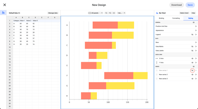
By selecting the eye icon next to the series, you have the ability to hide all the series and their associated elements. This encompasses their data marks and data labels.