 |
|
In this report, four types of Datylon charts are used to visually represent data. Apart from the commonly used bar charts, line charts, and arrow charts, a text object is employed. This text object serves as a complement to the charts by incorporating data-driven text blocks, providing additional context and insights. |
 |
|
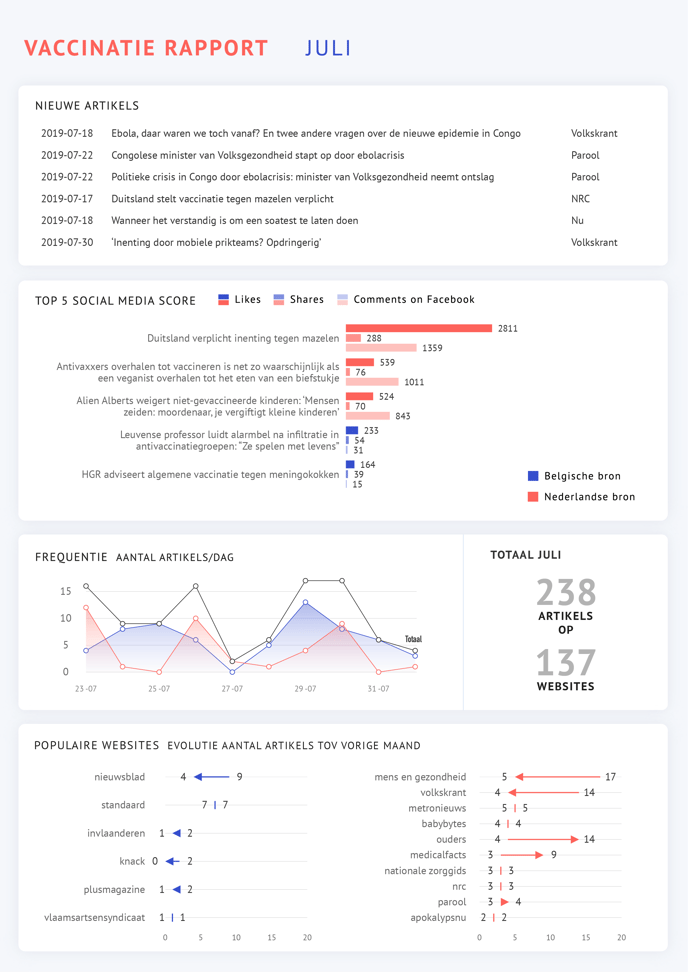
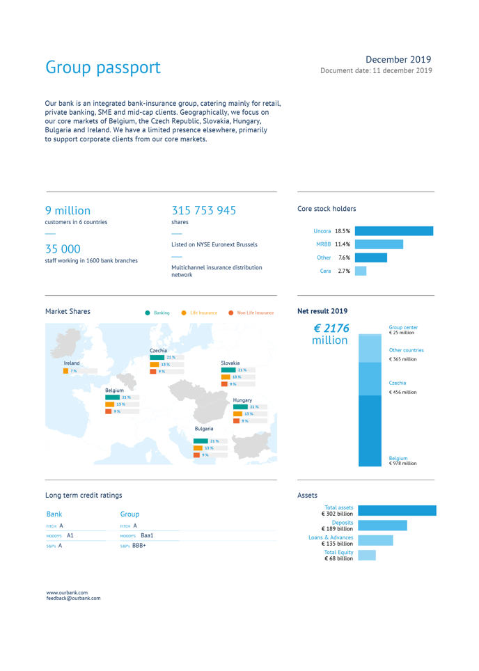
The report consists of a variety of bar charts showcasing different data sets and comparisons. These bar charts provide a clear visual representation of the data, making it easier for the reader to understand and analyze the information. The integration of Datylon bar charts with a map, created using Illustrator, adds an extra layer of context and insight to the data. By visually representing the data on a map, the report not only presents the information in a visually appealing way but also allows for a better understanding of geographical patterns and trends. |
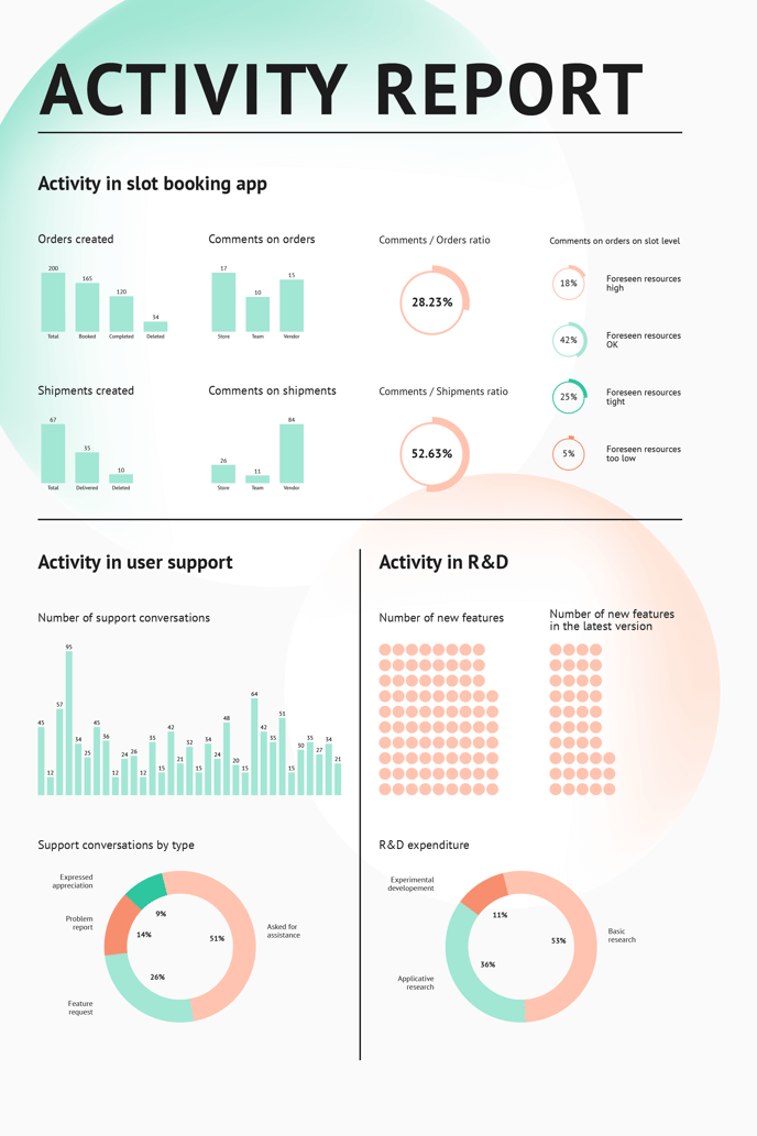 |
| The report showcases a nice combination of simple bar charts, pie charts, and gauge charts, all with data-driven coloring. The simple bar charts offer a straightforward representation of the information, making it easy to compare and analyze different data sets. The pie charts, on the other hand, allow for a clear visualization of proportions and percentages, enabling the reader to understand the distribution of data at a glance. Additionally, the gauge charts provide a visual indicator that represents a specific metric, making it quick and easy to assess performance against a target or goal. With their data-driven coloring, these charts ensure that the important information stands out, guiding the reader's attention to key insights and findings. |
 |
|
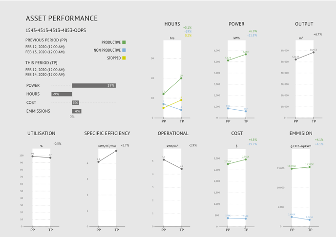
An easy, yet effective combination of a simple bar chart and multiple slope charts with subtle use of color is a powerful way to visually represent data. To enhance the visual impact of the charts, a subtle use of color can be employed. This can help highlight important data points or draw attention to specific trends or outliers. |
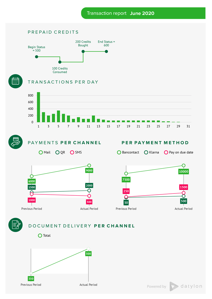 |
| A transaction report showing multiple indicators with the line charts, bar charts, and slope charts provides a comprehensive overview of various data points. These charts allow the reader to easily analyze and compare different indicators, making it simpler to identify trends and patterns. Together, these charts provide a holistic view of the transaction report, allowing for informed decision-making and analysis. You can read more about the process of creating this report here. |
 |
|
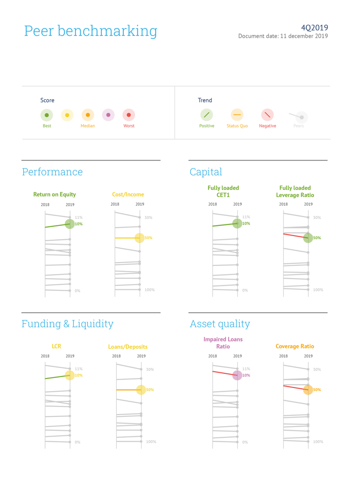
A benchmarking report provides valuable insights into the performance of different entities or competitors in a specific industry. In this case, the report utilizes slope charts, accompanied by a detailed legend created in Illustrator, to visually represent the benchmarking data. |
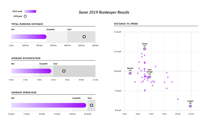 |
| A custom Runkeeper dashboard using bullet charts and a scatter plot is another effective way to visually represent data. The bullet charts provide a comprehensive overview of various performance metrics, total distance, average distance, and pace, allowing users to quickly assess their progress and set goals. The scatter plot, on the other hand, can be used to analyze the relationship between different variables, such as distance and speed, providing valuable insights into the user's overall performance. |