A combination of Adobe Illustrator and Datylon chart maker plug-in allows the creation of multiple chart layouts. All you need to do is to make and style one chart and then just copy-paste it, changing the data in each chart. It can be just a few charts with some indicators data, small multiples, or tile maps. The limitation is only your imagination.
On this page, you can check out some of the examples of multi-chart layout designs.
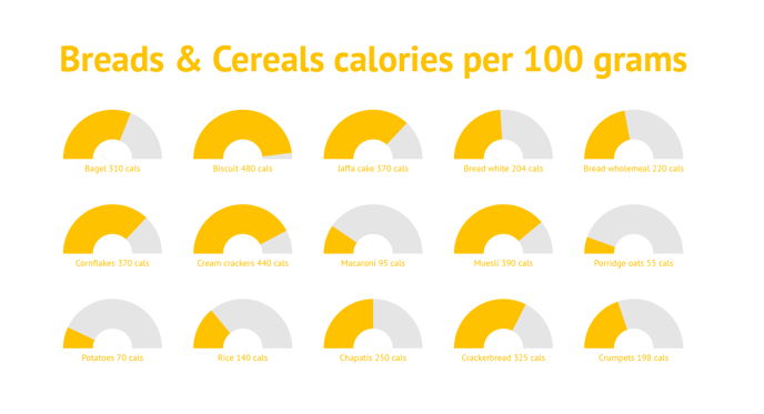 |
| Multiple semi-circle donut charts showing the number of calories for different kinds of meals. The title and all the labels are made in Datylon Text Object. One dataset was used for all charts data. |
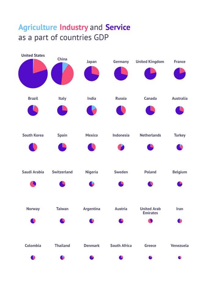 |
| Multiple pie charts communicating the value of the country's GDP by the size of the pie chart and the structure of GDP using slice sizes. The data for all of the pie charts is placed into one dataset. The legend was made by coloring the title. |
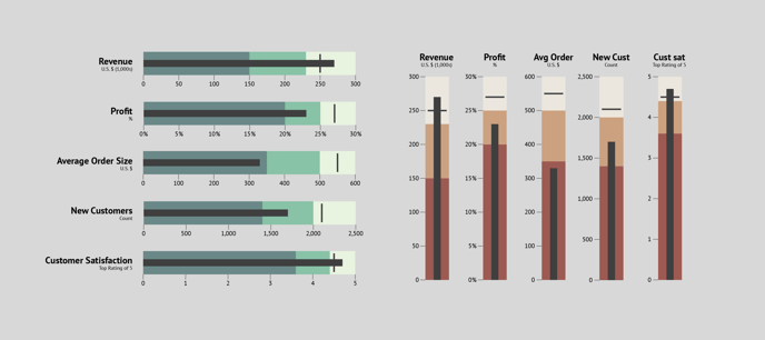 |
| Horizontal and vertical variations of bullet charts showing some of the KPIs. |
 |
| Multiple area charts each showing a box office of a single movie that was popular in cinemas in the first half of 2019. |
 |
| Line charts showing the changes in attendance of most visited English football clubs. |
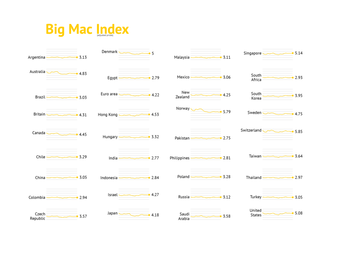 |
| Line charts showing the changes of the Big Mac Index over time for multiple countries. |
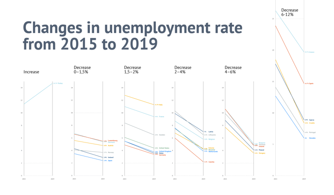 |
| Slope charts showing the changes in the unemployment rate for 2019 to 2019. Each slope chart represents a group of countries with a similar degree of change. |
 |
| Multiple area charts presented as a US tile map showing the changes of median household incomes over time for every state. |
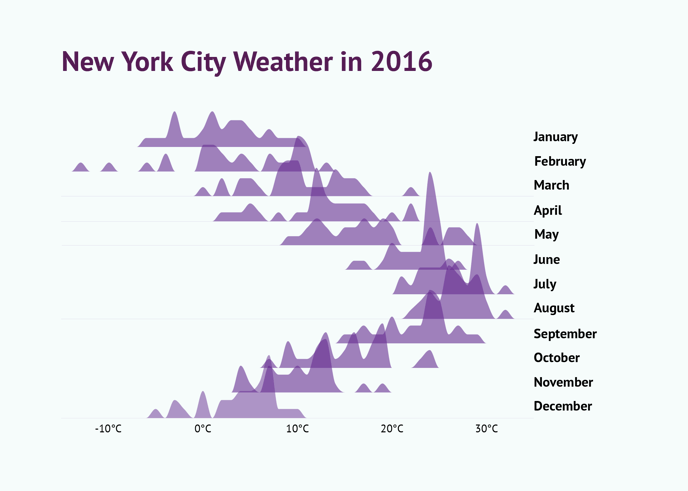 |
| Multiple line charts showing the frequency distribution of temperatures in New York City in every month of 2016. |