 |
|
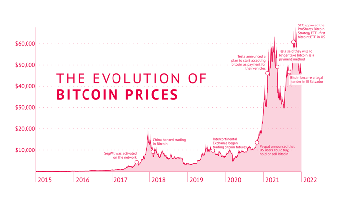
| A simple line chart with an extra area filled with lighter color below the line showing the evolution of Bitcoin prices over time. The title is made with the Datylon Text object. It opens a possibility to make a chart data-driven. |
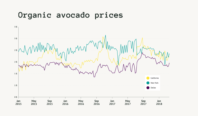
Line chart with multiple lines showing organic avocado prices in different regions over time. One of the default palettes is used for coloring the lines. A legend was added for additional readability. The title is made with the Datylon Text object.
|
 |
 |
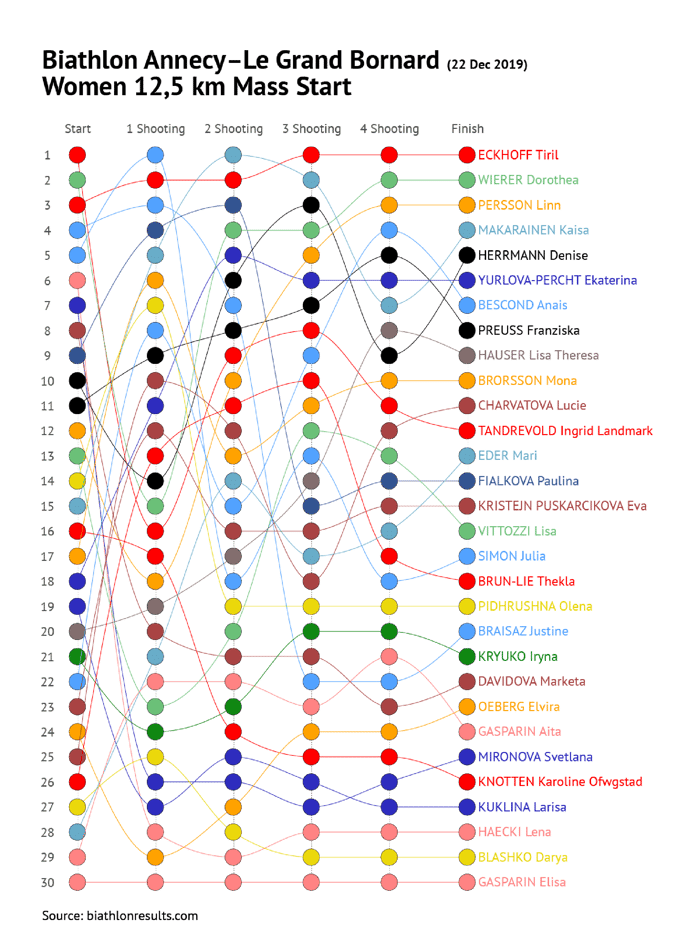
| “Spaghetti” line chart showing how the biathlon mass start race unfolded through its stages. Increased size of data marks allows to track the path of each athlete. Direct labels make it easier to link lines and athlete names. |
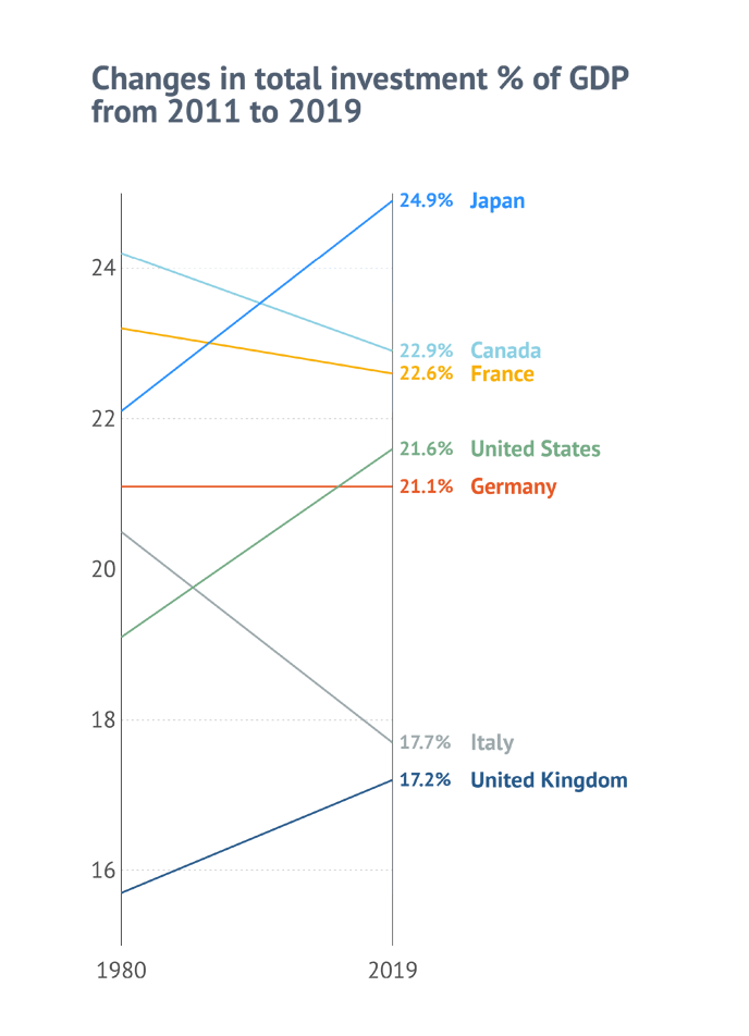
Slope chart made with the Datylon Line chart showing the changes of the investment percentage of GDP over 2 timestamps. The angle of the line communicates the rate of changes. Lines and direct labels have the same color for better readability
|
 |
 |
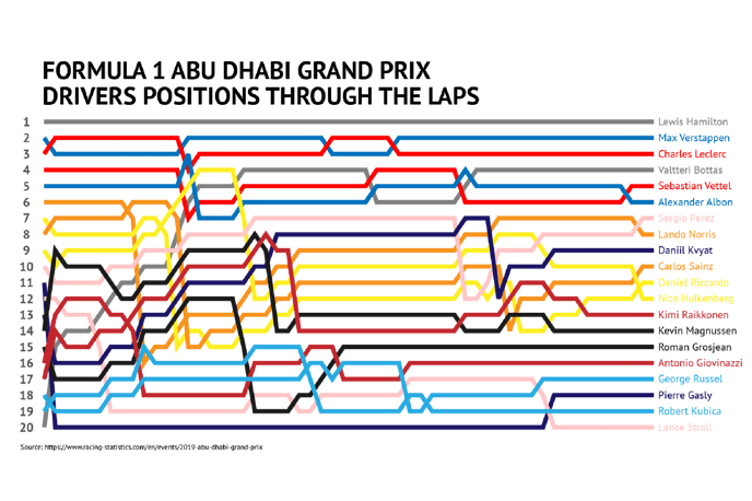
| Another “spaghetti” line chart showing how the F1 race drivers’ positions changed on every lap. The colors of lines match the colors of teams. Direct labels were added to follow the link between a line and a driver. |
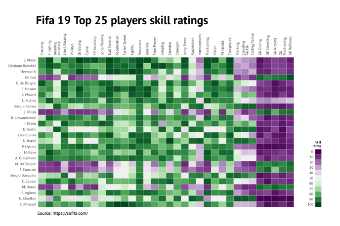
A heatmap showing the ratings of top players in the Fifa19 game. An additional heatmap on the side works as a legend.
|
 |
 |
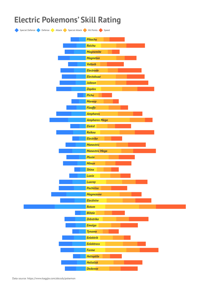
| A diverging stacked bar chart is perfect for making i.e. demographic charts. This chart, however, shows a skill rating of electric Pokemon. |
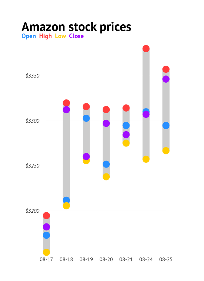
A dot plot chart that resembles a candlestick chart. It communicates the same data but in a slightly different way. Instead of using a colored box for opening and closing prices, simple dots and a line is used. Title and color legend made with Ai Type tool and Color picker.
|
 |
 |
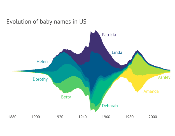
| This streamgraph (a variation of the Datylon area chart) shows a timeline of the number of baby names in the US. This is a unique and beautiful chart type that is not focused on presenting detailed values but rather indicates a trend. |
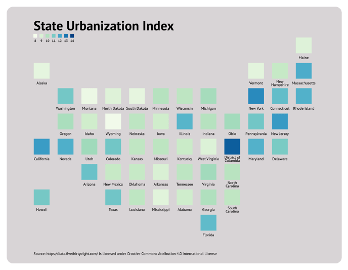
A tile map in the shape of the US showing the state urbanization index categorized by different colors applied to each state. It can be easily reused if you want to display any type of data that differs per state. Both the chart as well as the small color legend under the title were made using the Datylon scatter plot.
|
 |
 |
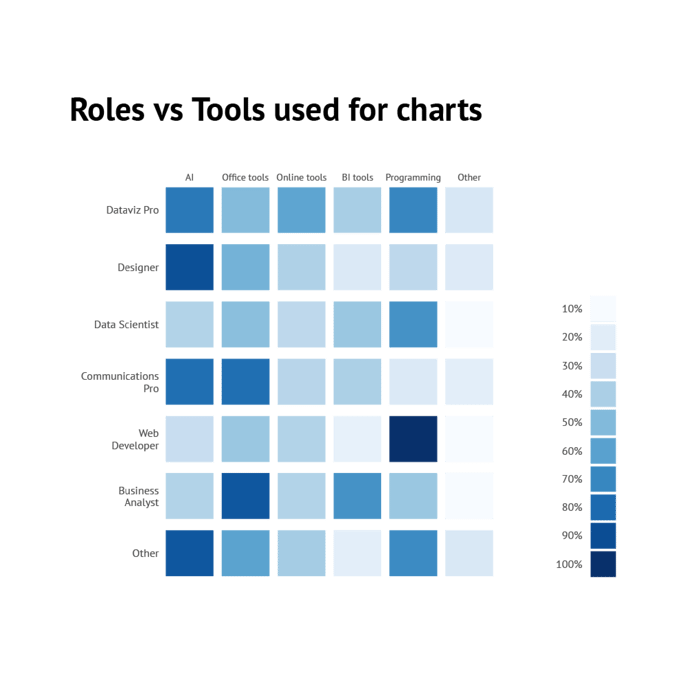
| This heatmap is used to show what type of visualization tools are used by different specialists. The color legend also was made using a heatmap. |
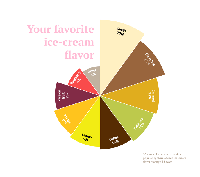
A Nightingale's chart showing the share of favorite ice cream flavors.
|
 |
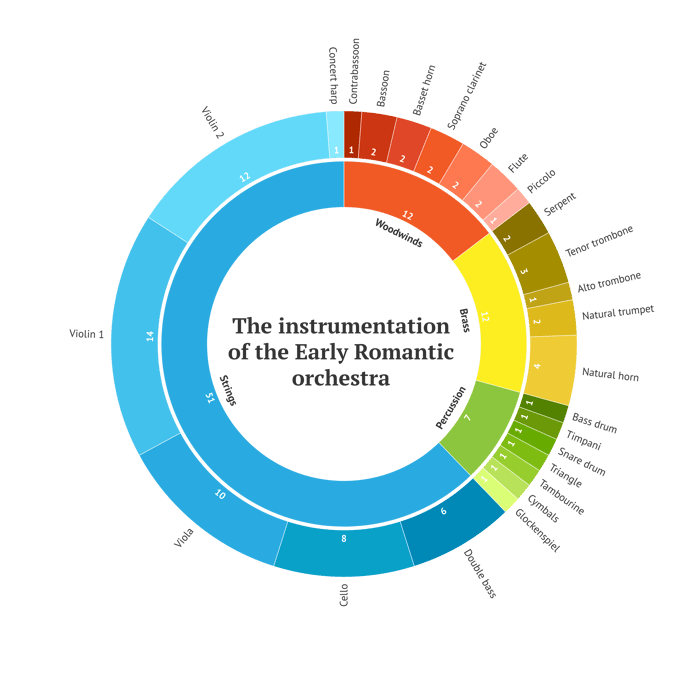 |
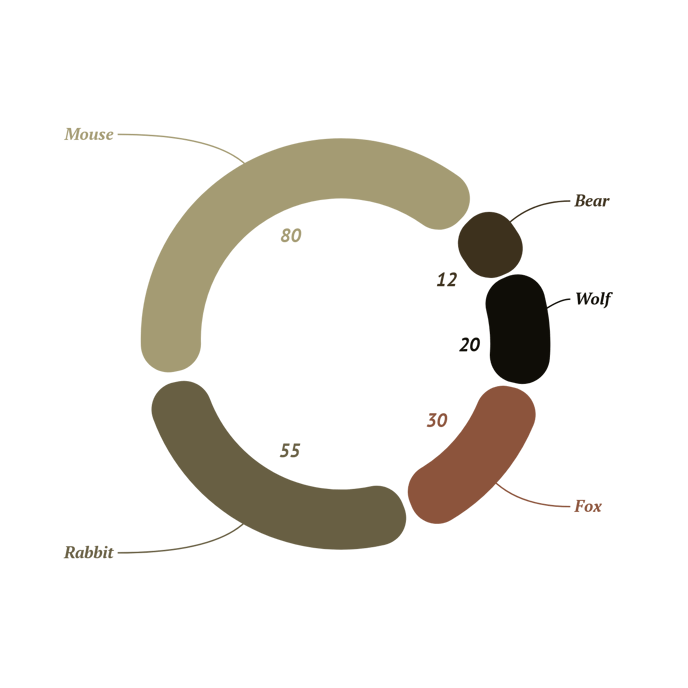
| A donut chart with rounded slices. Numerical and categorical labels have the same color as the corresponding slices. Also, the connector was added for categorical labels. | A sunburst chart shows the share of the instrumentation of the Early Romantic orchestra. The title in the middle of the chart was created with the Datylon Text Object. |