![Datylon_logo_blue_NEW2.svg]](https://help.datylon.com/hubfs/Datylon%20Brand%20Identity/Datylon_logo_blue_NEW2.svg)
Many properties in the DATA section can be set overall for the whole chart, but also separately on data point level. See data point styling for more details.
See also Line Chart Tutorial Video
Binding Tab
1 Dataset
2 Series
Styling Tab
General
1 Position and Size
2 Appearance
3 Legend
Data
4 Line
5 Data Marks
6 Data Labels
7 Direct Labels
Axes and Grid
8 Axis > Type: Categorical
9 Axis > Type: Numerical
10 Axis > Type: Datetime
Binding Tab
Dataset>
| First row (column) are headings |
When enabled, the first row (column) of the dataset are headings. When disabled, the first row (column) of the dataset is included in the data range. |
 |
| Data is in | Select if data series are structured in rows or columns. | 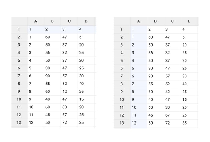 |
Series>
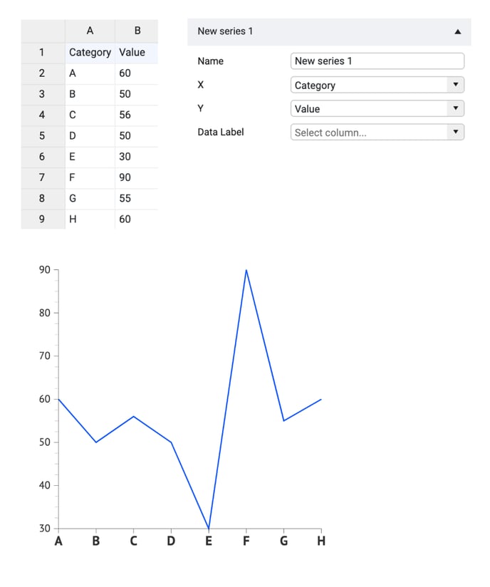
| Name |
Text field to name the Series. By default, it is set to “New Series n”. This name will be used for Direct labels in the Line chart. |
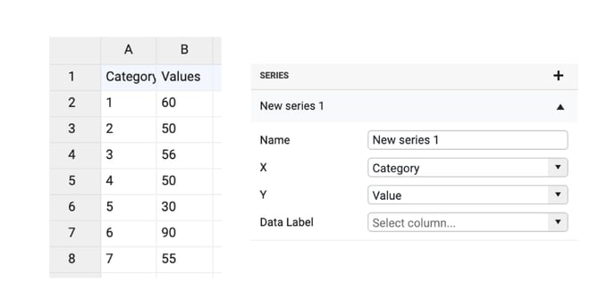 |
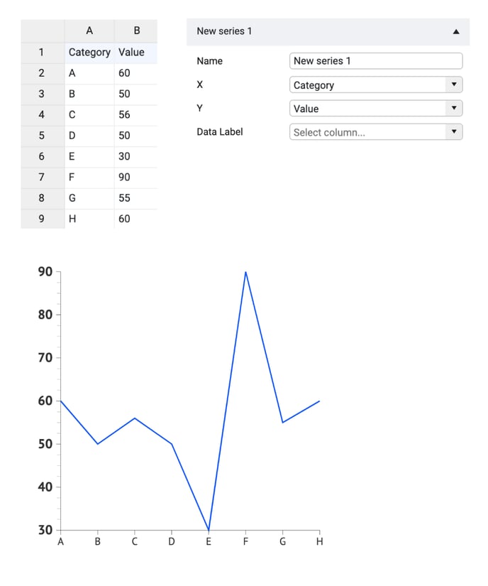
| X |
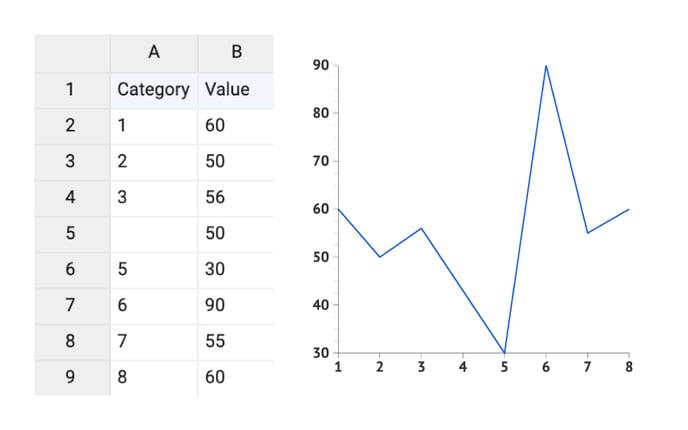
The X-axis can be used for binding 3 types of data:
|
 |
|
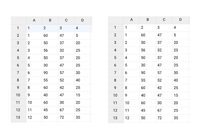
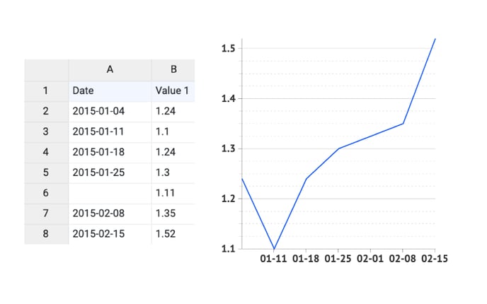
One or more empty cells in the X-axis data will give the following result:
“Empty values found where datetime values were expected. Data is ignored” |
1
2
3
|
|
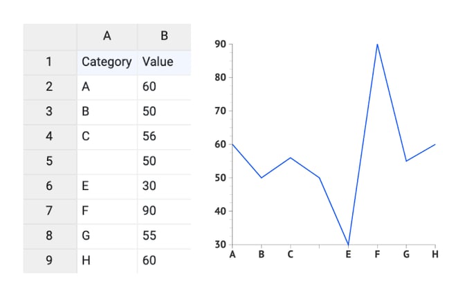
| Y |
Y-axis can be used for binding 3 types of data:
|
 |
|
One or more empty cells in the Y-axis data will give the following result:
|
1
2
3
|
|
| Data Labels | Adds the content of a bound column (row) as a label for the corresponding data point. | 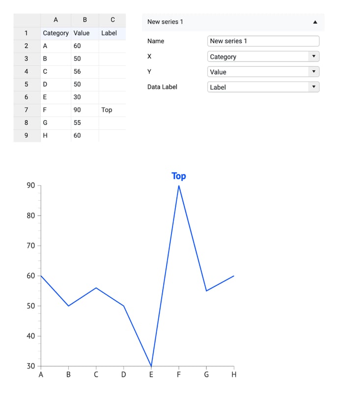 |
Styling Tab
DATA
Many properties in the DATA section can be set overall for the whole chart, but also separately on the data point level. See data point styling for more details.
Line >
| Chart Orientation | Sets chart orientation to horizontal or vertical. Note that in horizontal orientation, the X-axis is horizontal. In vertical orientation mode, the X-axis becomes vertical. | 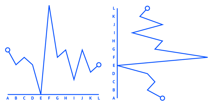 |
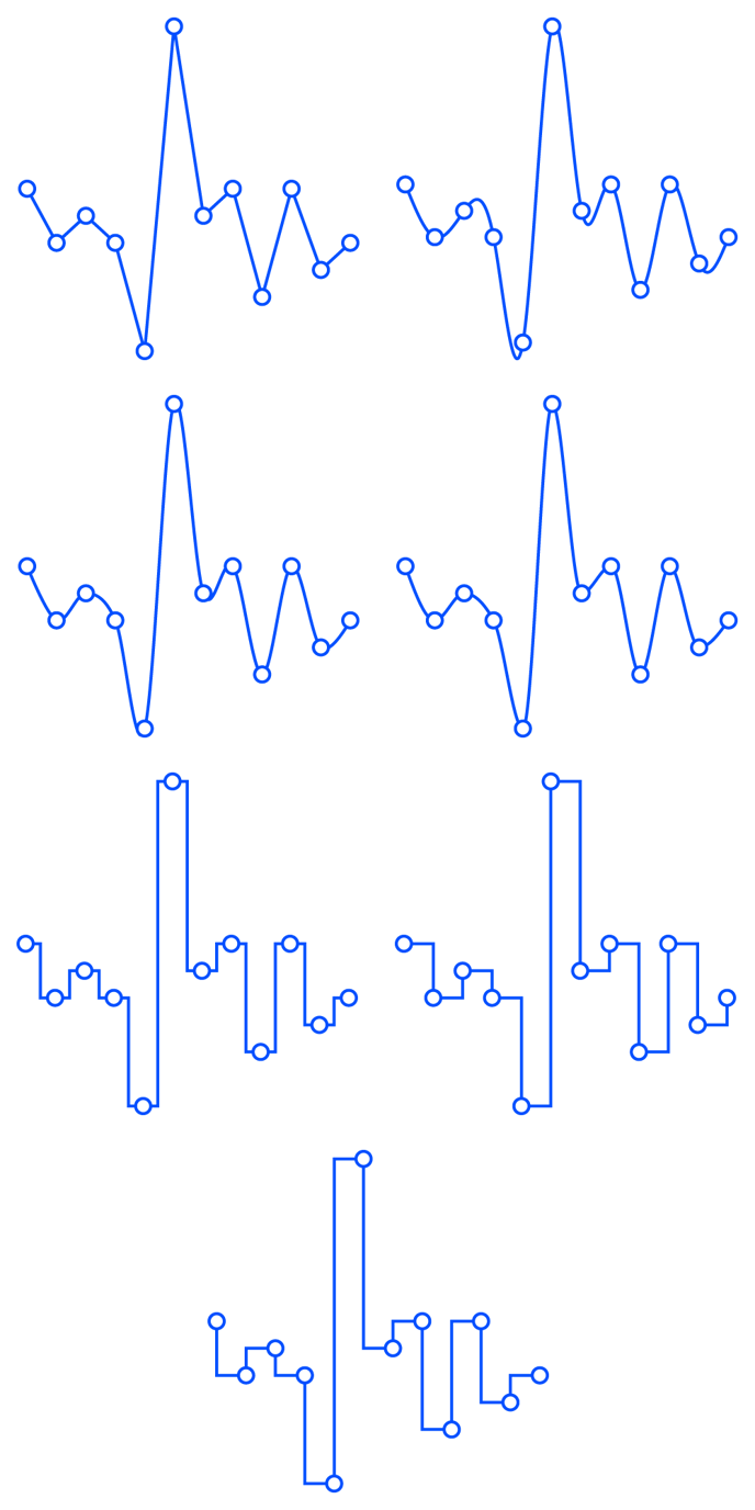
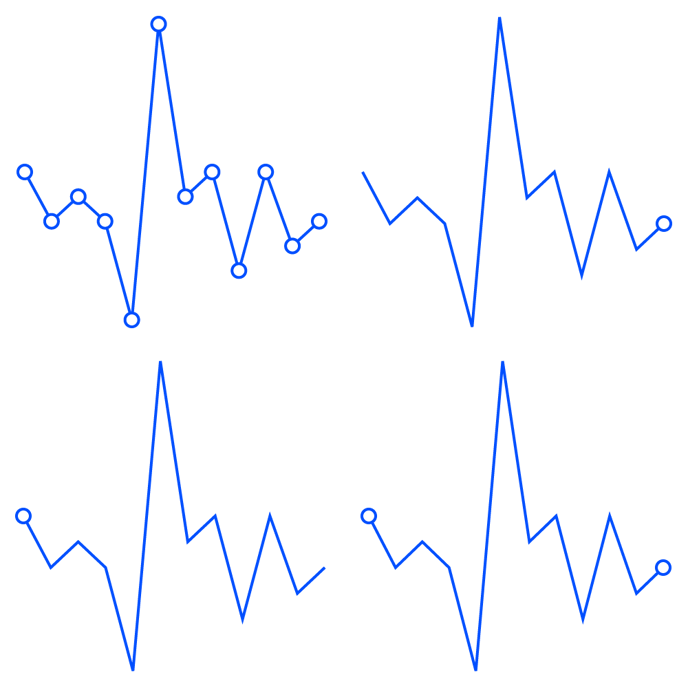
| Interpolation |
Sets the construction method of connecting the line between data points. There are 7 options available: Linear, Curved Natural, Curved Cardinal, Curved, Steps Middle, Steps After, Steps Before. |
 |
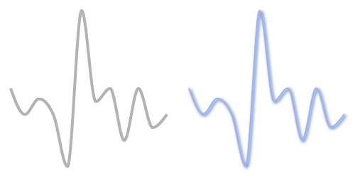
| Stroke |
Sets the color and weight of the line. |
 |
| Stroke > Cogwheel > Cap |
Sets the type of the line cap. There are two types available: Butt and Round. |
 |
| Stroke > Cogwheel > Corner |
Sets the type of the corner. There are two types available: Miter and Round. |

|
|
Stroke > Cogwheel > Dashed Line |
Sets the length and gap of the dashes. If Gap is left empty, the value from the Dash field applies as Gap.
When Dash is set on 0, and Cap on Round, the dots will be perfect circles. |
|
|
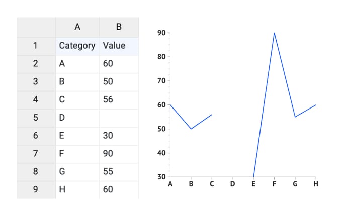
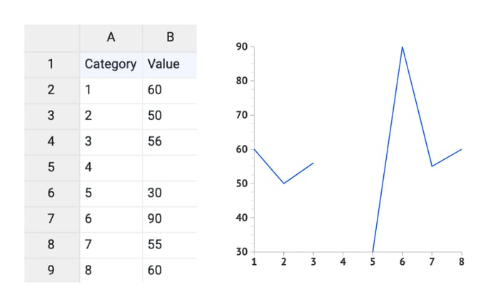
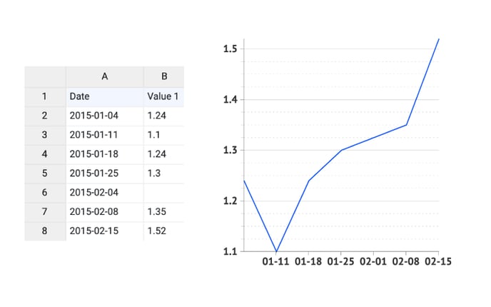
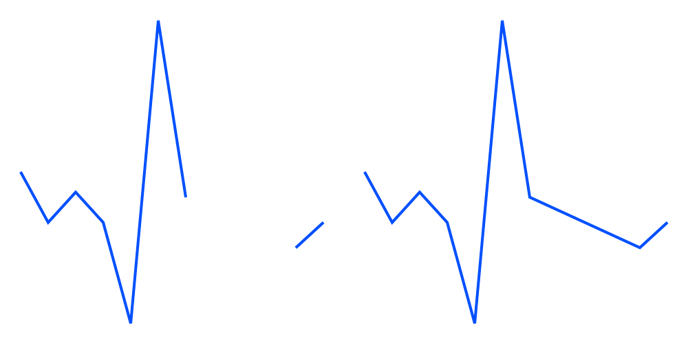
Connect Datapoints |
Allows to connect datapoints if some of the data in between is missing (empty cells in data set). |
|


FILL AREA
|
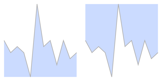
Fill Type |
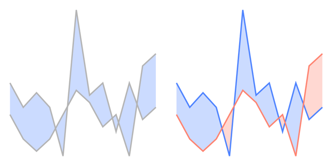
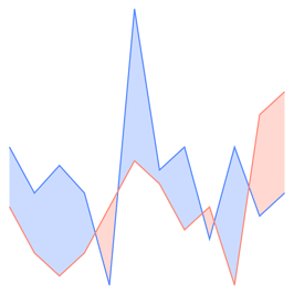
Sets the type of fill relative to the line. There are 3 options: Below fills the area underneath the line(s) down to the bottom of the plot area. Above fills the area above the line(s) up to the top of the plot area. Note: The lines, and their fill, are layered in order of the Series list under |
 |
|
|
Between fills the area between two lines starting with the line linked to the first Series in the Styling tab > Series list. The last line in the list will have no fill. |
 |
|
Color |
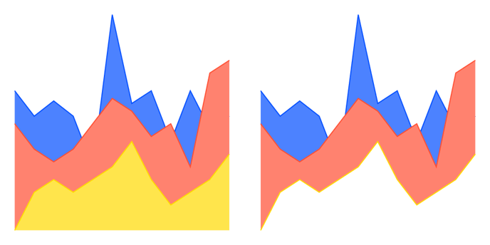
Color selector for fill type Below, Above, or Between lines. A palette can be applied. The latter results in each series being filled with another color from the palette. Note: When Between option is selected on the Global level, Color Above cannot be changed. |
 |
|
Color |
Color selector for Below and Above fill type behaves the same as on the Global level except that no palette can be applied. Color selection for Between has 2 options:
Color Below fills the color underneath the current line to the next line in the Styling tab > Series list. Color Above is by default linked to Color Below. It fills the current line upwards to the next line in the Styling tab > Series list. So in case two different colors are selected, Color Below is used to fill the area where the first line is above the second one. And where the second line is above the first one, the area is filled with Color Above. |
 |
SHADOW
| Shadow |
Available in the Datylon web app only.
|
 |
Data Marks >
| Show |
Sets the location(s) of data marks: All, Last, First, First, and Last |
 |
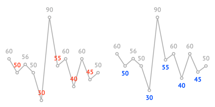
Data Labels >
| Show |
Sets the location(s) of data labels: All, Last, First, First, and Last |
|
| Data Mark Anchor |
Can only be applied when data marks are shown. Moves the center of the text box to the selected position of the data mark: Center, Center Left, Center Right, Top, Top Left, Top Right, Bottom, Bottom Left, Bottom Right. |
 |
| Smart Labels |
Positions the labels above or below the line (left or right the line in case of a vertical chart orientation), depending on the line's inclination. The distance of the label from the line is set by Vertical Offset (or Horizontal Offset in case of a vertical chart orientation). |
 |
| Horizontal Alignment | Aligns the label left, centered, or right relative to the data point or relative to the data mark anchor if data marks are shown. |  |
| Vertical Alignment | Aligns the label top, centered, or bottom relative to the data point or relative to the data mark anchor if data marks are shown. | 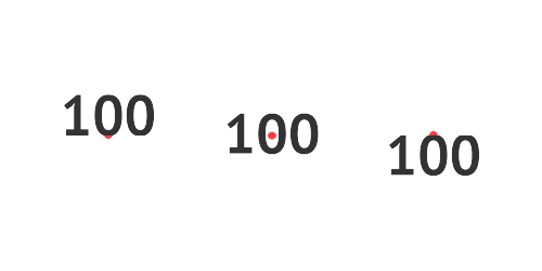 |
| Horizontal Offset | Sets the position of the label horizontally. Enter a positive value to move to the right. Enter a negative value to move to the left. |  |
| Vertical Offset | Sets the position of the label vertically. Enter a positive value to move up. Enter a negative value to move down. |  |
| Rotation |
Rotates the label around the anchor point. A positive value rotates counterclockwise. A negative value clockwise. |
 |
| Prefix |
Adds a prefix to all legend labels. Consecutive spaces are ignored. |
 |
| Suffix |
Adds a suffix to all legend labels. Consecutive spaces are ignored. |
 |
Direct Labels >
| Location | Sets the location(s) of the direct labels: First, Last, First and Last, Side | 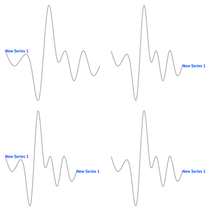 |
| Smart Labels | Automatically repositions direct labels if multiple labels overlap. | 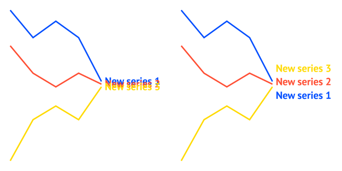 |
| Horizontal Alignment | Aligns the label left, centered, or right relative to the data point or relative to the data mark anchor if data marks are shown. | |
| Vertical Alignment | Aligns the label top, centered, or bottom relative to the data point or relative to the data mark anchor if data marks are shown. | |
| Horizontal Offset | Sets the position of the label horizontally. Enter a positive value to move to the right. Enter a negative value to move to the left. | |
| Vertical Offset | Changes the position of the label vertically. Enter a positive value to move to the top. Enter a negative value to move to the bottom. | |
| Rotation |
Rotates the label around the anchor point. A positive value rotates counterclockwise. A negative value clockwise. |
|
| Prefix | Adds a prefix to the labels. | |
| Suffix | Adds a suffix to the labels. | |