![Datylon_logo_blue_NEW2.svg]](https://help.datylon.com/hubfs/Datylon%20Brand%20Identity/Datylon_logo_blue_NEW2.svg)
Many properties in the DATA section can be set overall for the whole chart, but also separately on the data point level. See data point styling for more details.
Binding Tab
1 Dataset
2 Series
Styling Tab
GENERAL
1 Position and Size
2 Appearance
DATA
3 Ranges
4 Percentage Labels
5 Data Labels
AXES AND GRID
6 Numerical Axis
7 Categorical Axis
Binding Tab
Dataset>
| First row (column) are headings |
When enabled, the first row (column) of the dataset are headings. When disabled, the first row (column) of the dataset is included in the data range. |
 |
| Data is in | Sets the way data is structured: in rows or columns. | 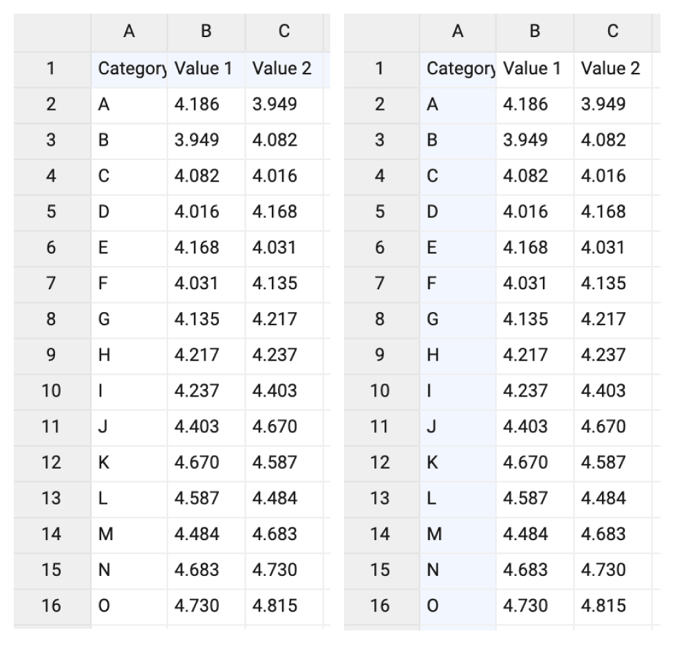 |
Series>
| Name | Text field to name the Series. By default it is set to “New series 1”. Range plot only supports one series. | 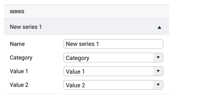 |
| Category | Used for binding categories. Every category is represented by at least one value. | 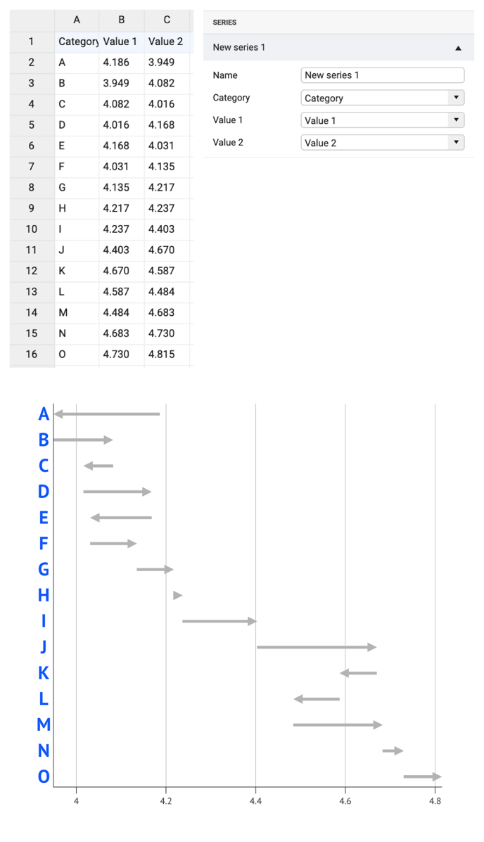 |
| If there are one or more empty cells, an empty category is added. Values of multiple empty categories will be merged into one category. | 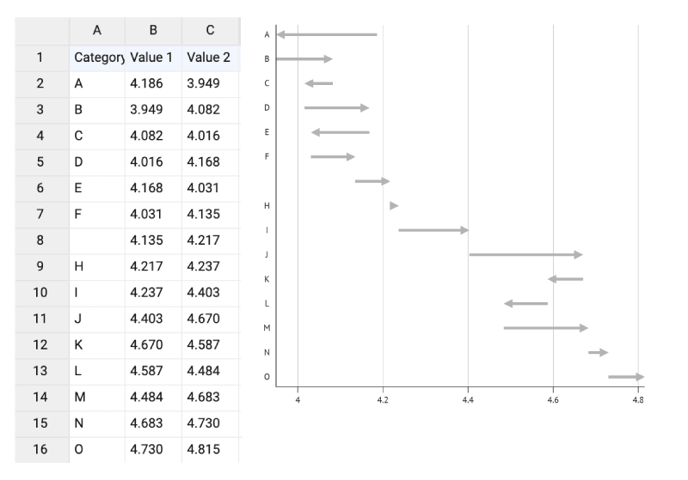 |
|
| Value 1 & 2 | Used for binding the start- and the end-point of the range. | 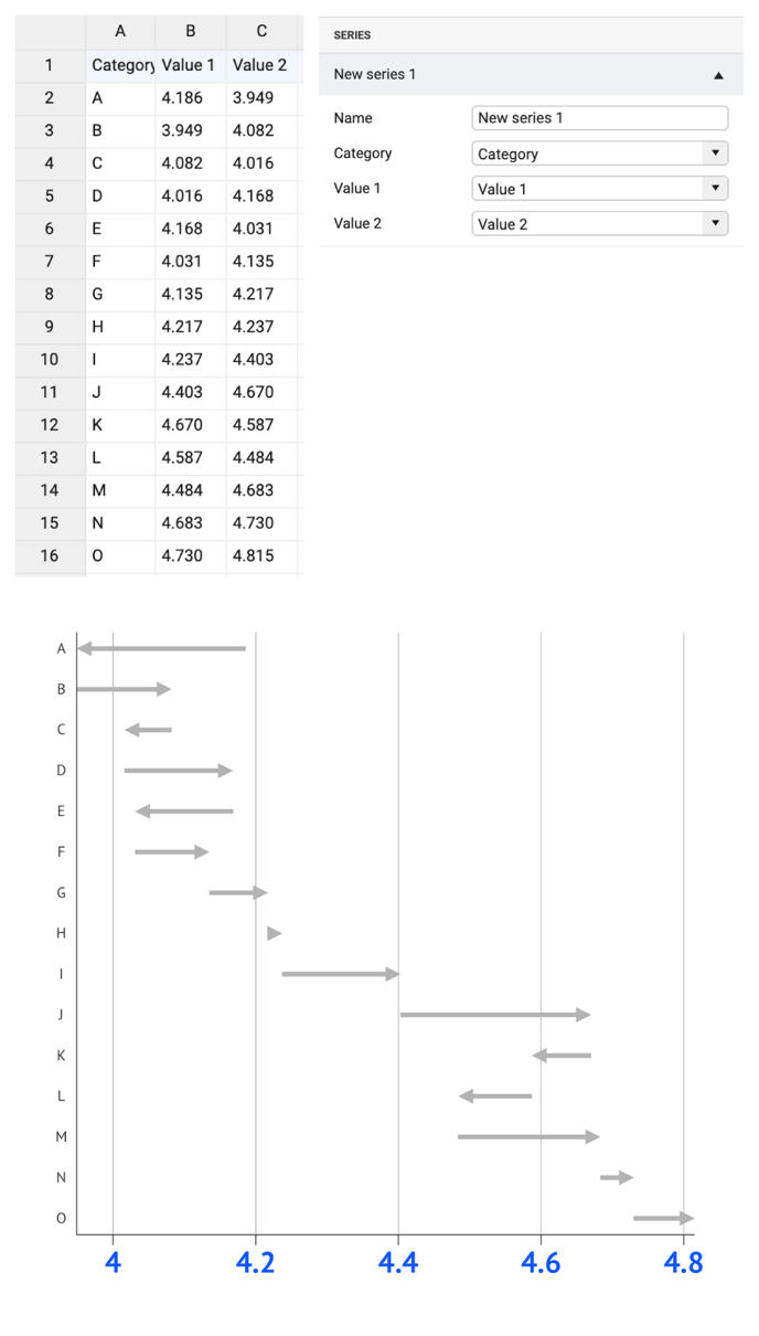 |
| If there are one or more empty cells, no start- and/or end-point is added. The corresponding categories are not changed. | 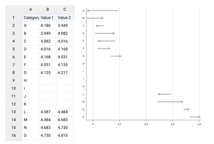 |
Styling Tab
DATA
Ranges>
| Chart Orientation | Defines the numerical axis as horizontal or vertical. | 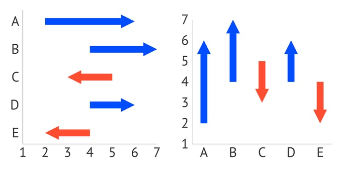 |
POSITIVE RANGE, NEGATIVE RANGE
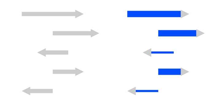
| Stroke |
Sets the color and weight of the range shaft. Available color options for the stroke are: solid and gradient. |
 |
|
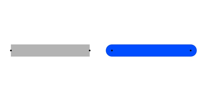
Stroke > |
Sets the type of the line cap. There are two types available: Butt and Round. |
 |
|
Stroke > |
Sets the length and gap of the dashes. If Gap is left empty, the value from the Dash field applies as Gap.
When Dash is set on 0, and Cap on Round, the dots will be perfect circles. |
|
| Arrowhead Color | Sets the color of the arrowhead. | 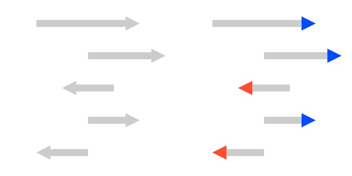 |
| Arrowhead Size | Sets the width and height of the arrowhead. For the positive range, the arrowhead is pointed to the right, and for the negative - to the left. | 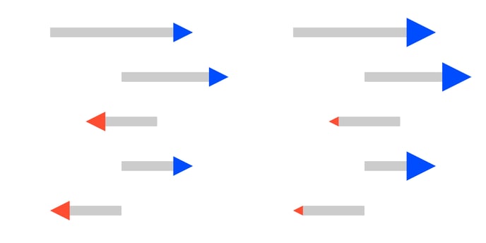 |