Custom Pentagon Radial chart properties
Below you will find in-depth user information about each property, what it does and how it can be applied
Custom charts are developed specifically on request. Therefore the behavior of this custom chart can be different from generic Datylon charts.
Please note we do not provide support for these charts unless contractually agreed upon. This also means some of the custom charts might not be supported in future versions of Datylon.
This Custom Pentagon Radial chart is a quantile chart, and more specifically an Octile chart. This means the used data is divided and displayed in eight equal subsets.
Binding Tab
1 Dataset
2 Series
General
1 Position and Size
2 Appearance
Data
3 Slices
4 Grid
5 Value Labels
6 Category Labels
7 Group Labels
Binding Tab
Dataset>
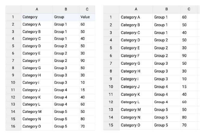
| First row (column) are headings |
When enabled, the first row (column) of the dataset are headings. When disabled, the first row (column) of the dataset is included in the data range. |
 |
| Data is in | Select if data series are structured in rows or columns. | 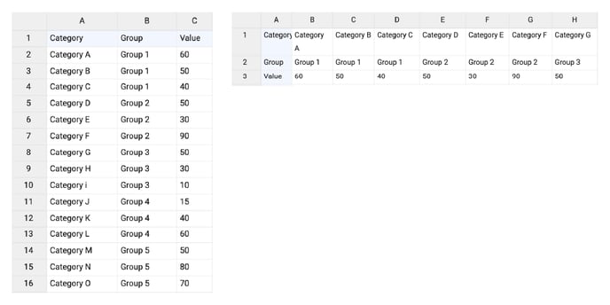 |
Series>
| Name |
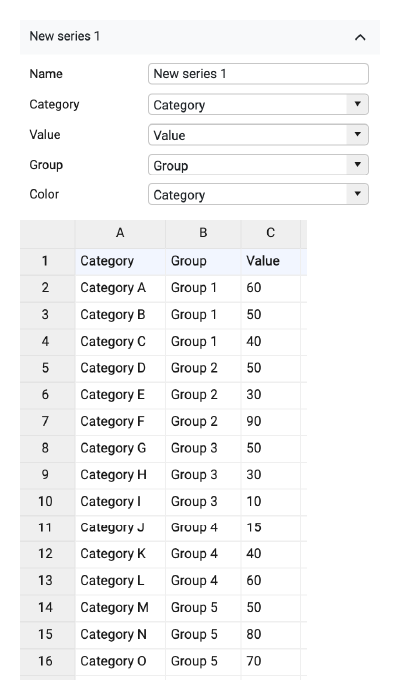
Text field to name the Series. By default, it is set to “New Series n”. Name is not used anywhere in the chart. |
|
| Category |
Used for binding categories. Maximum 15 categories. If the number of categories is more than 15, only the first 15 are shown. Fewer categories will show fewer slices. The order of the slices is based on the data. The first category will be plotted top right in the Pentagon, progressing clockwise. There is no way to sort the slices differently. |
|
| Value | Used for binding values. The range of the values is from 0 to 100. The slices are shown based on a stepped scale, where one step is 12.5. The slice is shown if a value exceeds the step value. | |
| Group | Used for binding group labels. By default, the number of groups is set to 5. The group value should be placed either into the second row/column of the group or into every cell related to this group. | |
| Color | Allows binding color to column (row) based on categorical or numerical values. |
Styling Tab
Data
Slices>
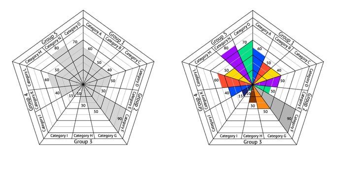
| Fill | Fills the slices with the selected color. The options are: None, Solid, Palette. For the palette to be applied a column or row should be bound to Color. Colors can also be applied using binding and Hex codes in a data column (row) bound to Color. |
 |
Grid>
| Grid | A fixed grid is applied. It can be turned on or off. | 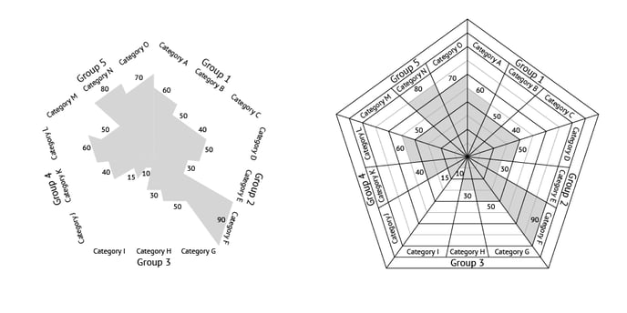 |
Value Labels>
| Anchor Radius | Defines the position of the labels on the radius of the slice. The positive direction corresponds to moving the labels outside. Negative – inside. | 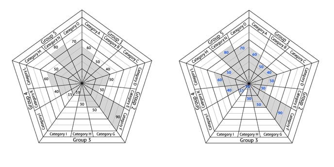 |
| Prefix |
Adds a prefix to labels. Consecutive spaces are ignored. |
 |
| Suffix |
Adds a suffix to labels. Consecutive spaces are ignored. |
 |
Category Labels>
| Anchor Radius | Defines the position of the labels on the radius of the slice. The positive direction corresponds to moving the labels outside. Negative – inside. | 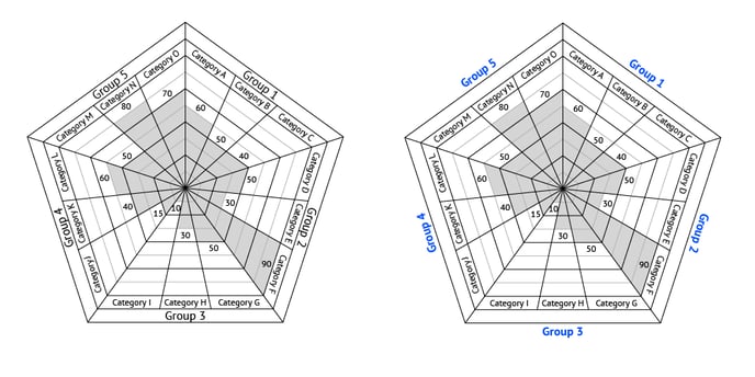 |
| Prefix |
Adds a prefix to labels. Consecutive spaces are ignored. |
 |
| Suffix |
Adds a suffix to labels. Consecutive spaces are ignored. |
 |
Group Labels>
| Anchor Radius | Defines the position of the labels on the radius of the slice. The positive direction corresponds to moving the labels outside. Negative – inside. | 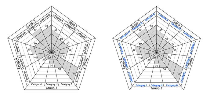 |
| Prefix |
Adds a prefix to labels. Consecutive spaces are ignored. |
 |
| Suffix |
Adds a suffix to labels. Consecutive spaces are ignored. |
 |